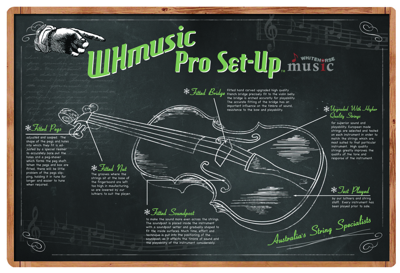
Redesign our MUSIC STORE violin diagram - 'vintage'
Whitehorse Music wollte ein graphic design und hat 11 Elegant, Spielerisch, Store graphic designs von 6 Designers bekommen
Designs
Designer
Budget
1 - 11 von 11 Grafik-Designs Vorschläge
Hier ist was Whitehorse Music suchte für sein graphic design.
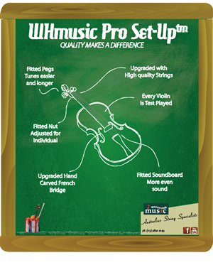
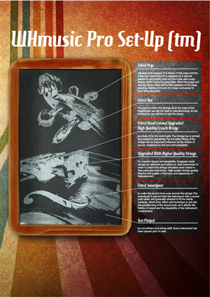
Please see the attachment to be restyled to Vintage.
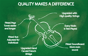
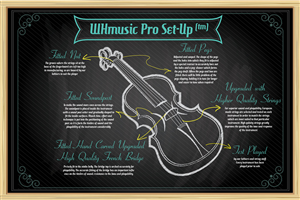
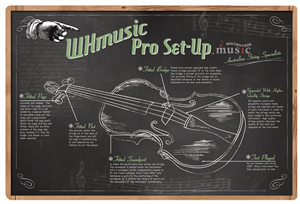
We are a Music String Instrument store with a unique point of difference which we hope to illustrate with a diagram of our Violin showing what we do to each one.
I have tried to make the illustration myself with limited skills.
We would like to have it re-designed so it is simpler and cleaner.
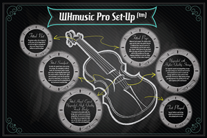
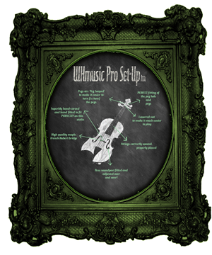
- simple 'outline drawing of the violin' on a vintage style Blackboard.
- fonts such as Hamburger Heaven and Ohio Script (Vintage style)
- Arrows or Icons to highlight the 6 points of difference that we do to our violin
- We like the current paypal illustration style, but this is just to give you a guide
http://www.justinmezzell.com/PayPal-Illustrations
- Our branding colour is green 'sage'
Here is the link of the original ones which we want re-designed
http://www.whitehorsemusic.com.au/g/9545/professional-set-up.html
Mehr lesen
