

 Aktualisieren
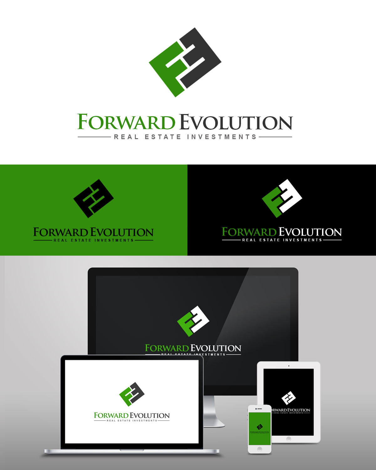
Logo design for new a real estate investing company
Wollen Sie auch einen Job wie diesen gewinnen?
Dieser Kunde bekam 111 Logo-Designs von 49 Designern. Dabei wurde dieses Logo-Design Design von Pendejo als Gewinner ausgewählt.
Kostenlos anmelden Design Jobs finden
- Garantiert
- Gebündeltes Projekt 1
-
 US$390
-
 111 Designs
-
 49 Designer
Logo-Design Kurzbeschreibung
The business name, "forward evolution" can't help but to evoke a dynamic of movement, and the logo can play on that, however...
1) imagery such as rushing forward like an express train is not desired, since we don't want to portray a rushed, careless company in a field where the details can mean everything.
2) another set of ideas to be avoided are anything that could remotely play into religious/political polarization, specifically the thought of evolution as a conflict between science and religion. So nothing that would bring to the customer's mind any famous graphics of monkeys turning into humans, for example. Red white and blue color schemes are not desired for similar reasons.
Now that the "red flags" are out of the way... We want to portray Comfort, Optimism, Progress toward a goal (that kind of evolution), Trust, and Competence.
So probably a color palette projecting warmth. And something with enough contrast that it can hold up to faxing 2-3 times without turning into a gray blob. It should be usable on letterheads, business cards, and a website.
The logo does not want to be *very* specific about the kind of business we're involved in, since there are many kinds of real estate investing and at this time the business does not want to niche itself into just one kind of real estate investing (or geographic area). We were thinking that something that incorporates a house, roofline, or key/keyhole imagery would be ok...except that this can be a little cliché and has been done many times already. Unless there is a fresh take on this.
"Forward" is liked by the business owner as the motto of Wisconsin where he grew up but that does not need to be conveyed in the logo. "Evolution" means, to the business owner, evolving his business to be more successful. That is also something that if communicated to the customer could undermine confidence ("you mean there is still room for improvement?"). There is no associated tagline for the business.

Aktualisierungen
After seeing the good quality of the first submissions within 24 hours, I have guaranteed the payment and also added participation payments and upped the compensation for 1st and 2nd place. I don't want to ask designers to put forth a good faith effort when they have a high potential of receiving nothing for it. Thanks for the submissions so far!
Added Monday, February 23, 2015
Zielmarkt/( -märkte)
1) Other real estate investors, for networking. 2) people who may need to sell their homes due to problems such as bankruptcy, foreclosure, etc.. 3) lastly, potential renters. This business does not sell homes in the retail market.
Industrie/Einheitstyp
Real Estate
Kontaktinformationen für Visitenkarte
There should be some "white space" or open area on it where one can add a small handwritten word or two on the FRONT when handing out the card. This white space should not look like an area that REQUIRES something to be written, however.
Logo Text
Forward Evolution
Logo Stile, die Sie interessieren können
Emblem-Logo
Logo eingeschlossen in einer Form



Pictorial / Combination-Logo
Ein reales Objekt (Text optional)



Wortmarke-Logo
Word oder namensbasiertes Logo (nur Text)


Lettermark-Logo
Kurzwort oder Buchstaben-Logo (nur Text)



Zu verwendende Schriftarten

Sehen und fühlen
Jeder Schieber zeichnet eine der Charakteristiken der Marke des Kunden aus sowie den Stil, den euer Logo widerspiegeln sollte.
Elegant
Fett
Spielerisch
Ernst
Traditionel
Modern
Sympatisch
Professionell
Feminin
Männlich
Bunt
Konservativ
Wirtschaftlich
Gehobenes
Anforderungen
Muss haben
- A color palette projecting warmth. And something with enough contrast that it can hold up to faxing 2-3 times without turning into a gray blob.
Schön zu haben
- I like the idea of using the acronym "FE" within the logo. FE can have an arrow built into it, the same idea (but not the same way) that FedEx uses the white space in their logo to show an arrow, but maybe softer. The logo and optional acronym design should not be in italics, since this gets too close to the "should not have" imagery of rushing forward.
Sollte nicht haben
- 1) imagery such as rushing forward like an express train is not desired, since we don't want to portray a rushed, careless company in a field where the details can mean everything.
- 2) another set of ideas to be avoided are anything that could remotely play into religious/political polarization, specifically the thought of evolution as a conflict between science and religion. So nothing that would bring to the customer's mind any famous graphics of monkeys turning into humans, for example. Red white and blue color schemes are not desired for similar reasons.
Zahlungen
Gesamt
US$390
Projekt-Deadline
04 Mrz 2015 19:18:09 UTCProjekt Upgrades
Gebündelte(s) Projekt(e)
- übergebe US$80 Visitenkarten-Design an den Sieger
