logo redesign for dealboard.com.au
Wollen Sie auch einen Job wie diesen gewinnen?
Dieser Kunde bekam 275 Logo-Designs von 71 Designern. Dabei wurde dieses Logo-Design Design von rastf2day als Gewinner ausgewählt.
Kostenlos anmelden Design Jobs finden- Garantiert
-
 A$400
A$400
-
 275 Designs
-
 71 Designer
Logo-Design Kurzbeschreibung
we started three months ago with a very basic logo and have since experienced rapid growth and we'd like to be leading daily deal site in australia. you may have head of some of our competitors - livingsocial, groupon - our site is more local to Australia. We will redesign our web site once we have a new logo as well.
The concept behind the name and what will hopefully help us differentiate ourselves from all the clutter is the board board game theme - where people come for winning deals.
We want to encourage identification and collaboration on the site by making the site and logo more engaging.
we want the logo to look professional - conversions are important - and you have a lot of new visitors on your site - so you want to build trust... but the logo should articulate the story subtly.
The first attachment is a logo that was put together briefly to show that the core demographics of the site are women and to portrait some subtle femminine charactaristics - but we didn’t think this logo was suitable... maybe even a little too feminine... even though this is our demographic... so whilst there should be femininity it is still an online company and not a beauty bramd.
the second attachment is something we did for a bit of fun. this demonstrates our story half way - kinda looks like a deal board concept but what’s on the board doesn’t make any sense and its a bit childish. we like professional logos. people have to trust us when they come to our web site. we sell daily deals. these deals include travel, hotels, flights, skydiving, restaurants, activities, weekend outings, beauty treatments, etc. im not sure if any of this can or needs to be portraid in the logo.
The final attached is our original logo - this took a couple of hours when we first started and where still using this today. we're a group of entrepreneur so we're always eager to test the success of the business before putting huge amounts of time into the logo. We don’t like this particularly as it doesn’t portray our story or our brand- in fact it doesn’t do anything.
have a look at our web site dealboard.com.au. a reminded we will be launching a new site after we chose a logo. have a look at our competitors - liveingsocial.com and groupon.com and in australia cudo.com.au
Aktualisierungen
I think elements related to board games such as chess, dice, cards are very playful and difficult to brand
The best direction so far I've seen is hte attached file with the d - it plays the board game theme very subtly with soft boxes build into a d element - its subtle - its plays the moderm game theme - like tetris or that game where you eat the boxes (very subtle of course we dont want it to look like these games)
Colours should be more female
Added Saturday, May 28, 2011
the direction should b the d in a box like a board (maybe little boxes) please check attached logo with purple d.
i think some of the designs have allowed us to see this
Added Saturday, May 28, 2011
the logo needs to have a more big brand feel
more professional then playful
i also dont mean to put a wet blanket on any ideas you might have - these are just suggestions above - if you have your own ideas would love to see the
Added Sunday, May 29, 2011
Zielmarkt/( -märkte)
Online, mass market but buyers, usually have social networking profiles, are more female skewed. Logo should have more feminine appeal - not to the extent of a beauty product brand, we still have a male audience, but most buyers are women
Industrie/Einheitstyp
Business
Logo Text
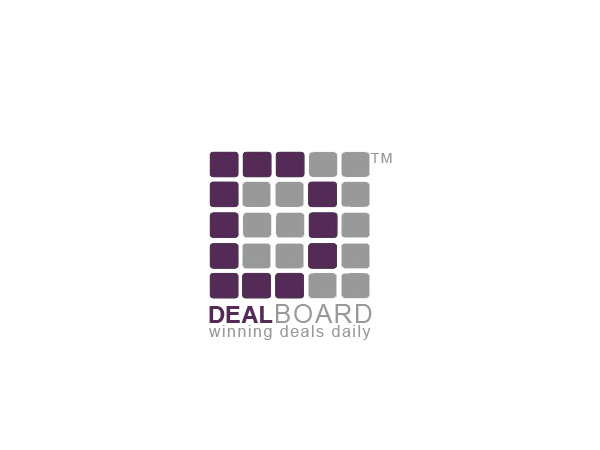
DealBoard
Sehen und fühlen
Jeder Schieber zeichnet eine der Charakteristiken der Marke des Kunden aus sowie den Stil, den euer Logo widerspiegeln sollte.
Elegant
Fett
Spielerisch
Ernst
Traditionel
Modern
Sympatisch
Professionell
Feminin
Männlich
Bunt
Konservativ
Wirtschaftlich
Gehobenes
Anforderungen
Muss haben
- Professional, clean look with a light entertainment touch with some referenceof the board game idea. Must be original. doesnt have to be a board game but the theme - winning, fun, engaging, games, etc. wed like to be a big brand one day and float the business and go public so we really want a big company feel web site - also so people feel trust when they buy something online.
Logo should also look good as an icon i.e on facebook and apps.
Schön zu haben
- Maybe the board game theme - winning daily deals- we're not sure - dont want the logo to look too busy but like the story behind it. the priority would be for a professional look. if both can be achieved. Maybe the letter d emphasized.
Sollte nicht haben
- Unprofessional, busy, childish characteristics
No dice - yes, the logo should have an entertainment component but it has to be original and have brandable elements.