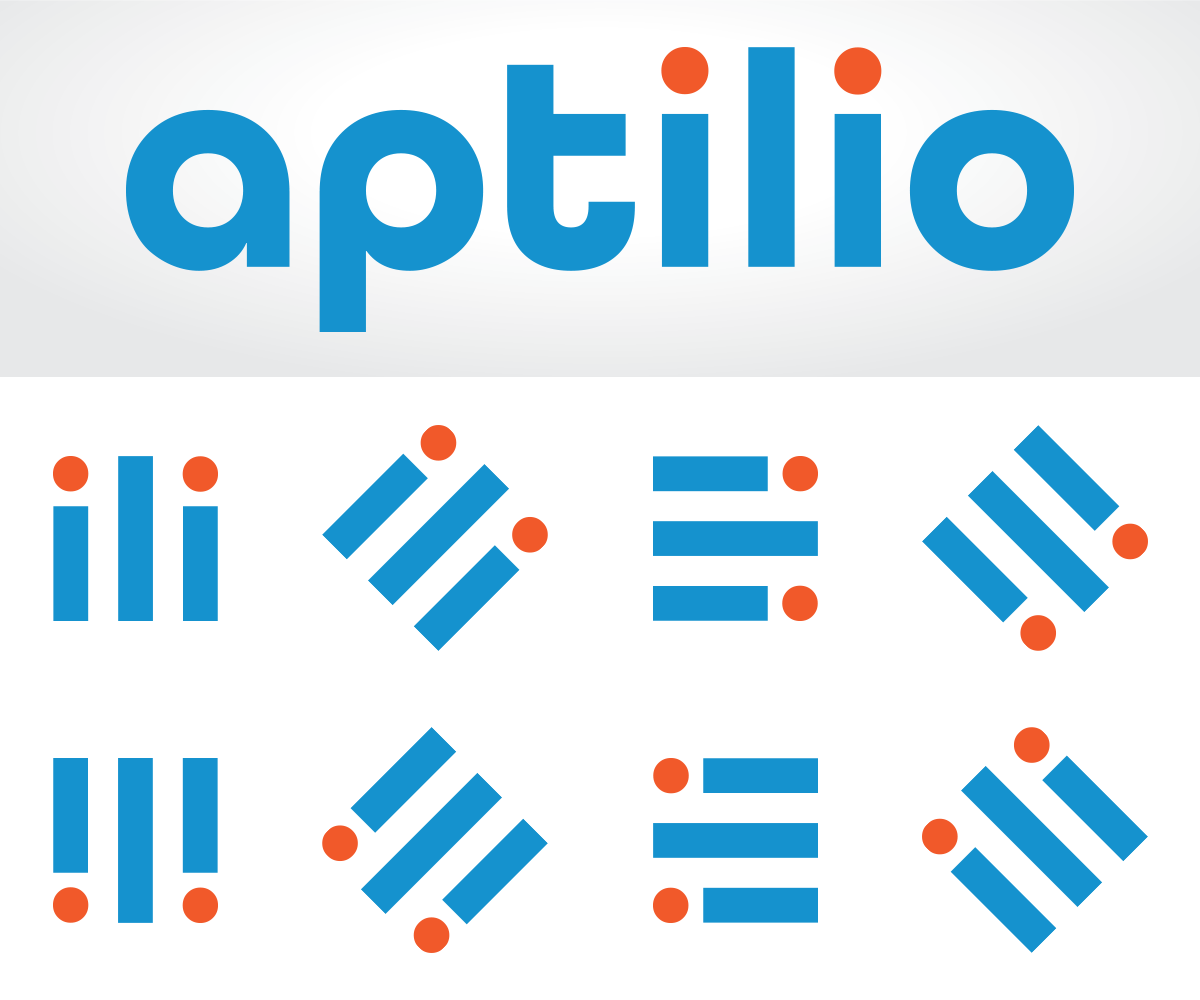
Logo Redesign to Match New Company Name - Aptilio

Wollen Sie auch einen Job wie diesen gewinnen?
Dieser Kunde bekam 117 Logo-Designs von 43 Designern. Dabei wurde dieses Logo-Design Design von z a n a als Gewinner ausgewählt.
Kostenlos anmelden Design Jobs finden- Garantiert
Logo-Design Kurzbeschreibung
We are renaming our company from Myhomepayge to Aptilio. We need a logo that keeps the blue and white color scheme of our existing logo but that integrates the new name. The existing logo uses Helvetica Neue as the "my" and Myriad Pro as the "homepayge" but these need not be used going forward. The logo should include both an icon as well as a logotype name. We are building a mobile app for people who live in apartment buildings to communicate with each other and their property management. The design should reflect a very hi-tech, modern feel. The logo could possibly having something related to real estate (e.g. buildings) but that is not essential.
Zielmarkt/( -märkte)
We sell our services to property managers of residential real estate in the US. However, the residents who live at the properties may see it as well. It should have both a B2B and B2C appeal.
Industrie/Einheitstyp
It Company
Logo Text
Aptilio or aptilio (the name is not case sensitive - whatever looks better)
Logo Stile, die Sie interessieren können
Pictorial / Combination-Logo
Ein reales Objekt (Text optional)
Wortmarke-Logo
Word oder namensbasiertes Logo (nur Text)
Zu verwendende Schriftarten
Farben
Vom Kunden ausgewählte Farben für das Logo Design:
Sehen und fühlen
Jeder Schieber zeichnet eine der Charakteristiken der Marke des Kunden aus sowie den Stil, den euer Logo widerspiegeln sollte.
Elegant
Fett
Spielerisch
Ernst
Traditionel
Modern
Sympatisch
Professionell
Feminin
Männlich
Bunt
Konservativ
Wirtschaftlich
Gehobenes
Anforderungen
Muss haben
- You must retain the existing blue and white color scheme. The logo should also have both a graphic and a text block. The existing logo uses the image of a door as the graphic and the word "myhomepayge" as the text block. The logo should lay out nicely both as a rectangle and as a square. In the past, we have used the door icon alone to fill a square and the door and name to fill the rectangle.
Schön zu haben
- Something that relates the logo to the concept of real estate. It should also have a strong technology influence. The name of the company has two key meanings. "Apt" is short for "apartment". When you say "Aptilio" you hear something that sounds like "app" & "tilio". We like the idea that our product is an "app" that gets installed rather than being a website.
Sollte nicht haben
- The logo should not have any other words besides "Aptilio" or "aptilio".