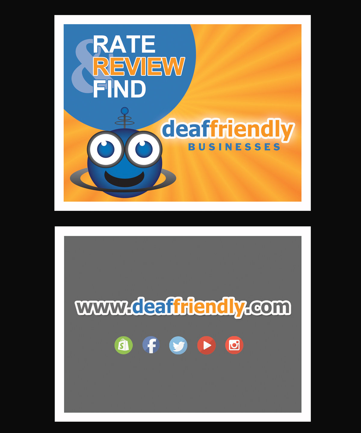
promotional postcard for expos

Wollen Sie auch einen Job wie diesen gewinnen?
Dieser Kunde bekam 33 Postkarten-Designs von 9 Designern. Dabei wurde dieses Postkarten-Design Design von NatPearlDesigns als Gewinner ausgewählt.
Kostenlos anmelden Design Jobs findenPostkarten-Design Kurzbeschreibung
We are a review website for 38 million deaf/hh people in the USA. Reviews help businesses understand how to improve their customer service for our community. We need a general promotional postcard refreshed (I've included the previous version). We use these at expos to remind people to visit our website and write a review about their deaf-friendly or deaf-challenged consumer experience. We also include them with tee-shirt purchases: www.deaffriendly.myshopify.com Please see websites www.deaffriendly.com to get a feel.
Aktualisierungen
Project Deadline Extended Reason: Originally I thought this was an urgent request. Checking in with my team, I realize we have more time, hence the extension. Added Tuesday, April 14, 2015
Zielmarkt/( -märkte)
deaf, hard of hearing and hearing allies
Industrie/Einheitstyp
Promotional
Zu verwendende Schriftarten
Farben
Vom Kunden ausgewählte Farben für das Logo Design:
Sehen und fühlen
Jeder Schieber zeichnet eine der Charakteristiken der Marke des Kunden aus sowie den Stil, den euer Logo widerspiegeln sollte.
Elegant
Fett
Spielerisch
Ernst
Traditionel
Modern
Sympatisch
Professionell
Feminin
Männlich
Bunt
Konservativ
Wirtschaftlich
Gehobenes
Anforderungen
Muss haben
- Words: Rate, Review & Find
- Words: deaf-friendly or #deaffriendly
- Mascot image (attached) (use his face only, no body)
- Website (www.deaffriendly.com)
- Social Media icons (I would be ok with removing the urls for each social media icon and just going with an image of instagram, fb, shopify, twitter, YouTube
Schön zu haben
- I would love these promo postcards to have a more professional feel to it. Different fonts are ok... different social media icons ok... rays (brand) either in blue or orange.. mascot... (brand). Please change the placement of things, could change from double sided to single sided... open.
Sollte nicht haben
- the word "hearing impaired"
- same placement of things as I have attached in the previous version, I want it placed differently.