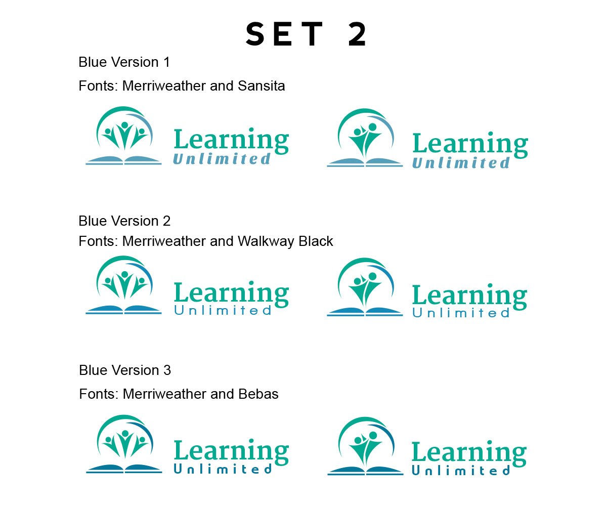
Education center called Learning Unlimited, located in Hawaii needs an updated look and new logo.
Wollen Sie auch einen Job wie diesen gewinnen?
Dieser Kunde bekam 70 Logo-Designs von 9 Designern. Dabei wurde dieses Logo-Design Design von Digital Waltz als Gewinner ausgewählt.
Kostenlos anmelden Design Jobs finden- Garantiert
-
 US$160
-
 70 Designs
-
 9 Designer
Logo-Design Kurzbeschreibung
I own and operate an education center that provides tutoring (1-1 and 1-2 ratios) to children 2 years through college. Our most common students are pre-school and middle school, then high school for college prep.
I need a new logo design that I can use consistently across mediums but primarily for web site and brochures and perhaps signs (larger materials than business card). I am a new owner but the company has been around 20 years. Our website is an example of what I don't want (www.learningunlimitedhawaii.com) - generic, not local enough (local is Asian, Caucasian, Hawaiian). the photographs give a sense of the peoples looks, but those are 5-10 years old.
I want to differentiate us from the competition Sylvan Learning Center and Kumon since we are not a franchise and we personalize our services to the nth degree. While conveying we are local, I want to convey personalized and professional! The place to trust and the place for results.
I need a professional versus cute font (one i can use in microsoft word docs and replicate on letter head etc so that things are consistent) and id like a style and picture that conveys progress, development, growth - "your child can succeed here."
Ive liked some designs at Designmantic - I like the open books (more active looking versus a closed book), the graduation hats (accomplishment), and the designs of kids reaching or studying, or pairing of kid and tutor pictured but none captured it and I don't like how they draw people. ideally we'd have a picture or design that has all those elements - scholastic, achievement, a place for very young to college students. something that conveys its for students (versus a library of books)
I do not want apples
My clients are families - Caucasian, Asian mostly. some Hawaiian (no aloha print needed but any ideas to convey we are here for Hawaii is great if not cheesy and too "country" looking. Ive seen some with the sun over a book but not really sure what that conveys. We don't need surfing scenes... we want them to recognize the logo/name for education and indoor studying :) thats positive! (fun and rewarding)
We serve professionals, doctors, lawyers, bluecollar workers etc people who invest in education and enjoy life in hawaii. but I also ideally want to reach any family trying to help their child catch up or prepare and succeed.
I want to convey welcoming versus any pretention.
While i prefer striking, simple and memorable, I also liked the ideas ive seen - if its not too much- of 3 scenes, figures or symbols atop the logo such as depicting the preschooler 1-1 tutoring, the youth or high schooler, and the college graduate. Or an arch of symbols, pictures or silhouettes that conveys some of this breadth.
A challenge for me is conveying that we work with a wide range of students, so how to show this range without eliminating one or the other. most options are very preschool ish or very college classroom ish.
Or just go for the middle ground if the range cant be conveyed.
I prefer colors that are not too obscure such that I can match if needed with docs I create on Microsoft word and that can print well on basic color printers.
Professional and inviting.
Colors: I like blues and black (im from Washington DC and NY and love simple, black, strong but I need that with more approachability.
(I think red isn't good for Chinese clients. im not sure! otherwise I like it. its bold. Id avoid pinks and pastels, tans and purple)
NOT all American red white and blue theme for Hawaii)
Japanese, and korean color schemes/design ok. Hawaii greens and sun colors ok, but cool versus warm hues. all in all either has to convey multicultural or be generic enough to reach Asian, Caucasian and Hawaiian, and just be professional.
The colors inside the center are blues, browns (Tan tables) and white walls with splashes of sharp bright colors in kids sections. Its a spacious, organized, inviting place. very comfortable and kid friendly.
Wow, that is a lot of info. I hope it helps. Its harder to convey in words than in images, but i'm sure something great will be created.
Current tag line is "Personalized education services for pre-k - college" but its more of a description.
Zielmarkt/( -märkte)
middle to upper income families or new parents. Parents of young, preschool age through high school students.
Industrie/Einheitstyp
Education
Logo Text
Learning Unlimited
Logo Stile, die Sie interessieren können
Figuren-Logo
Logo mit Abbildung oder Zeichen
Zu verwendende Schriftarten
Farben
Vom Kunden ausgewählte Farben für das Logo Design:
Sehen und fühlen
Jeder Schieber zeichnet eine der Charakteristiken der Marke des Kunden aus sowie den Stil, den euer Logo widerspiegeln sollte.
Elegant
Fett
Spielerisch
Ernst
Traditionel
Modern
Sympatisch
Professionell
Feminin
Männlich
Bunt
Konservativ
Wirtschaftlich
Gehobenes
Anforderungen
Muss haben
- detailed in project description. If you looked at our website youd see the old design, the apples, the cheesy stock photos that I don't want. the photos can show some people though they too are outdated.
- my comments might make more sense if you looked at designmantic and typed in Learning Unlimited. category is child care and education. these are my only reference points so far. some are close to what I like but not special enough or tailored enough. open to other ideas. I made some choices below. I am open to different logo styles but since I dont always use a tag line, so I like some symbols or pictures with the name that convey more than just the name.
Schön zu haben
- detailed in project description.
- I noted colors suggestions in project description too, open to ideas but those may help. I selected some colors too just as options, not limitations. its tropical here, but urban too - not sure how to describe it. im NOT good at picking colors so the wheel choices are just ideas - cooler hues. I like black too where appropriate.
- I liked designs that had Learning Unlimited in dark blue and the surrounding symbols in colors
- The photos I attached are just examples of internal look. and a shot from outside - picts for website. not sure if helpful for logo ideas. I use vista print for now at its too generic or too limited to one age group, not personal or professional looking enough.
Sollte nicht haben
- symbols or people's looks (if used) that are not representative of Hawaii. we are Caucasian, Asian - wide variety form Japanese, Korean, Chinese etc - and Hawaiian. (not much Latino, African American or Indian here) We don't need middle America apple pie or American flag stuff, nor generic touristy Hawaii surfers or hula skirts. if there is a way to convey we are Hawaii!! but also professional and focused on academics great. main part is academics and learning!
- Should not be the same "look" as Sylvan or Kumon learning centers (national franchises). I AM ok with blue, black and white but would add color somehow)
- id avoid the Learning Unlimited name in tan, purple or greens, or the pastels etc id mentioned