Corrections Company Logo Design
Wollen Sie auch einen Job wie diesen gewinnen?
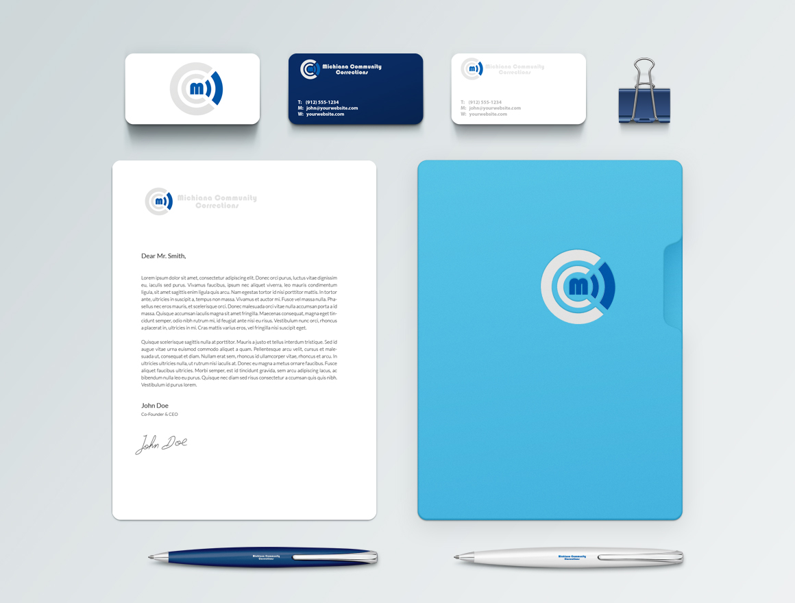
Dieser Kunde bekam 52 Logo- und Visitenkarten-Designs von 8 Designern. Dabei wurde dieses Logo- und Visitenkarten-Design Design von spase_janevski als Gewinner ausgewählt.
Kostenlos anmelden Design Jobs finden- Garantiert
-
 US$390
-
 52 Designs
-
 8 Designer
Logo- und Visitenkarten-Design Kurzbeschreibung
We need a logo designed for a Community Corrections Company. Our company offers gps monitoring, parole tracking, drug testing, corrective educational classes and things that fall within that realm.
Bold, clean and professional. Company name is Michiana Community Corrections. The logo design is the most important factor here; we're looking for something modern, yet professional and clean. We're located in South Bend, and Elkhart, Indiana; however we service a wider range.
Things to avoid in the logo design
-Maps
-The standard judicial seal
-The standard judicial scale
I'm looking for something creative, clean, and professsional. Please be creative on a font (google fonts come in very handy as it will be used within a site).
We want to stay with a blue color, along with either black, gray, or white, as an accompanying color. Use your creativity on shades of either black, gray or whites.
Please be creative. Please don't hesitate to contact me with any questions.
Black, Blue & Black, Dark Grays, Light Grays
*Added some examples that I found on Google Images. All seemed clean, modern and professional.
Zielmarkt/( -märkte)
Lawyers, Judges, community members
Industrie/Einheitstyp
Drug
Kontaktinformationen für Visitenkarte
Company Logo - Use a fictitious name and address
Logo Text
Michiana Community Corrections
Logo Stile, die Sie interessieren können
Abstraktes Logo
Begrifflich / symbolisch (Text optional)
Lettermark-Logo
Kurzwort oder Buchstaben-Logo (nur Text)
Farben
Vom Kunden ausgewählte Farben für das Logo Design:
Sehen und fühlen
Jeder Schieber zeichnet eine der Charakteristiken der Marke des Kunden aus sowie den Stil, den euer Logo widerspiegeln sollte.
Elegant
Fett
Spielerisch
Ernst
Traditionel
Modern
Sympatisch
Professionell
Feminin
Männlich
Bunt
Konservativ
Wirtschaftlich
Gehobenes
Anforderungen
Muss haben
- Project must have a Logo for my company (Michiana Community Corrections). The name does not have to be spelled out, but I'd like for it, or the MCC to be included within the logo.
Schön zu haben
- I bumped up the pay a bit as I realize this is a bit more of a project than I initially anticipated.
- I like the idea of keeping things in a rectangular shape, logo on one side and the Michiana Community Corrections on the other (doesn't have to be this way though. This works well on letter heads, business cards, print media and physical media.
- The Logo side doesn't neccessarily have to be anything crazy. Possibly a stylized M built into a logo. We do GPS monitoring, so Wireless Symbol or a Google Pin could very well play into it. Below are a couple of simple examples of plays off the letter M.
- http://www.scratchinginfo.net/wp-content/uploads/2013/11/world-media-design.jpeg
- http://www.scratchinginfo.net/wp-content/uploads/2013/11/Modico-M-Letter-Logo.jpeg
- http://www.scratchinginfo.net/wp-content/uploads/2013/11/Digital-Pix-Logo.jpeg
Sollte nicht haben
- Things to avoid in the logo design
- -Maps
- -The standard judicial seal
- -The standard judicial scale