

 Aktualisieren
Farmer's Stand - A farmer's market on the web
Wollen Sie auch einen Job wie diesen gewinnen?
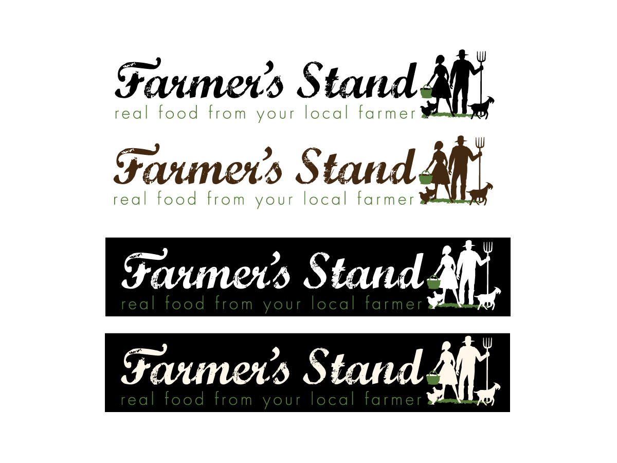
Dieser Kunde bekam 64 Logo-Designs von 23 Designern. Dabei wurde dieses Logo-Design Design von Patricia Baliviera als Gewinner ausgewählt.
Kostenlos anmelden Design Jobs finden
- Garantiert
-
 US$180
-
 64 Designs
-
 23 Designer
Logo-Design Kurzbeschreibung
Hello and welcome to our project.
We need a logo design for our website that is essentially an online farmers' market.
The design we have in mind is basically horizontal and is both 'organic' and represents web 2.0 at the same time (if that's even possible).
The company name embodies two meanings at once. Farmer's Stand represents the traditional farmers' market (see link: http://qwi.ki/if5I9Z). It also represents the local farmers and food artisans 'stand' for their community, lifestyle, expertise and family.
To get an idea of who this logo will represent, please take a look at the farmer photos about half way down this blog: http://bit.ly/jRf2RT (note, these are not my photos so please don't use them). Additionally, there's a bunch of interesting design ideas at this link: http://bit.ly/kDoDlH
We've uploaded the basic text idea of what we're looking for. However, we'd like to give designers creative flexibility and are willing to consider all designs.
Zielmarkt/( -märkte)
Our target market are eaters who want to purchase fresh locally grown and produced food opposed to low quality food trucked in from a far away locations (link: http://qwi.ki/ehQUby).
Industrie/Einheitstyp
It Company
Logo Text
Farmer's Stand - real food from your local farmer
Logo Stile, die Sie interessieren können
Pictorial / Combination-Logo
Ein reales Objekt (Text optional)

Wortmarke-Logo
Word oder namensbasiertes Logo (nur Text)
Sehen und fühlen
Jeder Schieber zeichnet eine der Charakteristiken der Marke des Kunden aus sowie den Stil, den euer Logo widerspiegeln sollte.
Elegant
Fett
Spielerisch
Ernst
Traditionel
Modern
Sympatisch
Professionell
Feminin
Männlich
Bunt
Konservativ
Wirtschaftlich
Gehobenes
Anforderungen
Muss haben
- Must have the name of the company (large) 'Farmer's Stand' and the company motto (small) 'real food from your local farmer' at at equal horizontal distance below the company name. See the attached file for our basic thoughts.
Farmer's Stand (large)
Real food from your local farmer (small)
Schön zu haben
- Unique stylized text for 'Farmer's Stand' portion of the logo. These companies have logos that we like. We especially like the fonts that are some-what ‘worn’ – not sure what it’s called but something similar would possibly look nice for the ‘Farmer’s Stand’ part of the logo.
http://www.doortodoororganics.com/
http://doorstepdairy.com/
http://www.farmersmarketonline.ca/
http://www.freshdirect.com
http://www.gilttaste.com/
http://www.localdirt.com/
http://www.abelandcole.co.uk/
http://www.earthfare.com/
http://www.realtimefarms.com/
http://www.localfoodisbetter.com/
Sollte nicht haben
- No color backgrounds or borders - this logo background must be translucent for a variety of uses including our website, business cards, documents, various backgrounds, etc. Thanks.
