

 Aktualisieren
Craft Brewer Needs a Logo Design
Wollen Sie auch einen Job wie diesen gewinnen?
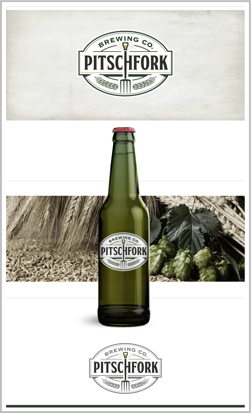
Dieser Kunde bekam 91 Logo-Designs von 24 Designern. Dabei wurde dieses Logo-Design Design von Raicho als Gewinner ausgewählt.
Kostenlos anmelden Design Jobs finden
- Garantiert
-
 C$160
C$160
-
 91 Designs
-
 24 Designer
Logo-Design Kurzbeschreibung
We need a logo design for a new brewery based in Toronto, Ontario, Canada called "PITSCHFORK BREWING CO". Note the word "Pitschfork" is deliberately misspelled.
Our initial product will be a lager-style beer but we do plan to create additional beer varieties over time. Product characteristics are dry, crisp, and clean; a well made beer aimed at filling a hole in a noisy craft beer market. What people think of when they think about "what great straightforward beer should taste like". Our target market is mostly men, aged 25-40 who enjoy drinking beer and who support smaller, local brewers.
The brand should strike a balance between (a) a simple product, crafted in small batches with a dedication to quality, and (b) an image and messaging that will remain "current and relevant" among target customers. While the product will be made with care, we don't want to come across as being old-fashioned or taking ourselves too seriously.
We are aiming for a tasteful overall look that's moderately high contrast, that uses black on white or white on a dark colour, with red accents. Easily identifiable and memorable, that won't get lost in a crowd. Also we like the use of circles and simple images (e.g., farmer's pitchfork and/or barley, hops) in the logo.
It should be well suited to several mediums, including can, bottles, tap handles, beer glasses, coasters, tshirts, etc.
Zielmarkt/( -märkte)
Mostly men, but some women, located in the city of Toronto, Canada, who enjoy drinking beer and support small, local breweries.
Industrie/Einheitstyp
Brewery
Logo Text
Pitschfork Brewing Co.
Logo Stile, die Sie interessieren können
Emblem-Logo
Logo eingeschlossen in einer Form



Pictorial / Combination-Logo
Ein reales Objekt (Text optional)



Zu verwendende Schriftarten


Farben
Vom Kunden ausgewählte Farben für das Logo Design:
Sehen und fühlen
Jeder Schieber zeichnet eine der Charakteristiken der Marke des Kunden aus sowie den Stil, den euer Logo widerspiegeln sollte.
Elegant
Fett
Spielerisch
Ernst
Traditionel
Modern
Sympatisch
Professionell
Feminin
Männlich
Bunt
Konservativ
Wirtschaftlich
Gehobenes
Anforderungen
Muss haben
- - the company name, but can be either (a) Pitschfork Brewing Company or (b) Pitschfork Brewing Co. or (b) Pitschfork Brewing
- - Use of the color red (or reddish) or golden yellow (not ballpark mustard) somewhere. Does not have to be dominant. This could be one small accent in the overall design, or could be the main colour. Use discretion to balance the whole thing.
- - Logo should be appropriate on white and dark backgrounds. Or, colors easily inverted depending on background.
Schön zu haben
- - Pitchfork imagery (preferably four pronged)
- - Barley, hops images
- - Circular look or elements (see sample file). Egg shapes, ovals welcome too.
- - Simple images, perhaps silhouettes
- - Good level of contrast to recognizable from a distance
- - A little graphical catch somewhere in the design. See New Belgium's logo (http://www.ohbeautifulbeer.com/2011/04/new-belgium-brewing/). The small light on the bicycle to match the white upper font is what I think works well and what I'm referring to.
Sollte nicht haben
- Fussy graphics.
- Clutter.