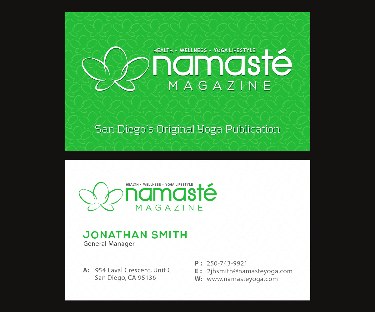
Yoga Magazine needs simple business card!

Wollen Sie auch einen Job wie diesen gewinnen?
Dieser Kunde bekam 66 Visitenkarten-Designs von 10 Designern. Dabei wurde dieses Visitenkarten-Design Design von Grace A als Gewinner ausgewählt.
Kostenlos anmelden Design Jobs finden- Garantiert
Visitenkarten-Design Kurzbeschreibung
We are a new yoga magazine and need a simple business card!
I also encourage you to design a text logo and maybe even incorporate some form of the "flower" pattern in the namastelogo.jpg and namasteyellow.jpg files attached below. I prefer to have the "namaste" word in larger font and then "San Diego" in smaller font somewhere. See the sweatequity.jpg file or also the organicspa.jpg file. Our tag line will be something similar to these. If you could incorporate HEALTH, WELLNESS and YOGA LIFESTYLE into the name somehow that'd be really cool. Maybe even add in FITNESS if there is room. Also, please incorporate MAGAZINE somewhere as I want people to know what we are without having to guess.
we are NAMASTE, San Diego's original magazine for Health, Wellness and the Yoga Lifestyle.
Above all, the business card needs to be classy, clean and sophisticated. I want it to look professional.
I have included a few logos that I like. My favorite colors are the chief.jpg and the kamloops.jpg cards, but that doesn't mean that you have to use orange. I'm just looking for something that stands out.
Zielmarkt/( -märkte)
Colors are up to you, but I'm leaning toward something soft and subtle, not bold and obnoxious. Font should be soothing and calm. Include pictures in the brochure of pretty people doing yoga, healthy looking food, families with young children. The target audience is women in their late 20s thru 50s and beyond. We will have some male readers, but maybe on 1/4 of readers will be men...so let's lean toward more feminine than masculine.
Industrie/Einheitstyp
Business
Kontaktinformationen für Visitenkarte
Jon Smith
Editor-In-Chief
Namaste San Diego Magazine
555 Main Street #100
San Diego, CA 92101
www.anywebsite.com
john@gmail.com
Zu verwendende Schriftarten
Sehen und fühlen
Jeder Schieber zeichnet eine der Charakteristiken der Marke des Kunden aus sowie den Stil, den euer Logo widerspiegeln sollte.
Elegant
Fett
Spielerisch
Ernst
Traditionel
Modern
Sympatisch
Professionell
Feminin
Männlich
Bunt
Konservativ
Wirtschaftlich
Gehobenes
Anforderungen
Muss haben
- mellow, calm colors
- accent mark (') above the "e" in namaste.
Schön zu haben
- small logos in front of contact information that denote location, globe and phone.
- maybe just flower logo and text name on back? let's be creative here. i'll leave up to you all.
- green? yellow? orange? you pick!
- how about black and green? or green and black? :-)
Sollte nicht haben
- no pictures or cartoon drawings of people doing yoga poses.
- no photography of people doing yoga poses.