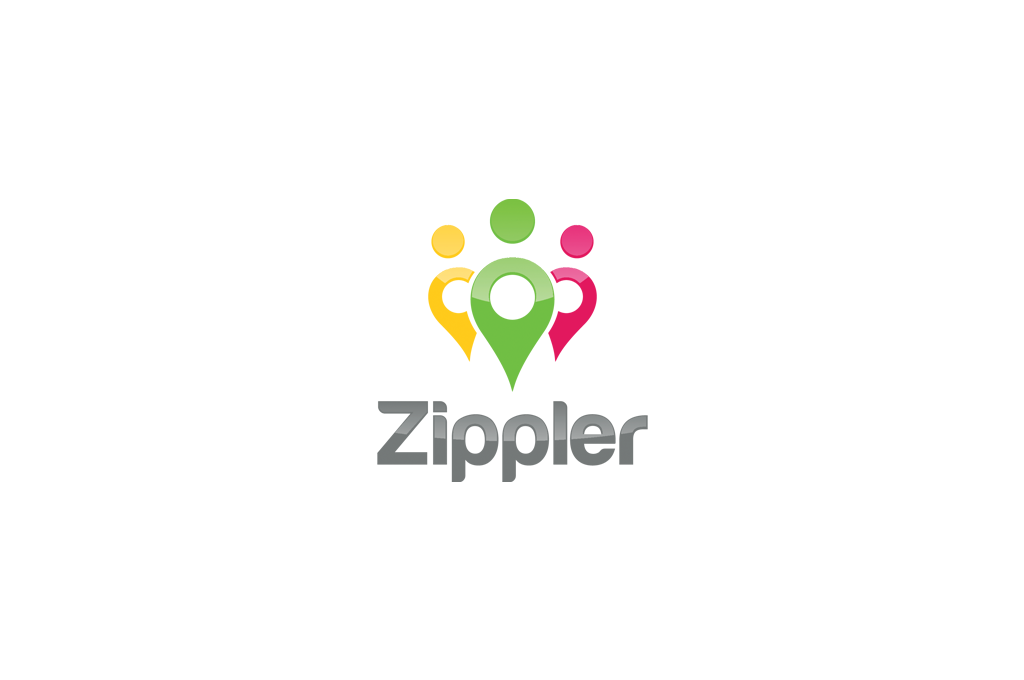
Zippler Logo Design

Wollen Sie auch einen Job wie diesen gewinnen?
Dieser Kunde bekam 233 Logo-Designs von 59 Designern. Dabei wurde dieses Logo-Design Design von Omee als Gewinner ausgewählt.
Kostenlos anmelden Design Jobs finden- Garantiert
Logo-Design Kurzbeschreibung
Zippler is a Location-based social network that helps you with everything you need based on your location: locate someone, search, connect and share, follow people and businesses, interact, get information, get recommendations, shop and get deals, discover new things and people, get alerts, etc..
we are innovative, and it has to be cool, fun, and simple.
The key aspects are
a) Location
b) social sharing with others
c) posting and exchanging small texts (like Twitter) with others
The logo should probably represent a location arrow that represent one or a few people. The Z! or Z could also be cool in the logo. I have created very rough draft ideas in the document attached.
Zielmarkt/( -märkte)
Same target as Facebook users
Industrie/Einheitstyp
Shop
Logo Text
the slogan will be added underneath later
Logo Stile, die Sie interessieren können
Pictorial / Combination-Logo
Ein reales Objekt (Text optional)
Abstraktes Logo
Begrifflich / symbolisch (Text optional)
Figuren-Logo
Logo mit Abbildung oder Zeichen
Sehen und fühlen
Jeder Schieber zeichnet eine der Charakteristiken der Marke des Kunden aus sowie den Stil, den euer Logo widerspiegeln sollte.
Elegant
Fett
Spielerisch
Ernst
Traditionel
Modern
Sympatisch
Professionell
Feminin
Männlich
Bunt
Konservativ
Wirtschaftlich
Gehobenes
Anforderungen
Muss haben
- The logo should likely represent a location arrow, one or a few) that represent one or a few people. The Z! or Z could also be cool in the logo but I think the location arrow (or or a few arrows representing people) would make the most sense. I have created very rough draft ideas in the document attached.
Please use those started concepts or brand new concepts that you feel will drive home "Social Network Based on your Location"
Schön zu haben
- I want our logo to be nicer than Twitter or Skype, and be simple, cool, unique. There has to be one thing that people will remember from the logo (the location arrow as a person) is what i am thinking could differentiate us.