Re-branding stationary for Company
Wollen Sie auch einen Job wie diesen gewinnen?
Dieser Kunde bekam 95 Briefpapier-Designs von 18 Designern. Dabei wurde dieses Briefpapier-Design Design von BrandWar als Gewinner ausgewählt.
Kostenlos anmelden Design Jobs finden-
 US$200
-
 95 Designs
-
 18 Designer
Schreibwaren-Design Kurzbeschreibung
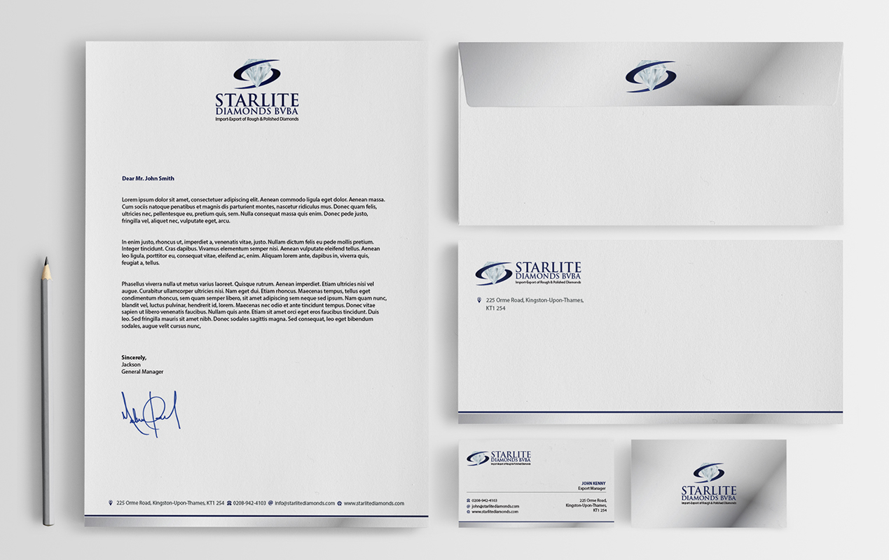
Starlite Diamonds is a diamond trading company that has been established since more then 30years.
We are currently looking to re-design our current logo design into something more modern and more appealing the the new generation. Small changes are what we are looking for that will give our company a little more modern look and a new appeal.
The design should be on similar lines to what our current logo is, but we are definitely wanting to have some modern changes to this.
Along with this, we are looking to have design for complete stationary including, business cards, envelopes, letterheads, etc..
Attached is our current logo, can use this as a base point towards creating a new design.
Aktualisierungen
Project Deadline Extended Reason: Am still looking for wonderful and amazingly creative design for my company, a facelift with a little modern touchHave provided you with a current logo of the company as inspiration to make something new and unique. PLEASE DO NOT USE COPY THE LOGO FILE AS IT IS! Added Wednesday, May 6, 2015
Zielmarkt/( -märkte)
We are a company established since over 30 years, and want to maintain our core fundamental values which is portrayed through our logo. Use this as a base into creating new modern design.
Industrie/Einheitstyp
It Company
Zu verwendende Schriftarten
Sehen und fühlen
Jeder Schieber zeichnet eine der Charakteristiken der Marke des Kunden aus sowie den Stil, den euer Logo widerspiegeln sollte.
Elegant
Fett
Spielerisch
Ernst
Traditionel
Modern
Sympatisch
Professionell
Feminin
Männlich
Bunt
Konservativ
Wirtschaftlich
Gehobenes
Anforderungen
Muss haben
- A modern touch
- Color combination should be similar in terms with what we currently use in attached design.
Schön zu haben
- Want that the design is appealing using simple but yet modern features to change and restructure the current company logo.
Sollte nicht haben
- Not looking more multi colored design
- Not gotta be too overly extravagant