Looking for a creative & stylish Freemason Brotherhood T-Shirt with symbols in letters
Wollen Sie auch einen Job wie diesen gewinnen?
Dieser Kunde bekam 53 T-Shirt-Designs von 8 Designern. Dabei wurde dieses T-Shirt-Design Design von ArtTank als Gewinner ausgewählt.
Kostenlos anmelden Design Jobs finden- Garantiert
-
 US$170
-
 53 Designs
-
 8 Designer
T-Shirt-Design Kurzbeschreibung
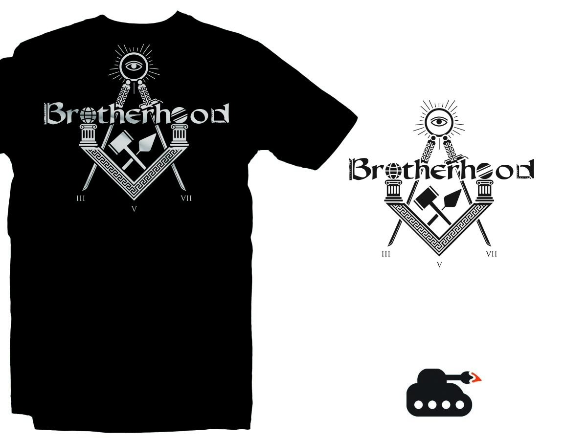
Name (Main text) for the logo: Brotherhood
Colors you like: Black, white, gray, gold
Type / Background of business, organization or website: Organization, Fraternity, online shop
A rough sketch: I've attached (it say's Brotherhood)
Special remarks? In the word Brotherhood, there are going to be various elements which include the square and compass, all seeing eye, 24 inch gauge, common gavel, the plumb, the trowel, the apron, point within a circle, among others. All these symbols and instruments can be googled through a google image search. There would be too many attachments if I was to attach every image of the symbols.
The idea is to use the symbols as letters as much as possible in the word Brotherhood while maintaining readability, simplicity, and style.
My original name of the company is Traveling Brother but I thought Brotherhood would make it more simpler. I don't have much on my website but my website is travelingbrother.com
I want it to be readable yet stylish at the same time.The idea would be to keep it stylish yet simple.
In the B in Brotherhood, it would have a 24 inch gauge as shown
in the sketch in the brief, the first two o's in Brotherhood
are the masonic pillars. The B in Brotherhood has a 24 inch
gauge in the letter. The d has the square. On top of the compass is the all
seeing eye. At the tip of the compass and middle of the
square would be numbers 357 in the bottom but instead
it would be roman numeral numbers III, V, VII. In the square. Let me know if you have any suggestions or ideas.
Aktualisierungen
Project Deadline Extended Reason: I was informed from Design Crowd that when I first uploaded this project, it was in the wrong category. They fixed it a few days ago. I am extending the deadline because of that reason as well as, I don't have enough designs to choose from. Thank you for your participation in my project. Added Saturday, June 6, 2015
Project Deadline Extended Reason: Don't have enough designs to choose from Added Thursday, June 11, 2015
Zielmarkt/( -märkte)
Freemasons
Industrie/Einheitstyp
Business
Zu verwendende Schriftarten
Andere Schriftarten erwünscht:
- Old English
Sehen und fühlen
Jeder Schieber zeichnet eine der Charakteristiken der Marke des Kunden aus sowie den Stil, den euer Logo widerspiegeln sollte.
Elegant
Fett
Spielerisch
Ernst
Traditionel
Modern
Sympatisch
Professionell
Feminin
Männlich
Bunt
Konservativ
Wirtschaftlich
Gehobenes
Anforderungen
Muss haben
- The symbols provided as well as others through a google search
Schön zu haben
- I would like to see the square and compass in the design.
Sollte nicht haben
- too much color. It would be too confusing for the design. You can add color just make sure the design is readable. Someone should see the design and be able to tell what it says. I'm thinking either 60% symbols 40% letters or 60%letters and 40% symbols. I'm open to any other ratios.