

 Aktualisieren
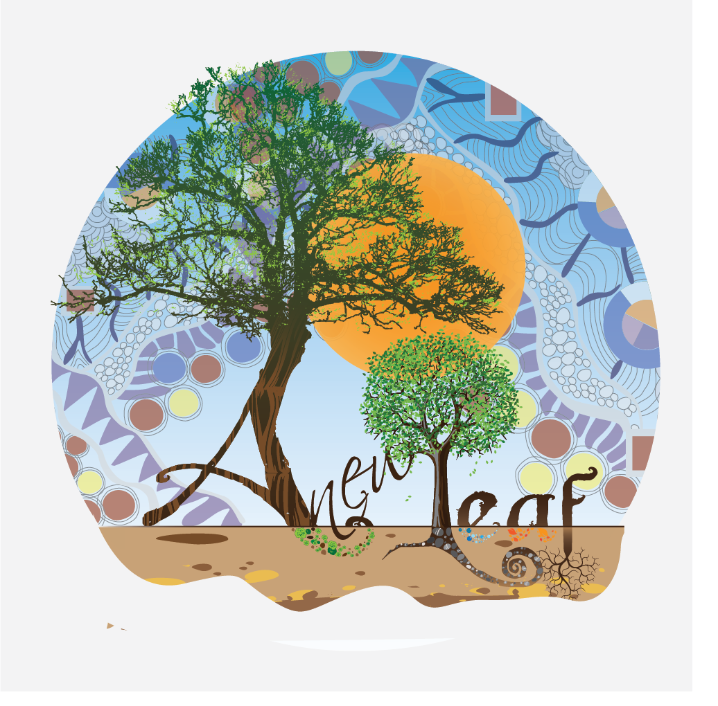
A new Leaf logo, where young artists meet budding scientists.
Wollen Sie auch einen Job wie diesen gewinnen?
Dieser Kunde bekam 67 Logo-Designs von 6 Designern. Dabei wurde dieses Logo-Design Design von Gaurav_Thakur als Gewinner ausgewählt.
Kostenlos anmelden Design Jobs finden
- Garantiert
-
 US$365
-
 67 Designs
-
 6 Designer
Logo-Design Kurzbeschreibung
We are A new Leaf, where young artists meet budding scientists.
We offer preschool, toddler playgroup, after school, and summer camp programs. We are located on a beautiful 5 acres that support our Reggio Emilia approach to childhood and education. We are about hands-on experiential learning, artistic expression, enjoyment of nature, and emergent curriculum. Children and adults interests lead the way to great projects that enable the exploration of concepts in unusually great depth and from different points of view.
Our image of the whole child is a person who is developing 100 languages, a person who is strong, competent, and eager to construct new knowledge about the world, the self, and others. The child is a person with rights: to be heard, to engage in varied and complex activities, to participate in community.
Our web site is anewleafnashville.org, where you can find more information about our philosophy and see some pictures. We just celebrated 100 days of school in our new location. We need to advertise our presence so that we can grow our enrollment.
We would like a logo that reflects our philosophy. We are not interested in something cute and simple. It must convey an organic feel while at the same time showing a diversity of mediums with transitions between light levels or illumination and dark areas. The edges could give the impression that the story continues off into infinity (to symbolize that every being is new and different from all others, and the community has infinite potential). This would also allow us to place the logo at the center of a banner or a car sticker while other pieces would be added around it.
I am sending you a picture of my favorite google doodle. See how the word google is coming out of the ground. Such a look for A new Leaf would illustrate the sentiment that growing developing children spring forth from the fertile soil of the community.
In a similar way, we would like the name to be part of the logo. The words could be written in fonts that look like branches with ramifications and buds. I am sending you 2 pictures of branches to give you an idea. The twigs could be larger and the buds more pleasantly plump of course. I am also sending a picture of a font that has a lot of potential for you to get started: Lot 6. I like that L very much and it could be elongated to the right also at the top. It could be easily modified to look a bit more branch like with buds here and there. I also thought that the letters of A and Leaf could be written with that style (or similar style) while the word new in between could be written in cursive to look like a tendril or a vine growing from A to Leaf (possibly at a diagonal angle). The letters could be one brown color, or with several shades or lines of brown inside.
We wonder if the logo should include the word Nashville, and if so where and how to place the letters. It should probably be in the “fertile soil of the community,” if it is added.
We imagine that there could be a transition between the community soil and the 100 languages of children in the background. Colorful shapes or lines could illustrate the languages set above and contrasting with the lines or shapes of the “community soil” (which could be darker). The soil could also be placed elsewhere (middle or background) and the languages coming forward or upward.
We are sending you some of our favorite quilted works, and some of our children’s original artwork and schoolwork (which are languages to us) to give you atmosphere ideas.
The line drawings with the tree and the hand are for ideas with the soil at the bottom or center. But the style on the hand drawing could be reserved for the branch-like letters. I also included a picture of an artwork collage by one of our students. We chose against the idea of writing A new Leaf in that way, but the nature letters could be used as inspiration to draw the soil of the community or the Nashville letters in the soil, or the edges of the logo, or a transition.
Later in another advertising piece we would like to place the phrase: “Where young artists meet budding scientists for a school banner or sign, and for car stickers, so it would be nice to consider how that would fit later with the logo while designing the logo.
Thanks!
elle
Zielmarkt/( -märkte)
Parents and children ages 3 to 12, grandparents as well.
Industrie/Einheitstyp
Advertising
Logo Text
A new Leaf
Sehen und fühlen
Jeder Schieber zeichnet eine der Charakteristiken der Marke des Kunden aus sowie den Stil, den euer Logo widerspiegeln sollte.
Elegant
Fett
Spielerisch
Ernst
Traditionel
Modern
Sympatisch
Professionell
Feminin
Männlich
Bunt
Konservativ
Wirtschaftlich
Gehobenes
Anforderungen
Muss haben
- Name shaped with letters looking like branches with buds.
Organic, natural, magical feel. Some level of complexity implied or possible.
Schön zu haben
- Many lines, shapes, and colors up, above or upwards. An effect of sunlight shining.
Below, darker lines connected to symbolize community.
Sollte nicht haben
- We don't want something cute, kid like, or pastel.