Clean, Modern Logo For Friendly Local IT Company
Wollen Sie auch einen Job wie diesen gewinnen?
Dieser Kunde bekam 245 Logo-Designs von 68 Designern. Dabei wurde dieses Logo-Design Design von ketoprofen als Gewinner ausgewählt.
Kostenlos anmelden Design Jobs finden- Garantiert
-
 US$320
-
 245 Designs
-
 68 Designer
Logo-Design Kurzbeschreibung
PLEASE REAd THE BRIEF AND STOP SUBMITTING GENERIC SPAM
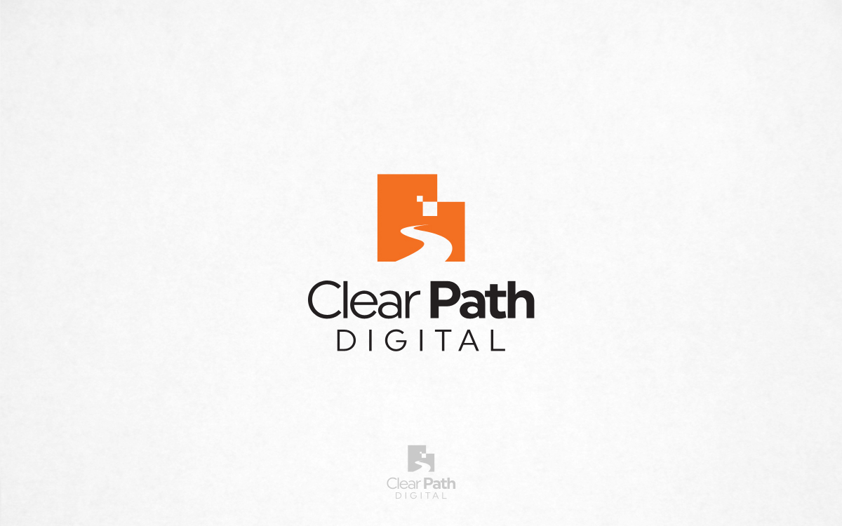
We are an existing IT Consultancy in Vancouver focused on helping local small business and non-profits meet their IT goals. We have been operating for 10 years. We are re-branding to Clear Path Digital (.com) in order to better reflect that we are friendly to those who are not tech-savvy, and provide clear, simple, streamlined systems. We would like the logo to also reflect the name "Clear Path" but are open to other creative ideas. Our (placeholder) web site (please ignore the design) has more information about what we do: clearpathdigital.com. We will likely expand this project to web site and business card design as well.
NOTE: We are not a giant corporation. We are a small, friendly local company. Please keep your logo unique, casual, fun, and friendly.
Zielmarkt/( -märkte)
Small business and non-profits.
Industrie/Einheitstyp
Information Technology
Logo Text
NORTHING - OR - Clear Path Digital
Logo Stile, die Sie interessieren können
Emblem-Logo
Logo eingeschlossen in einer Form
Pictorial / Combination-Logo
Ein reales Objekt (Text optional)
Abstraktes Logo
Begrifflich / symbolisch (Text optional)
Figuren-Logo
Logo mit Abbildung oder Zeichen
Zu verwendende Schriftarten
Sehen und fühlen
Jeder Schieber zeichnet eine der Charakteristiken der Marke des Kunden aus sowie den Stil, den euer Logo widerspiegeln sollte.
Elegant
Fett
Spielerisch
Ernst
Traditionel
Modern
Sympatisch
Professionell
Feminin
Männlich
Bunt
Konservativ
Wirtschaftlich
Gehobenes
Anforderungen
Muss haben
- STOP SUBMITTING GENERIC SPAM
- Logo must be UNIQUE and CREATIVE. Logo ***must stand out from other logos*** in the IT industry. ***NOTE: It will be much better for you to submit ONE very UNIQUE design. Please do not submit multiple renderings of the same design or the same design but in different colours! If we mark something by you as a 5-star, then stop submitting similar designs and try something completely new, or just stop. Thanks!
- Update: SPECIAL PREFERENCE given to logos that are NOT LETTERMARK LOGOS. That is, not made up of the letters C and P. Read the entire brief, please!
Schön zu haben
- Logo should creatively reflect the words "Clear Path" and align with the philosophy of the company.
Sollte nicht haben
- Please avoid using the text or other design cues from our website, it is just a placeholder. I.e. your text does not necessarily have to have the words "clear path" on top with the word "digital" underneath them.