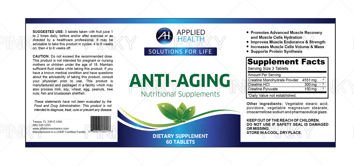
Label Redesign for Bottled Anti-Aging Nutritional Supplements

Wollen Sie auch einen Job wie diesen gewinnen?
Dieser Kunde bekam 19 Etikett-Designs von 9 Designern. Dabei wurde dieses Etikett-Design Design von Pinky als Gewinner ausgewählt.
Kostenlos anmelden Design Jobs findenEtikett-Design Kurzbeschreibung
This is how I did the description for the label redesign.
Applied Health is a company based in Scottsdale, Arizona. For over 15 years, we have developed and sold direct-to-consumer nutritional supplements. We are going through a 'cleansing' of the product line, removing slow moving items, reformulating most of the remaining products, and relabeling the line for consistency. The company has been through several label designs for different categories of products over the years, but now wants to redesign with new logo/branding.
Company has two current logos that are "the same but different". One logo is used on website and formal documentation, while the other logo is more often used in social media environments. For the label design, both have their benefits; one is more clean and professional, and the other has more "pop", with deeper color and greater visibility, which is the one on social sites. I will include samples of both logos. Best design could end up being either version. (The example logos I will include are jpg or png format. I can also provide them in .ai, when vector form is needed.)
Our colors more commonly include blues, and in the past, greens. Our logo on the website is much more formal and clinical than the logo on the social settings. Examples in use can be seen as follows:
Main website: appliedhealth.com
Facebook: facebook.com/appliedhealth
Twitter: twitter.com/appliedhealth
Our primary customer demographic is female, 40-65, but we also want to appeal to the 30-something female. This is not to say we can disregard the male audience of same ages. It is just that men are slower to adopt healthy habits, so for the types of products we have, they are often influenced by the women in their lives. The primary focus of our products cover a broad spectrum on anti-aging benefits. So both men and women are targets, but women are greater responders.
When people think of us, we want them to think active, vital, driven, restorative, timeless, and refined. These products carry a higher than average price, and they deliver much higher than average results.
Our products are not for everyone. They are for the active adult who is not satisfied with sitting on a couch and watching the years pass. They want to restore aspects of their life they fear they may have lost... they want to renew or prolong old hobbies, they want to improve or arrest a weakening performance, whether on the trail, in the gym, at the office, or in the bedroom. They can't help but feel nostalgic about their past achievements, and abilities, and they are not ready to let that go. They are passionate about taking care of themselves, but they are not fanatics. They just want to still impress themselves, their friends, their kids, and their spouse... and they are willing to make the effort, rather than excuses.
Those are the people we want to resonate with... and when one of those people, for the first time, pulls a bottle of one of our products out of a box, we want them to feel like they made the right choice. The label should speak quality, and youthful vigor.
Every product we make was first made for one of us, or someone in our families. And we all live by the old saying, "We won't age gracefully... We will fight it every step of the way."
So, how do you say all that I mentioned above in a tiny square-ish front-panel of a label?
I have no idea. Which is why I am sitting here on a Sunday evening, typing this long-winded description in DesignCrowd. You folks are the experts. :-)
Aktualisierungen
Project Deadline Extended
Reason: Designer-initiated request to extend deadline so as to permit additional submission.
Added Wednesday, July 22, 2015
Zielmarkt/( -märkte)
Stated in description.
Industrie/Einheitstyp
It Company
Sehen und fühlen
Jeder Schieber zeichnet eine der Charakteristiken der Marke des Kunden aus sowie den Stil, den euer Logo widerspiegeln sollte.
Elegant
Fett
Spielerisch
Ernst
Traditionel
Modern
Sympatisch
Professionell
Feminin
Männlich
Bunt
Konservativ
Wirtschaftlich
Gehobenes
Anforderungen
Schön zu haben
- I don't have a mandatory color requirement, other than to compliment one of the logos, which ever works best for purpose. We currently lean toward blue spectrum in logos and websites, but there is some flexibility, since that is what the designer is for. Also, I see a question below about fonts. I won't select one of those because that too is designer domain. However, keep in mind the audience includes people who have very tired, aging eyes. I am too often amazed how little thought goes into the difficulty in reading labels for products that find their way to store shelves. Many times, even when I have my reading glasses with me, I still can't read a poorly designed label.
Sollte nicht haben
- Well, it is getting late and I am getting punchy, so when I see this question of what the resulting label design should NOT have, the first thing that comes to mind is it would be best not to reflect satanic or demonic imagery. That works for Gene Simmons and KISS, but not so much for this purpose.