

 Aktualisieren
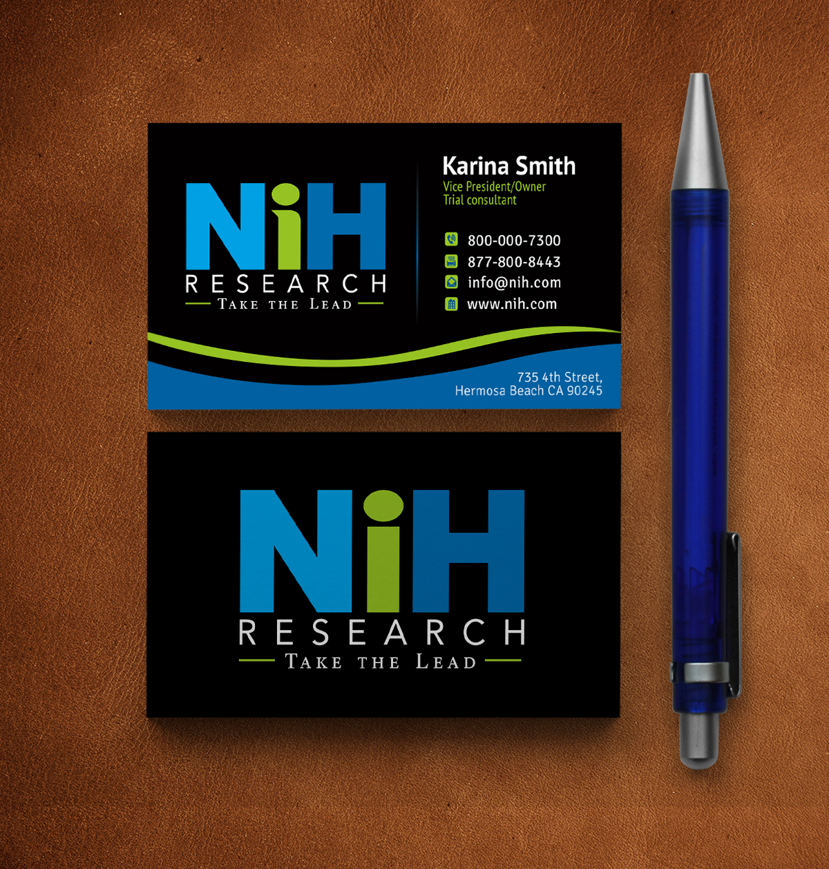
Re-Design Logo of 20 year old company - fresh, updated look
Wollen Sie auch einen Job wie diesen gewinnen?
Dieser Kunde bekam 93 Logo-Designs von 34 Designern. Dabei wurde dieses Logo-Design Design von JLG Studios als Gewinner ausgewählt.
Kostenlos anmelden Design Jobs finden
- Garantiert
-
 US$160
-
 93 Designs
-
 34 Designer
Logo-Design Kurzbeschreibung
Our logo is almost 20 years old. Looking for something fresh and new. We are a professional firm offering lead generation, tele-prospecting, and high level marketing and consulting services to very high-end healthcare technology companies.... many whom are members of Fortune 500. Logo must be professional yet clean and crisp. Current logo is too "boxy" both in design and feel. Our clients work in the technology and hospital space therefore anything cutesy or whimsical is completely out. Current logo is in the green and blue area and we are open to new colors as long as they are professional and communicate a tenured company with a long standing history in healthcare and professional staff. Our company name is "NiH Research" however we are not at all affiliated with the National Institute of Health so it's important to make that distinction. Current logo can be seen at www.nihresearch.com
Our people are our best asset. After 20 years, we have client retention rate of over 90%. Clients come back year after year because they know they can access the same people and get the same reliable support they received five, ten, fifteen years ago.
We would like something that is catching yet familiar...after 20 years, we have some recognition however we can afford to branch out a good bit with something fresh and polished. Has to convey trust, knowledge and reliability.
Zielmarkt/( -märkte)
Large Healthcare technology companies, large technology companies, products range in the $250k and up range for services and solutions. Our clients usually have more than 100 employees but our contacts are people we have known for a long time who are bringing us in.
Industrie/Einheitstyp
It Company
Logo Text
NIH Research
Logo Stile, die Sie interessieren können
Wortmarke-Logo
Word oder namensbasiertes Logo (nur Text)


Sehen und fühlen
Jeder Schieber zeichnet eine der Charakteristiken der Marke des Kunden aus sowie den Stil, den euer Logo widerspiegeln sollte.
Elegant
Fett
Spielerisch
Ernst
Traditionel
Modern
Sympatisch
Professionell
Feminin
Männlich
Bunt
Konservativ
Wirtschaftlich
Gehobenes
Anforderungen
Muss haben
- Take the logo out of the box, literally. Current logo is presented as a negative image and we want to get away from that.
Schön zu haben
- Prefer something with a healthcare or hospital feel/association...that is why we stayed in the blues historically. Prefer to have the lowercase "i" as it puts the emphasis on our people. Not mandatory though.
- Our tag line is "Take the Lead." Would be nice to incorporate that if possible. Not mandatory. We generate leads as a function of marketing and sales support provider so "take the lead" fits in nicely with our mission.
Sollte nicht haben
- Negative image.