

 Aktualisieren
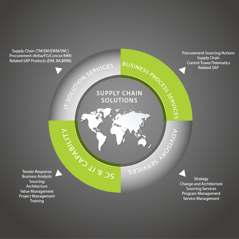
IT Business needs services diagrams turned into infographics
Wollen Sie auch einen Job wie diesen gewinnen?
Dieser Kunde bekam 15 Infografik-Designs von 5 Designern. Dabei wurde dieses Infografik-Design Design von lovelyMe als Gewinner ausgewählt.
Kostenlos anmelden Design Jobs finden
-
 A$230
-
 15 Designs
-
 5 Designer
Infografik-Design Kurzbeschreibung
We have two diagrams that show our service categories. We'd like the content to be turned into an infographic for each diagram so that they look more modern and professional. The two infographics should have a similar design so that they can be used together. The infographics should use the content supplied in the diagrams and the corporate colours of black, grey and green as per our website www.fourpl.com.au. Attached below is the original diagrams and some infographic designs that we are currently using but we would like something new.
Zielmarkt/( -märkte)
Big Corporate companies
Industrie/Einheitstyp
It Company
Zu verwendende Schriftarten

Farben
Vom Kunden ausgewählte Farben für das Logo Design:
Sehen und fühlen
Jeder Schieber zeichnet eine der Charakteristiken der Marke des Kunden aus sowie den Stil, den euer Logo widerspiegeln sollte.
Elegant
Fett
Spielerisch
Ernst
Traditionel
Modern
Sympatisch
Professionell
Feminin
Männlich
Bunt
Konservativ
Wirtschaftlich
Gehobenes
Anforderungen
Muss haben
- Content as per the diagrams
- Use corporate colours of green, grey and black
Schön zu haben
- Similar style to the website style: www.fourpl.com.au
- strong lines, modern style.
Sollte nicht haben
- nothing airy fairy,

