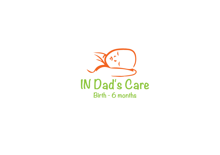
In Dad's Care App icon & website logo
Wollen Sie auch einen Job wie diesen gewinnen?
Dieser Kunde bekam 35 Logo-Designs von 19 Designern. Dabei wurde dieses Logo-Design Design von andalucia als Gewinner ausgewählt.
Kostenlos anmelden Design Jobs finden- Garantiert
-
 A$250
A$250
-
 35 Designs
-
 19 Designer
Logo-Design Kurzbeschreibung
In Dad's Care is to be a series of age related apps to assist a new dad with caring for his baby without direct input from baby's mom. It has all the basic info plus a provision for (mom?) to enter notes relevant to their baby. See www.indadscare.com for more info and current icon/logo useage.
This design needs to be applicable to the following:
1. App icon (so it has to work in different sizes), is OK to have fine detail which may get lost at smaller scale as the first impressions are with the bigger form of it.
2. Related website, Facebook page and twitter page.
3. Brief:
a) must establish an instant emotional connection (suggest photo of dad + baby),
b) must strongly or clearly convey the brand name In Dad's Care,
c) convey function or purpose of the app e.g. Birth - 6 months, 6 - 12 months, child carseat installation, etc.
Notes:
1. this is a tricky one, the app is designed for men and hence the initial look and feel needs to be masculine; inside the app the style is very clean - white background etc, it's really an instruction manual with a notes function but we avoid saying that as "men don't read instruction manuals" :) but dad needs to be comfortable with the style of the icon, and related use .
2. but purchase is often driven by the mom and she relates to feminine, so the problem is how to hook mom (e.g. picture of baby, or some part of baby e.g the eyes, and ideally with dad included so a lot of the story is told instantly) but not so obviously feminine that dad is uncomfortable with it.
3. Notwithstanding the current trend to have an icon with no words on it, there are two important pieces of information that need to be conveyed "In Dad's Care" and e.g. "Birth - 6 months", it's not essential to have "Birth - 6 months" on the icon but desirable as it's likely that over time there will be quite a few of these apps with different ages and functions etc and when the app function is underneath the icon it does not have such impact.
4. ideally the design needs to lend itself to use on the Website and Facebook page where the form retains the style or feel but has a different composition.
5. there needs to be a generic icon for Twitter and the copy underneath that may be something like "Essential information for dad" or similar.
Aktualisierungen
Project Deadline Extended
Reason: Deadline extended 7 days as brief was updated recently and no one has nailed the concept yet. The solutions need more emotive appeal attractive to new moms.
Added Saturday, May 18, 2013
Zielmarkt/( -märkte)
moms expecting or with new babies, and dads with new babies.
Industrie/Einheitstyp
Baby
Logo Text
IN Dad's Care
Logo Stile, die Sie interessieren können
Pictorial / Combination-Logo
Ein reales Objekt (Text optional)
Sehen und fühlen
Jeder Schieber zeichnet eine der Charakteristiken der Marke des Kunden aus sowie den Stil, den euer Logo widerspiegeln sollte.
Elegant
Fett
Spielerisch
Ernst
Traditionel
Modern
Sympatisch
Professionell
Feminin
Männlich
Bunt
Konservativ
Wirtschaftlich
Gehobenes
Anforderungen
Muss haben
- Needs to attract attention quickly, people scan the App store icons quickly so the window of opportunity to grab their attention is small.
This app relates to an emotive issue in peoples lives - a new baby. Moms in particular respond to baby pictures so is likely that a baby and dad photo will both attract attention and tell the story better than a graphic only design. Generally after several months of having the baby Moms are looking for a break i.e. more input from Dad. The app is designed to give him the confidence/tools/etc to take over single handed for a while.