Logo Redesign for a meditation, yoga, reiki, psychotherapy Institution
Wollen Sie auch einen Job wie diesen gewinnen?
Dieser Kunde bekam 96 Logo-Designs von 31 Designern. Dabei wurde dieses Logo-Design Design von Hot Rod als Gewinner ausgewählt.
Kostenlos anmelden Design Jobs finden- Garantiert
-
 US$160
-
 96 Designs
-
 31 Designer
Logo-Design Kurzbeschreibung
COMPANY INFORMATION:
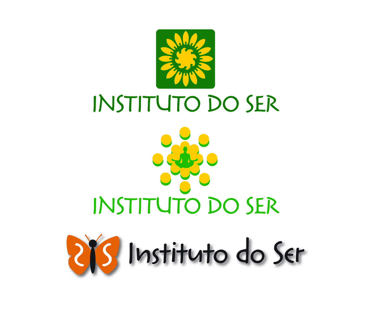
Our Institution is located in Brazil. It has been operating for more than 20 years using the same logo, which looks old and too complicated with too much information.
The company name is Instituto do Ser. It is a human gathering space that invites to carefully look and listen about us (our humanity and our divinity) and from us, our self-knowledge and self-transformation, we build more authentic relationships, and a world full of love and peace.
Also we provide many services such as Meditation, Yoga groups, Reiki, enneagram, Bach flowers Therapy, Mana, Psychotherapy, among others. We also have a spiritual retreat located close to a wonderful area isolated from the big city where we provide a 7 days package to recover energy and relax.
This is just a brief introduction of our company to give you an idea about the business.
The logo that we have been using is really old (almost 20 years) and it is very confusing because has so many elements that makes very difficult to understand it.
We are looking for something totally different that look modern and stylized.
We need a clean design that uses a very characteristic font and some symbol that captures the essence of our business as was explained before. We don´t want to use the images that are being used in the actual logo anymore (hand and a head). It has to be and image, icon or something that captures these ideas or concepts:
A SPACE FOR HUMAN TRANSFORMATION
LIGHT
ENERGY
HUMANITY
Please find attached the actual logo that is being use from our company. As you can see the logo looks really old. Also the gradient effect is not a good idea because it causes a lot of problems when we print it. We would like to use solid colors.
No need to use a slogan we are not going to use it anymore.
FONT:
Has to be a very personalized font that goes with the company concept which has been explained above.
TYPE OF LOGO:
Iconic
PREFERRED COLORS:
I am not sure maybe orange and yellow that might reflect energy, light...
but no more than three. It has to look very simple (not simplistic) and modern.
Aktualisierungen
Project Deadline Extended Reason: Waiting for more designs. Added Monday, August 10, 2015
Zielmarkt/( -märkte)
It has a wide range because we do yoga for kids but mainly are women and men 40 years old and up. High and middle class and well educated clients.
Industrie/Einheitstyp
Medical
Logo Text
INSTITUTO DO SER
Logo Stile, die Sie interessieren können
Figuren-Logo
Logo mit Abbildung oder Zeichen
Wortmarke-Logo
Word oder namensbasiertes Logo (nur Text)
Zu verwendende Schriftarten
Sehen und fühlen
Jeder Schieber zeichnet eine der Charakteristiken der Marke des Kunden aus sowie den Stil, den euer Logo widerspiegeln sollte.
Elegant
Fett
Spielerisch
Ernst
Traditionel
Modern
Sympatisch
Professionell
Feminin
Männlich
Bunt
Konservativ
Wirtschaftlich
Gehobenes
Anforderungen
Muss haben
- We have change the concept. We decided that have to be something figurative.
Sollte nicht haben
- Hands or a Head. Those images has been used for the last 20 years in our logo and we are tired of use them.