Private practice dietitian/nutritionist needs a business card design update
Wollen Sie auch einen Job wie diesen gewinnen?
Dieser Kunde bekam 26 Visitenkarten-Designs von 5 Designern. Dabei wurde dieses Visitenkarten-Design Design von Poonam Gupta als Gewinner ausgewählt.
Kostenlos anmelden Design Jobs finden-
 A$80
A$80
-
 26 Designs
-
 5 Designer
Visitenkarten-Design Kurzbeschreibung
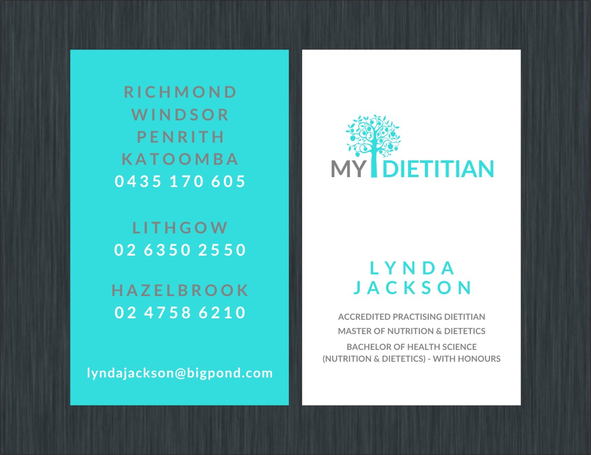
Please see the attached files. The two dark blue files are the front and rear of my current business card which I would like updated. The other two files give a basic framework for what I'm after. Specifically:
* I was hoping to try the card turned up the other way - vertically =
instead of horizontally
* Front of card the background in white, back of card the background =
in a bright turquoise - I didn't have a bright turquoise on my computer =
so it's not the colour in the photo I'm after
* On the front side, I'd like to an apple tree but in the same turquoise colour for the whole tree as the turquoise background colour on the back of the card
* I'd like to get rid of the horizontal line under the tree that currently joins the trunk of the tree and to shorten the trunk of the tree a little?
* Also, I was wondering if we could put "MY" in capitals in a pale
grey colour on the left of the trunk but close to it and "DIETITIAN"
also in capitals but in the turquoise colour of the tree, on the right
side of the trunk, close to it? I used Avenir medium
as I was after a plain text - if you have one similar that looks
better, please feel free to use it -
but I like the idea of the letters spaced like I've shown where my
name is written.
* Could you put my name in turquoise, spaced like I've shown in
capitals?
* My qualifications underneath in capitals in the same grey as "MY", =
I'm not sure if the font for those should be stretched or spaced out a =
little too?
* Qualifications should read:
ACCREDITED PRACTISING DIETITIAN
MASTER OF NUTRITION & DIETETICS
BACHELOR OF HEALTH SCIENCE
NUTRITION & DIETETICS) - WITH HONOURS
But there should be an opening bracket before "NUTRITION" in the above line - my one on this computer doesn't work anymore!
Also, I know in the picture I had the last two lines of my
qualifications different to what I've written above but I think I'd =
prefer them like I've typed above - ie with the Nutrition & Dietetics) -
with honours on it's own line.
* For the back of the card, the locations in grey spaced/stretched =
capitals and the phone numbers in white, spaced/stretched, all centred
Happy for other ideas, but also happy just to get the business card done quickly
Zielmarkt/( -märkte)
Clients/patients of dietitian/nutritionist and doctors referring to dietitian/nutritionist
Industrie/Einheitstyp
Business
Kontaktinformationen für Visitenkarte
See my old card front and back files in blue. I simply want a basic update of the card. Some of my ideas are as follows:
* I was hoping to try the card turned up the other way - vertically
instead of horizontally
* I've attached two photo's to give you an idea of what I'm thinking
* Front of card the background in white, back of card the background
in a bright turquoise - I didn't have a bright turquoise on my computer
so it's not the colour in the photo I'm after
* On the front side, I'd like to try the letterhead apple tree you did
for me but in the same turquoise colour for the whole tree as the
turquoise background colour on the back of the card
* Would it be possible to get rid of the horizontal line under the
tree that currently joins the trunk of the tree and to shorten the trunk
of the tree a little?
* Also, I was wondering if we could put "MY" in capitals in a pale
grey colour on the left of the trunk but close to it and "DIETITIAN" -
also in capitals but in the turquoise colour of the tree, on the right
side of the trunk, close to it? I used Avenir medium
as I was after a plain text - if you have one similar that looks
better, please feel free to use it -
but I like the idea of the letters spaced like I've shown where my
name is written.
* Could you put my name in turquoise, spaced like I've shown in
capitals?
* My qualifications underneath in capitals in the same grey as "MY",
I'm not sure if the font for those should be stretched or spaced out a
little too?
* Qualifications should read:
ACCREDITED PRACTISING DIETITIAN
MASTER OF NUTRITION & DIETETICS
BACHELOR OF HEALTH SCIENCE
NUTRITION & DIETETICS) - WITH HONOURS
But there should be an opening bracket before "NUTRITION" in the above
line - my one on this computer doesn't work anymore!
Also, I know in the picture I had the last two lines of my
qualifications different to what I've written above but I think I'd
prefer them like I've typed above - ie with the Nutrition & Dietetics) -
with honours on it's own line.
* For the back of the care, the locations in grey spaced/stretched =
capitals and the phone numbers in white, spaced/stretched, all centred
Zu verwendende Schriftarten
Andere Schriftarten erwünscht:
- Avenir medium or something similar that is clear but modern
Farben
Vom Kunden ausgewählte Farben für das Logo Design:
Sehen und fühlen
Jeder Schieber zeichnet eine der Charakteristiken der Marke des Kunden aus sowie den Stil, den euer Logo widerspiegeln sollte.
Elegant
Fett
Spielerisch
Ernst
Traditionel
Modern
Sympatisch
Professionell
Feminin
Männlich
Bunt
Konservativ
Wirtschaftlich
Gehobenes
Anforderungen
Muss haben
- The above details with the exception of a correction to the phone numbers as I made a mistake!
- Hazebrook - 02 4758 6210
- Lithgow - 02 6350 2550
Schön zu haben
- Clear, fresh, modern look
Sollte nicht haben
- -