

 Aktualisieren
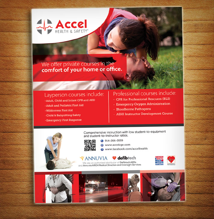
Two flyers for a CPR and first aid training center
Wollen Sie auch einen Job wie diesen gewinnen?
Dieser Kunde bekam 34 Flyer-Designs von 16 Designern. Dabei wurde dieses Flyer-Design Design von alessandroevge als Gewinner ausgewählt.
Kostenlos anmelden Design Jobs finden
- Garantiert
-
 US$180
-
 34 Designs
-
 16 Designer
Flyer-Design Kurzbeschreibung
We are a health and safety training facility that provides CPR and first aid training to laypersons and professionals in their homes or offices.
We need two flyers for a booth we will have at a local fair:
1) We need a flyer that outlines our services. Designs should be clean, yet eye catching. A .zip file is attached with a Word file that has details about the required text, and location / use of logos. It also has stock images, logos, etc.
2) I have a Word document that I need redesigned into a very basic flyer. The second zip file will have the original Word document and the logos for that flyer.
Both will be printed 8 1/2 x 11 full bleed.
Our logo color (for matching):
Red: C=0 M=100 Y=100 K=0
R=237 G=28 B=36
Gray: C=0 M=0 Y=0 K=70
R=109 G=110 B=112
Our logo fonts:
Accel - Mouser
Health & Safety - Bellerose Light
UPDATE: 1st flyer should be 2-sided. 2nd flyer should be 1-sided. Disregard any conflicting instructions.

Aktualisierungen
Both flyers should be one-sided. No back pages. Added Tuesday, August 18, 2015
Zielmarkt/( -märkte)
1) High net worth consumers; 2) medical professionals: doctor/dental offices, lifeguards, EMTs, personal trainers
Industrie/Einheitstyp
Training
Zu verwendende Schriftarten
Andere Schriftarten erwünscht:
- See description - use judgement regarding matching logo fonts.
Farben
Vom Kunden ausgewählte Farben für das Logo Design:
Sehen und fühlen
Jeder Schieber zeichnet eine der Charakteristiken der Marke des Kunden aus sowie den Stil, den euer Logo widerspiegeln sollte.
Elegant
Fett
Spielerisch
Ernst
Traditionel
Modern
Sympatisch
Professionell
Feminin
Männlich
Bunt
Konservativ
Wirtschaftlich
Gehobenes
Anforderungen
Muss haben
- My logo and contact information. Clean design - eye catching.
Schön zu haben
- Contrast across the page.
Sollte nicht haben
- Must not be difficult to read the text.