3D Logo Design For Construction Company- Design is almost Complete
Wollen Sie auch einen Job wie diesen gewinnen?
Dieser Kunde bekam 35 Logo-Designs von 10 Designern. Dabei wurde dieses Logo-Design Design von Javier Porto als Gewinner ausgewählt.
Kostenlos anmelden Design Jobs finden-
 US$160
-
 35 Designs
-
 10 Designer
Logo-Design Kurzbeschreibung
Looking for a 3D logo design for a construction company. Building homes and commercial property. I am looking for a replica of the exact copied attached with the necessary changes in the Example 2 file. This logo was almost ready to go, but the person who designed it did not want to make the minor changes. Please let me know if you can handle this project? This should look like a steel beam structure with connecting bolts.
Please see recent Vista corrections file that I uploaded and see corrections on the left V Vector.
Zielmarkt/( -märkte)
Home owners
Industrie/Einheitstyp
Construction Company
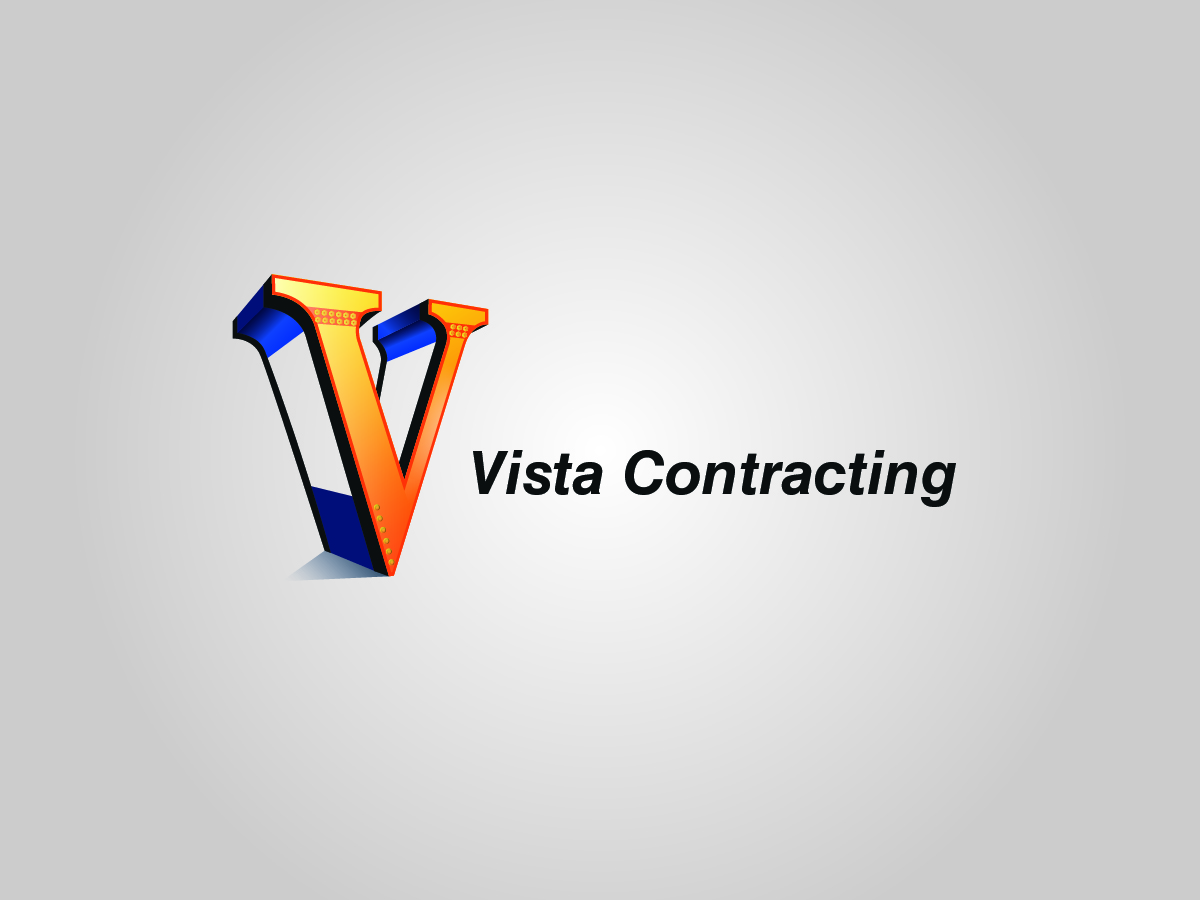
Logo Text
Vista Contracting
Zu verwendende Schriftarten
Andere Schriftarten erwünscht:
- Get Creative
Sehen und fühlen
Jeder Schieber zeichnet eine der Charakteristiken der Marke des Kunden aus sowie den Stil, den euer Logo widerspiegeln sollte.
Elegant
Fett
Spielerisch
Ernst
Traditionel
Modern
Sympatisch
Professionell
Feminin
Männlich
Bunt
Konservativ
Wirtschaftlich
Gehobenes
Anforderungen
Muss haben
- Necessary changes in attached example 2 file.
- The bolts on the bottom right side of the V look pixelated.
- The black line in the back of the V, connecting the top to the apex, should be parallel to the other black border.
Schön zu haben
- A perfect and portioned design
- Please see the file latest example
- (BLUE BOX) The rivets with the beam just look like circles. I feel like previous versions they had more depth and looked more realistic. Also how I explained in the previous briefs the rivets should be on top of each other (showed example)
- (GREEN BOX) Same thing for rivets at bottom just look like circles. Same thing as I said before feel like previous versions had more depth to them and realistic looking. I feel those to things are really taking away from the whole logo that looks great right now. A lot of good graphic work to just have plain looking circles in those 2 spots.
- (PURPLE ARROW) Also just make sure they are not touching the orange border going around the V.
- (BROWN ARROWS/BOXES) I said in previous briefs and showed with my pic example the spacing between the top should be the same thickness on
- (RED ARROW) Latest I would make the thickness of the dark orange border around the V a little less thick (maybe in half w/e you think best). Want the other great graphic work to stand out.
Sollte nicht haben
- Not matching up to the original designs, not matching up to original colors, -Rusty Orange and Blue
_brief310345.jpg?AWSAccessKeyId=ASIARQT47ZIU4O5TDLN2&Expires=1764409932&response-content-disposition=attachment%3Bfilename%3D%22Vista%20Contracting%20Logo-%202nd%20%20%281%29%20Monday%2C%2031%20August%202015%2020_03_45.jpg%22&x-amz-security-token=IQoJb3JpZ2luX2VjEOj%2F%2F%2F%2F%2F%2F%2F%2F%2F%2FwEaCXVzLWVhc3QtMSJIMEYCIQC%2BKV00cfX2EtHoi%2BAK1t39fOGyFdCotWF0tWHQKTGLbAIhANSrYsXlrVd68uaarAl39tX5I%2BSdzS6mlW4A%2BaU6esnCKvQDCLH%2F%2F%2F%2F%2F%2F%2F%2F%2F%2FwEQABoMMTA0NDE1MDg3MTQ1IgyRtrY8gFnQHBkNu6oqyAOavbHHIo8Mo9LUHuvJkGUJiVmcNZK6HpKLgZKkVei5smh%2FaNd7NTHm5wb4zsVj7WFCqOFbf0nyKY55LB03XGDUjpvqWom2BWK8fwxeFkO2X3iI62zTO9z36jiOJbUwpRbjLzDr%2FUv7gyWBRs2JKh7%2BT3md5HE4028EkgN39%2F5Dn7JiyNK1rTe4Tgg7R78IasWz%2FwJ%2BX2dRNQapcuomcXPTJaiTWAdS1eSNQSRKWBit6JN4XhpzlJ%2FpP1Phc8rE9WruEEr88fAgV6mBdgmiTJbKEKm3noSXtuIRbMhwiZ1VWms1CHuMREj9v6DBbck2oopd2ezfywYW1ZX979VMx8WV1p3KIsB8hKMm86bjvWM%2Bf493tU6r5gl1SpPQfY3MnaZClWFEoMcifX%2FAcvcaqouLgBuSjddLcIKlsLnDST%2B9fD0S5boc8CSGKRZFHVMUHUTsDxmx2VbJpGvF%2B8AsKvv1xGqy7UTg42zXsxU57dmBnpElH%2F3iIVlkumpNdVzVsBNfBUjOedEJN%2Fntf90nA9OthoWRRNySn%2FnwFVmpaPVMqD8XCQNGdhuctHwXdwRmGE4PCj040r5LL1LD4tx8C%2FFLjLXpciXhXZAw1KWlyQY6pAGFj9UlrUCi5DwM8wIHYiHQFH2VPqurnShmEnpW6B%2FgPpxq%2FchVwxQzEPDrtSona4ZwiIXpfq6KcObco1ru8r7eJEL7cRESNL8aKb9ZsvWr%2BuZqM%2BBVGoUvYyOU632pwNTlalDTebILPOGDzhtwZK5E9mG3EhzflLUdZSMJkMq%2Fff9NBB9DznCCPHR8aoNCp38Uz5D4ytcU8rogYHI7nYnwT8gp6g%3D%3D&Signature=UBs6m4xrsOfBpkZCQChN4dIcbLE%3D)