FUN, Energetic, Travel & Entertainment Startup, Fiestafy, Needs Slight Logo Adjustment!
Wollen Sie auch einen Job wie diesen gewinnen?
Dieser Kunde bekam 70 Logo-Designs von 20 Designern. Dabei wurde dieses Logo-Design Design von natashamilner als Gewinner ausgewählt.
Kostenlos anmelden Design Jobs finden- Garantiert
-
 A$160
A$160
-
 70 Designs
-
 20 Designer
Logo-Design Kurzbeschreibung
Hello awesome designers!
IT'S BEEN TOO LONG NOW and I can't ignore all the feedback..
Fiestafy is a travel and entertainment startup. It turns anyone into an entertainment expert by allowing them to find major available and accessible world-class events, anywhere in the world.. in their own language!
You can THINK OF US as Expedia for Major Events.
The word Fiestafy comes from Fiesta (a party, a CELEBRATION!) and Fy from Magnify (to search). So together it means to search for a party or celebration or AN AWESOME EVENT.
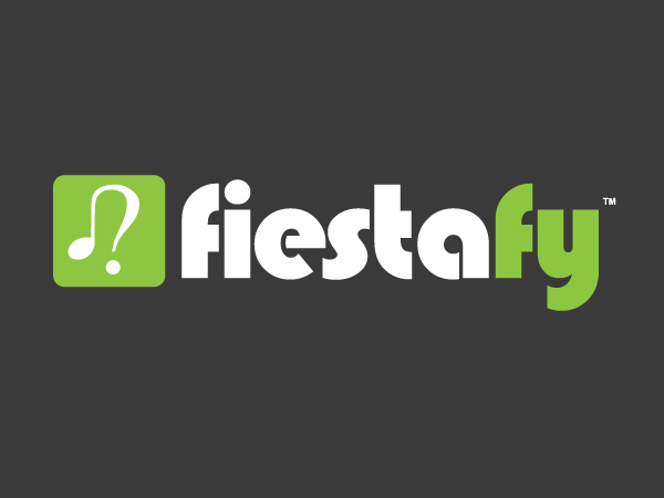
I originally designed our logo and it was tweaked by our graphic designer. The problem is that people often pronounce Fiestafy as Fie-Staffy OR Fi-Staffy. Whereas it should be pronounced Fiesta-Fy.
NOT FUN.
SO..
WE NEED SOME CHANGES!!
The main issue is the TEXT. People are mispronouncing the name. We need to signal that the name is Fiesta-fy. We've tried changing the colour of the Fy but it didn't look too great.
I've recently been informed it could be the 's' in the Bauhaus font that makes the FIE really stand out and seperate the Fie from the Stafy. I don't know.
I've also been recommended making the e (é) accented so to show it is exotic, but even the spanish writing of the word features no accents.. but we might need this. I don't know.
I'LL LEAVE IT TO THE EXPERTS. YOU!
All I know is we need to make sure people pronounce our brand correctly. When people learn the actual name they usually love it, so the fact they struggle and are embarrassed to pronounce it because the logo is lacking something is a problem.
I generally like our icon logo but feel free to play with it as well. The ICON is made up of two things: a question mark (?), and a music note (♫), to resemble simplicity and searching for music.
In terms of our branding, we want to appear fun, energetic, and youthful. Our users are young travellers who want to explore the world finding amazing experiences and attending things like the best music festivals around the world and the best art exhibitions and theatre productions.
Our colour palette is made up of the following:
Fiestafy green is #8dc63f
Fiestafy grey is #474747
And then we use pure white and an off white, and we have a new burnt orange colour we are using for small accents on our new site which is #DA501F.
Hope that helps. I'll leave you geniuses to work your graphic design magic.
Many thanks in advance! Keep being GREAT!
Kevin
Founder and Chief Events Officer of Fiestafy
Industrie/Einheitstyp
Entertainment
Logo Text
Fiestafy
Logo Stile, die Sie interessieren können
Pictorial / Combination-Logo
Ein reales Objekt (Text optional)
Abstraktes Logo
Begrifflich / symbolisch (Text optional)
Wortmarke-Logo
Word oder namensbasiertes Logo (nur Text)
Sehen und fühlen
Jeder Schieber zeichnet eine der Charakteristiken der Marke des Kunden aus sowie den Stil, den euer Logo widerspiegeln sollte.
Elegant
Fett
Spielerisch
Ernst
Traditionel
Modern
Sympatisch
Professionell
Feminin
Männlich
Bunt
Konservativ
Wirtschaftlich
Gehobenes
Anforderungen
Muss haben
- A new text of Fiestafy that really signals the name is pronounced Fiesta-fy. Not Fie-Staffy.
Schön zu haben
- Can slightly tweak our icon as long as they keep it simple and clear with a focus on our branding of fun, youthful and energetic - likely structured around the music note and question mark concept.
Sollte nicht haben
- Any massive, massive changes like overly complex new logos. Happy to have some colour change inputs, but nothing excessively different from what we have unless it's brilliant!