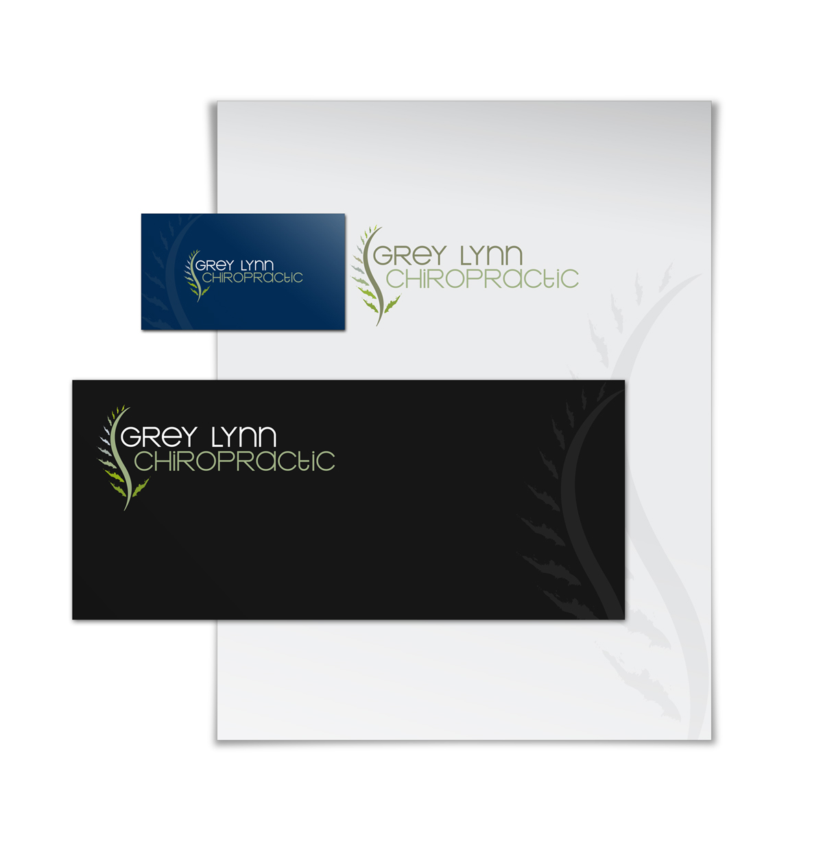
Grey Lynn chiropractic Logo Design
Wollen Sie auch einen Job wie diesen gewinnen?
Dieser Kunde bekam 70 Logo-Designs von 22 Designern. Dabei wurde dieses Logo-Design Design von ppnelance als Gewinner ausgewählt.
Kostenlos anmelden Design Jobs finden- Garantiert
-
 A$200
A$200
-
 70 Designs
-
 22 Designer
Logo-Design Kurzbeschreibung
We need a logo design for a new company based in Auckland New Zealand. It is a chiropractic medical centre and we focus on healing and promoting general well being by adjusting spine subluxation and misaligned joints.
Spine and nervous system healing and adjustment are our main focus and we would like this to be showed in our logo.
please check the below website for more information about our industry and competitors.
the set up of our office is more artistic than a traditional reception area whereas you feel like you walked ina n art gallery than a waiting room.
feel free to check the attached photos eg the official symbol of New Zealand.
http://www.chiropractic.ac.nz/chiropractic-education/index.php
http://www.chiropracticfirst.co.nz/
http://www.mtedenchiro.co.nz/
http://www.aucklandchiropractors.co.nz/
http://www.chiropractictouch.co.nz/
http://www.elite-chirotables.com/associations.php
Zielmarkt/( -märkte)
people with back and neck pain, headache,... and we welcome with different financial status from low to high.
Industrie/Einheitstyp
Industry
Logo Text
Grey Lynn Chiropractic
Sehen und fühlen
Jeder Schieber zeichnet eine der Charakteristiken der Marke des Kunden aus sowie den Stil, den euer Logo widerspiegeln sollte.
Elegant
Fett
Spielerisch
Ernst
Traditionel
Modern
Sympatisch
Professionell
Feminin
Männlich
Bunt
Konservativ
Wirtschaftlich
Gehobenes
Anforderungen
Muss haben
- rich and darker background color is a must. Must have warm colors.
Schön zu haben
- The use of green and blue colors. Integration of Spine and New Zealand symbol (Fern tree) would be nice to see.
Sollte nicht haben
- Too much color, or circus like theme.