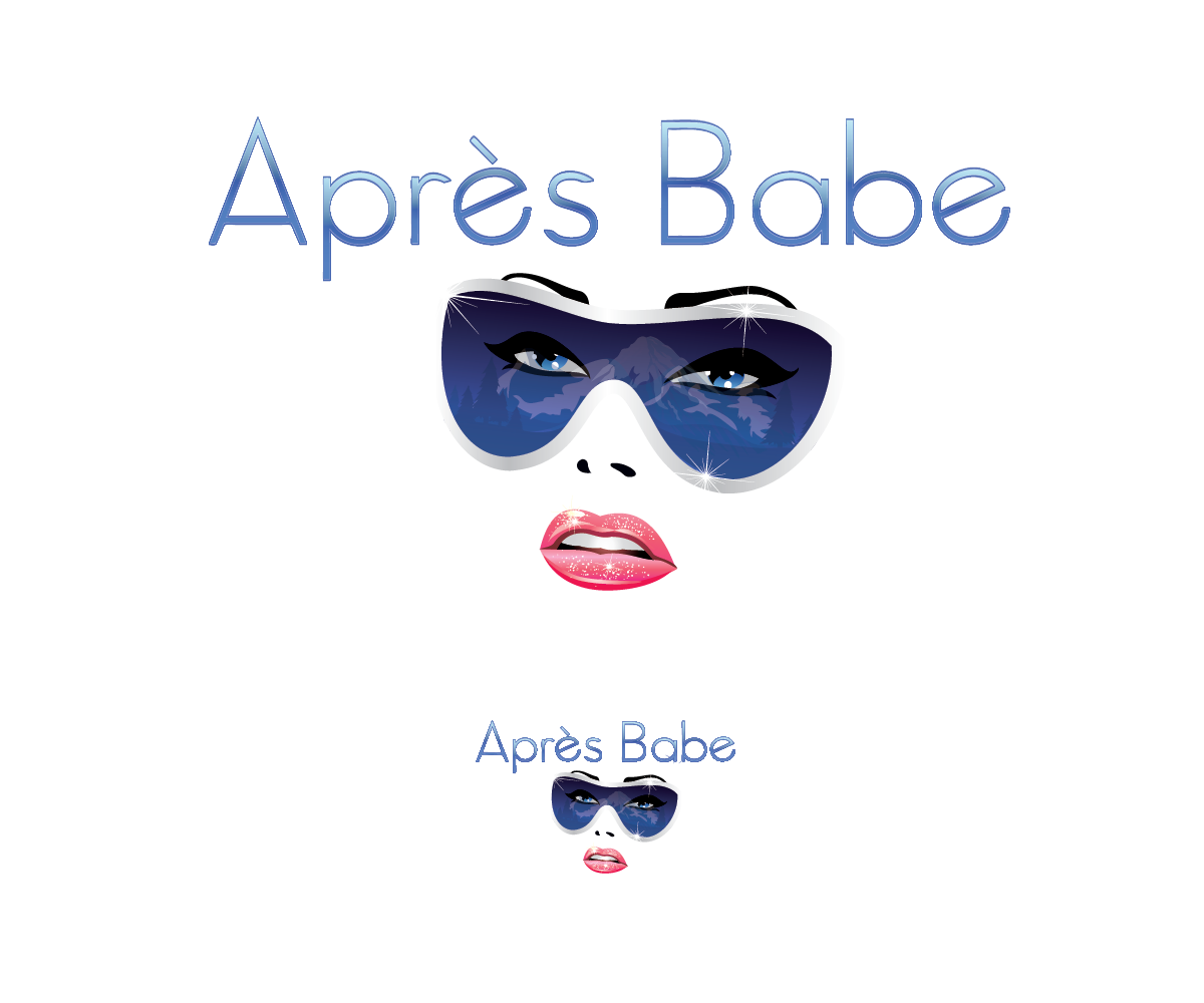
Logo For After Ski Apparel Line For Women
Wollen Sie auch einen Job wie diesen gewinnen?
Dieser Kunde bekam 40 Logo-Designs von 18 Designern. Dabei wurde dieses Logo-Design Design von BlackDahlia als Gewinner ausgewählt.
Kostenlos anmelden Design Jobs finden- Garantiert
-
 US$160
-
 40 Designs
-
 18 Designer
Logo-Design Kurzbeschreibung
I'd like a logo that isnt visually messy and if you scale it up or down you can still see the logo clearly. I need a design for wide application so it will look good on a retail tag, letterhead or business cards. As inspiration think Mountain Lifestyle. The logo needs to attract a woman who loves a sophisticated mountain style but still wants to have a little fun. The clothing is fashionable, comfortable, cool, not fussy. Apres Ski Apparel for women in their late 20's 30's & early 40's.
I want the feeling of fun but sophisticated. The price of the line is more towards upscale but think of a hip sophisticated California mountain girl who has money but isnt stuffy or stuck up.
Zielmarkt/( -märkte)
Women in their late 20's, 30's and 40's
Industrie/Einheitstyp
Womens Clothing
Logo Text
Après Babe
Logo Stile, die Sie interessieren können
Pictorial / Combination-Logo
Ein reales Objekt (Text optional)
Abstraktes Logo
Begrifflich / symbolisch (Text optional)
Figuren-Logo
Logo mit Abbildung oder Zeichen
Wortmarke-Logo
Word oder namensbasiertes Logo (nur Text)
Zu verwendende Schriftarten
Farben
Vom Kunden ausgewählte Farben für das Logo Design:
Sehen und fühlen
Jeder Schieber zeichnet eine der Charakteristiken der Marke des Kunden aus sowie den Stil, den euer Logo widerspiegeln sollte.
Elegant
Fett
Spielerisch
Ernst
Traditionel
Modern
Sympatisch
Professionell
Feminin
Männlich
Bunt
Konservativ
Wirtschaftlich
Gehobenes
Anforderungen
Muss haben
- Conceptual Simplicity
- The accent above the e in "Après"
Schön zu haben
- A mountain as the A in "Après
- Not a must have just an idea
- Frosted blue's
- In image #6 I love the font in that for the "Babe" part of "Apres Babe"
- for the "Apres" font I like more of a font in image #6
Sollte nicht haben
- Nothing too literal more metaphorical in design.