

 Aktualisieren
New design for www.BarberBooking.com
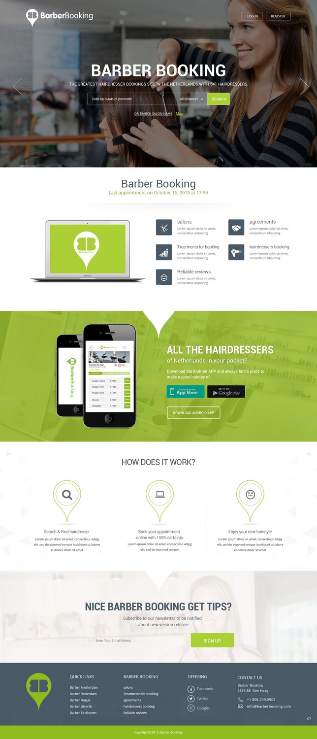
Wollen Sie auch einen Job wie diesen gewinnen?
Dieser Kunde bekam 100 Web-Designs von 18 Designern. Dabei wurde dieses Web-Design Design von pb als Gewinner ausgewählt.
Kostenlos anmelden Design Jobs finden
- Garantiert
-
 €305
-
 100 Designs
-
 18 Designer
Web-Design Kurzbeschreibung
On BarberBooking you can find & book your hairdresser. BarberBooking is the biggest platform in the Netherlands.
- The design should be a responcive design
- Should be able to go global, should fit in perfectly between all the big booking platforms like airbnb, uber etc,
- Should have te result of more bookings. :)
- We are ‘only’ asking a beautiful design, not a technical solution.
- We need a homepage (https://barberbooking.com/), search resultpage ((https://barberbooking.com/kapper/amsterdam/#), salonpage (https://barberbooking.com/kapper/vorden/da-vinci-for-hair/), about us page (https://barberbooking.com/aboutus/), for the hairdresser info page (https://barberbooking.com/kapper/), login/register page (https://barberbooking.com/account/signin/).
- On the page of the hairdresser there is a dynamic part. The part where you create your appointment. Please take a look at this part too after you choose your treatment (behandeling), employee (medewerker), Date (datum) and time (tijd). The part that you see after this, is the part where you fill in your data as a consumer.
I've added more logo's but mostly we use the green color.
A few of our competitors: www.treatwell.com, www.wahanda.com
Zielmarkt/( -märkte)
All consumers
Industrie/Einheitstyp
Hair And Beauty
Anzahl benötigter Seiten
5+ page
Zu verwendende Schriftarten

Farben
Vom Kunden ausgewählte Farben für das Logo Design:
Sehen und fühlen
Jeder Schieber zeichnet eine der Charakteristiken der Marke des Kunden aus sowie den Stil, den euer Logo widerspiegeln sollte.
Elegant
Fett
Spielerisch
Ernst
Traditionel
Modern
Sympatisch
Professionell
Feminin
Männlich
Bunt
Konservativ
Wirtschaftlich
Gehobenes
Anforderungen
Muss haben
- Responsive
- We did an A/B test with the homepage. It turns out that option B works better then option A (take a look at the uploaded pictures). So what we need on the homepage: The USP's with the green checkboxes, The search button needs to by dynamic (changes for example from light green to dark green so you can see you can click it) The call to action sentence Zoek & Vind je kapsalon, the searchfield and searchbutton should be seperated.
Schön zu haben
- The style that we like is the flat design style. The website should be simple, clean and it should feel a bit like a luxury thing. Because an appointment with the hairdresser can be a real treat and luxury moment for yourself.
- The luxury feeling and flat design that is in the www.uber.com website is really nice for example. But then it has to be a bit more light and not so black and dark.


