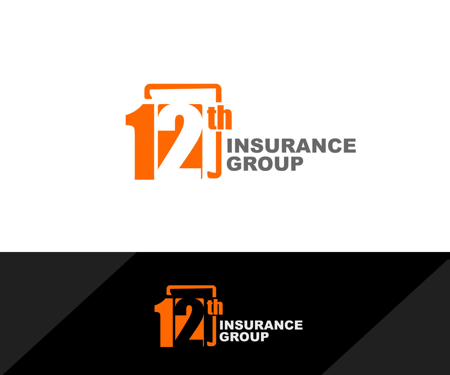
the 12th main logo, the one logo that will differentiate us from the competition
Wollen Sie auch einen Job wie diesen gewinnen?
Dieser Kunde bekam 115 Logo-Designs von 35 Designern. Dabei wurde dieses Logo-Design Design von edong artwork als Gewinner ausgewählt.
Kostenlos anmelden Design Jobs finden- Garantiert
-
 US$310
-
 115 Designs
-
 35 Designer
Logo-Design Kurzbeschreibung
i need the main logo for my business, the one that's going to be displayed everywhere.. front door, business cards, letter heads, etc.. i engage in the sale of life and health products and have created my d.b.a. as 12th insurance group, don't ask me why i just like how it sounds, attached is sample i've created using really simple tools, the one thing i want to keep intact is the orange background using the same color and the white lettering, i really like the color combination, everything else i'm open for suggestions, thank you..
Zielmarkt/( -märkte)
the main trade area is located in el paso, tx witch is pretty much made up of 70% latino/hispanic population, and my intent is to target all age groups 20 and up, for the sale of life&health insurance products.
Industrie/Einheitstyp
Life Insurance
Logo Text
12th insurance group
Logo Stile, die Sie interessieren können
Wortmarke-Logo
Word oder namensbasiertes Logo (nur Text)
Lettermark-Logo
Kurzwort oder Buchstaben-Logo (nur Text)
Zu verwendende Schriftarten
Andere Schriftarten erwünscht:
- the fonts are explained in the "must haves" sections
Sehen und fühlen
Jeder Schieber zeichnet eine der Charakteristiken der Marke des Kunden aus sowie den Stil, den euer Logo widerspiegeln sollte.
Elegant
Fett
Spielerisch
Ernst
Traditionel
Modern
Sympatisch
Professionell
Feminin
Männlich
Bunt
Konservativ
Wirtschaftlich
Gehobenes
Anforderungen
Muss haben
- the color must be intact.. i like the contrast between the orange and white.. i have the exact orange i used in a file and can make that available at any time.. obviously the the numbers.. on these i'm open to suggestions as far as fonts.. i used Gill Sans MT Condensed for no 2 & Segoe UI Symbol for no 1.. the letters is up to you.. to be hones i really liked the font used by the 5 gum, i was trying to get as close as the font used in that logo for the "12" is really modern in my opinion.. and definitely have a square aspect to it like the square surrounding the 12.. 10/29 after seeing a few of the designs submitted i definitely know that the logo should be rectangular, meaning having the the words "insurance" to the right of the "12" and "group" underneath" "insurance"..
Schön zu haben
- one i idea i had and again this is just an idea i dont want to make it the whole project have this is kind of create like a cube where the 1 is on one face and the 2 on the other, and have them alternate colors like the 1 be in white with an orange on the background and the 2 be oarange and a white backgound..
Sollte nicht haben
- no sure.. i guess i'm open to all suggestions..