Retail & Restaurant co-branding concept logo
Wollen Sie auch einen Job wie diesen gewinnen?
Dieser Kunde bekam 176 Logo-Designs von 24 Designern. Dabei wurde dieses Logo-Design Design von Elza als Gewinner ausgewählt.
Kostenlos anmelden Design Jobs finden-
 US$160
-
 176 Designs
-
 24 Designer
Logo-Design Kurzbeschreibung
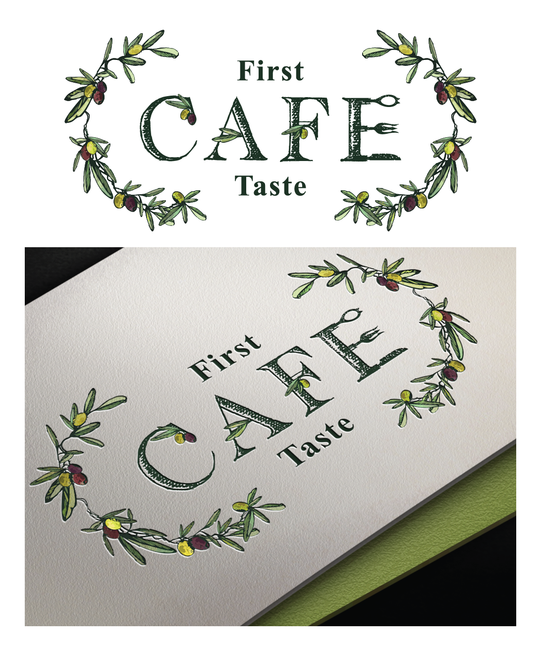
We are an Ultra premium Olive Oil and Vinegar Retail store with an established logo that has expanded with a Cafe (restaurant) inside the retail store. The Cafe serves modern International food in a relaxed restored historic building that incorporates the products available for retail. Our tableside service directs the guests to "play" with their food by seasoning and garnishing with the Oils & Vinegars. We would like to see designs that demonstrate a connection between the retail and Cafe but allows the Cafe to stand on it's own with a logo that is more suited for restaurant and not retail.
Aktualisierungen
Project Deadline Extended
Reason: Working on some revisions with in the designs submitted
Added Friday, May 20, 2016
Zielmarkt/( -märkte)
25+, health conscious, eats out regularly, destination oriented
Industrie/Einheitstyp
Restaurant
Logo Text
First Taste Cafe
Logo Stile, die Sie interessieren können
Emblem-Logo
Logo eingeschlossen in einer Form
Pictorial / Combination-Logo
Ein reales Objekt (Text optional)
Abstraktes Logo
Begrifflich / symbolisch (Text optional)
Figuren-Logo
Logo mit Abbildung oder Zeichen
Lettermark-Logo
Kurzwort oder Buchstaben-Logo (nur Text)
Zu verwendende Schriftarten
Andere Schriftarten erwünscht:
- ereshkigal
Sehen und fühlen
Jeder Schieber zeichnet eine der Charakteristiken der Marke des Kunden aus sowie den Stil, den euer Logo widerspiegeln sollte.
Elegant
Fett
Spielerisch
Ernst
Traditionel
Modern
Sympatisch
Professionell
Feminin
Männlich
Bunt
Konservativ
Wirtschaftlich
Gehobenes
Anforderungen
Muss haben
- See attached sketch and images. An Olive spoon & fork are attached along with two separate ideas for logo. The first one is the Olive spoon that should appear to be engraved with "First Taste" using the font supplied (Ereshkigal) with "Cafe" in the spoon opening. An olive branch for the handle. The second concept is drawn out with olive branches, olives and "first taste" incorporated into the letters. Style should be either a water color, portait or illustrative style. We would like to see both of these interpreted.
Schön zu haben
- something besides an olive that is over used for this concept like an olive oil tasting glass
Sollte nicht haben
- The same font used in the Retail logo