Terre rouge coffee - Label design
Wollen Sie auch einen Job wie diesen gewinnen?
Dieser Kunde bekam 60 Etikett-Designs von 11 Designern. Dabei wurde dieses Etikett-Design Design von Yvette als Gewinner ausgewählt.
Kostenlos anmelden Design Jobs finden- Garantiert
- Gebündeltes Projekt 1
-
 €180
€180
-
 60 Designs
-
 11 Designer
Etikett-Design Kurzbeschreibung
Watchout: Keep in mind while you submit it needs to be a LABEL (that will be sticked on brown kraft 250 g side gusset coffee pouches). No custom pack for time being (need more scale to custom print pack).
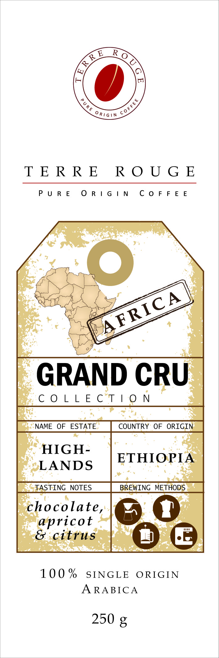
Looking for a label design for my new Grand Cru collection of freshly roasted, single origin specialty coffee. Brand name is Terre Rouge (it means red earth and alludes to the soil coffee grows on at high altitude in Africa. It also alludes to the red color of the coffee fruit). Brand selling line is "Pure Origin Coffee". Label to go as stickers on 250 g side gusset coffee pouches in Kraft brown paper (will print labels and stick on packs, packs are 80 mm wide and 260 mm long). This is a relatively complex project comprising the "terre rouge" brand logo (funded separately, winner will have the job), the "Grand Cru" collection visual identity, iconic assets for brand and collection recognition across lineup, educational visual icons, text placeholders. It needs to combine hard point visual elements and soft points (text placeholder) which I can easily edit on need basis (text needs to be "outlines" for easy editing after submission). Winner of label submission gets to design brand logo. I will ultimately need 3 different labels for our Grand Cru collection, one for each continent our coffee comes from (Africa, Asia, Latin America). This pitch should focus on the Africa one only. Winner will then have opportunity to design the other ones in consistent way.
BRIEF:
We roast single origin, high quality specialty coffee from high altitude estates in Africa (volcanic slopes in Congo and Burundi, Highlands in Ethiopia and Kenya) Design need to induce the premiumness of the proposition (this is a collection called "Grand Cru"), as well the the unique geographical origins of our coffee (without being too specific as we want to use same label for all our African origins) -oversized shape of continent in background + some visuals conveying the African roots could work well. It needs to create a mental Journey "back to the origins" - of mankind, of unique terroirs creating the best coffee, of our unspoilt roots. So the Journey themes is critical (to be expressed by the telegram type of font, by the way Africa is brought to life,etc.). At the same time keep in mind label space is limited (label stickers go on 250 g coffee pouches made in kraft brown paper) and we want to have a pure design, which leaves room to the text placeholder (see below) and is easily recognizable and reapplicable across the SKUs (we will add Asia and Latin America packs once we lock Africa). As such we need to strike right balance between visual differentiation by origin (Africa, Asia, Latin America) and common iconic assets for brand recognition and lineup harmonization (same font, same way the continent is brought to life, same structure of the label, differentiation by color background,etc.).
We need placeholder for text that will specify exact name of estate, county of origin, coffee type, roasting level and tasting notes. Here I will allow myself some creative direction: it should be in the format of a vintage luggage tag (see attached examples) where we can edit content in Telegram font (our coffee sourcing changes often). We will need to assess if the tag remains standard across collection, or whether we are able to give it a visual twist for each origin (Africa, Asia, Latin America). That would be nicer (see Starbuck "Stamps" example), but priority of the text placeholder is clarity of information above anything else.
Last nice to have (if it time allows) we need educational visual icons (ideally as separate small round labels we can stick on the pack above the main label) for recommended brewing method (filter, espresso, italian moka, french press).
Aktualisierungen
Project Deadline Extended
Reason: Still looking for the design in line with brief. Will send feedback to the top 3 routes today.
Added Sunday, November 22, 2015
Zielmarkt/( -märkte)
Switzerland
Industrie/Einheitstyp
Coffee Shop
Logo Text
Terre rouge -Pure Origin Coffee
Zu verwendende Schriftarten
Andere Schriftarten erwünscht:
- TELEGRAM type of font to induce geographical journey, single origin,.. For the "luggage tag" placeholder
Sehen und fühlen
Jeder Schieber zeichnet eine der Charakteristiken der Marke des Kunden aus sowie den Stil, den euer Logo widerspiegeln sollte.
Elegant
Fett
Spielerisch
Ernst
Traditionel
Modern
Sympatisch
Professionell
Feminin
Männlich
Bunt
Konservativ
Wirtschaftlich
Gehobenes
Anforderungen
Muss haben
- - Brand name: Terre Rouge. Brand selling line: Pure Origin Coffee. Brand Logo: winner of label submission gets to design brand logo
- - Collection name: GRAND CRU (written, I can see well as a vertical block). name of SKU: AFRICA (visualized a must, written tbc).
- - Text place holder (vintage luggage tag in telegram font) : we will show there name of estate, country of origin, tasting notes. I could see nicely a baggage tag format, where we fill in the details in telegram type of font.
- - 100% single origin Arabica (at the bottom)
- - 250 g (at the bottom)
- Technical Specs:
- A. Artwork must be supplied in either Adobe illustrator or Adobe Photoshop files or Coral Draw files
- B. Create all text in artwork in ‘ outlines ’
- C. The resolution of photographic image files must be no less than 350 dpi
- D. Never flatten the file as we require all layers
- E. All Photoshop image files should be linked and attached. Never flatten the layers and do not change the directory
- F. Create the images with CMYK colour mode ( RGB colour mode is not for printing)
- G. If you are going to use a spot colour please reference the Pantone ( PMS #)
- H. Designate all ‘Transparent’ areas in the artwork with a custom Pantone colour as well as designating the layer’s name as ‘ Transparent’. Please indicate specifically which pantone colour is designated for the ‘transparent’ area.
- I. Reduce any barcodes to 85% as a minimum scale
Schön zu haben
- - educational simple visual icons on recommended brewing method (filer, italian moka, french press or espresso) as additional small stickers to stick above main label
Dateien
Alle Dateien herunterladen - 0,4 MB
Zahlungen
Gesamt
€180
Projekt-Deadline
29 Nov 2015 21:25:35 UTCProjekt Upgrades
Gebündelte(s) Projekt(e)
- übergebe €140 Logo-Design an den Sieger