Design a Logo for an oil and gas technology startup!
Wollen Sie auch einen Job wie diesen gewinnen?
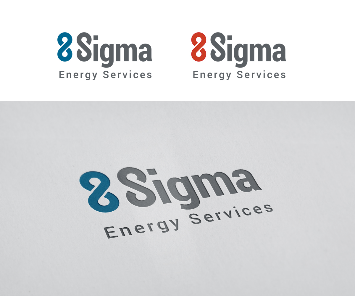
Dieser Kunde bekam 80 Logo-Designs von 33 Designern. Dabei wurde dieses Logo-Design Design von mrSergio als Gewinner ausgewählt.
Kostenlos anmelden Design Jobs finden-
 C$160
C$160
-
 80 Designs
-
 33 Designer
Logo-Design Kurzbeschreibung
We've developed a technology that will make extracting oil and gas more economical by an order of magnitude. Our company is an oil and gas service company but also heavily weighted as a technology company. We are technical, think out of the box and have come up with a very unique and controversial solution to a large problem associated with oil and gas production. People will be skeptical of our technology when we go to market so we need a brand that conveys we know what we are doing and we are competent.
Zielmarkt/( -märkte)
Oil Companies (Shell, ExxonMobil, etc) / Oil and Gas Service Companies (Weatherford, Halliburton, Schlumberger, etc)
Industrie/Einheitstyp
It Company
Logo Text
8 Sigma Energy Services
Logo Stile, die Sie interessieren können
Pictorial / Combination-Logo
Ein reales Objekt (Text optional)
Abstraktes Logo
Begrifflich / symbolisch (Text optional)
Wortmarke-Logo
Word oder namensbasiertes Logo (nur Text)
Zu verwendende Schriftarten
Andere Schriftarten erwünscht:
- Arial or similar (up to designer)
Farben
Vom Kunden ausgewählte Farben für das Logo Design:
Sehen und fühlen
Jeder Schieber zeichnet eine der Charakteristiken der Marke des Kunden aus sowie den Stil, den euer Logo widerspiegeln sollte.
Elegant
Fett
Spielerisch
Ernst
Traditionel
Modern
Sympatisch
Professionell
Feminin
Männlich
Bunt
Konservativ
Wirtschaftlich
Gehobenes
Anforderungen
Muss haben
- Professional Colours. Red or Blue or Black or White or Grey or a combination of them. Red and Blue cannot go together.
- "8 Sigma" is the focus, "Energy Services" is not the focus and may, possibly, be smaller than "8 Sigma" if that works with the designer.
- professional, serious, technical feel to the brand. Examples of competitors that have good branding/logo for the industry:
- http://www.weatherford.com/
- http://www.halliburton.com/en-US/default.page
- http://nineenergyservice.com/
Schön zu haben
- The "8" in "8 Sigma" should be a 'infinity' symbol standing upright in a few of the logos as the 8 actually has the meaning of infinite in the brand..
Sollte nicht haben
- light colours, anything perceived as fun or goofy or not professional or not serious.