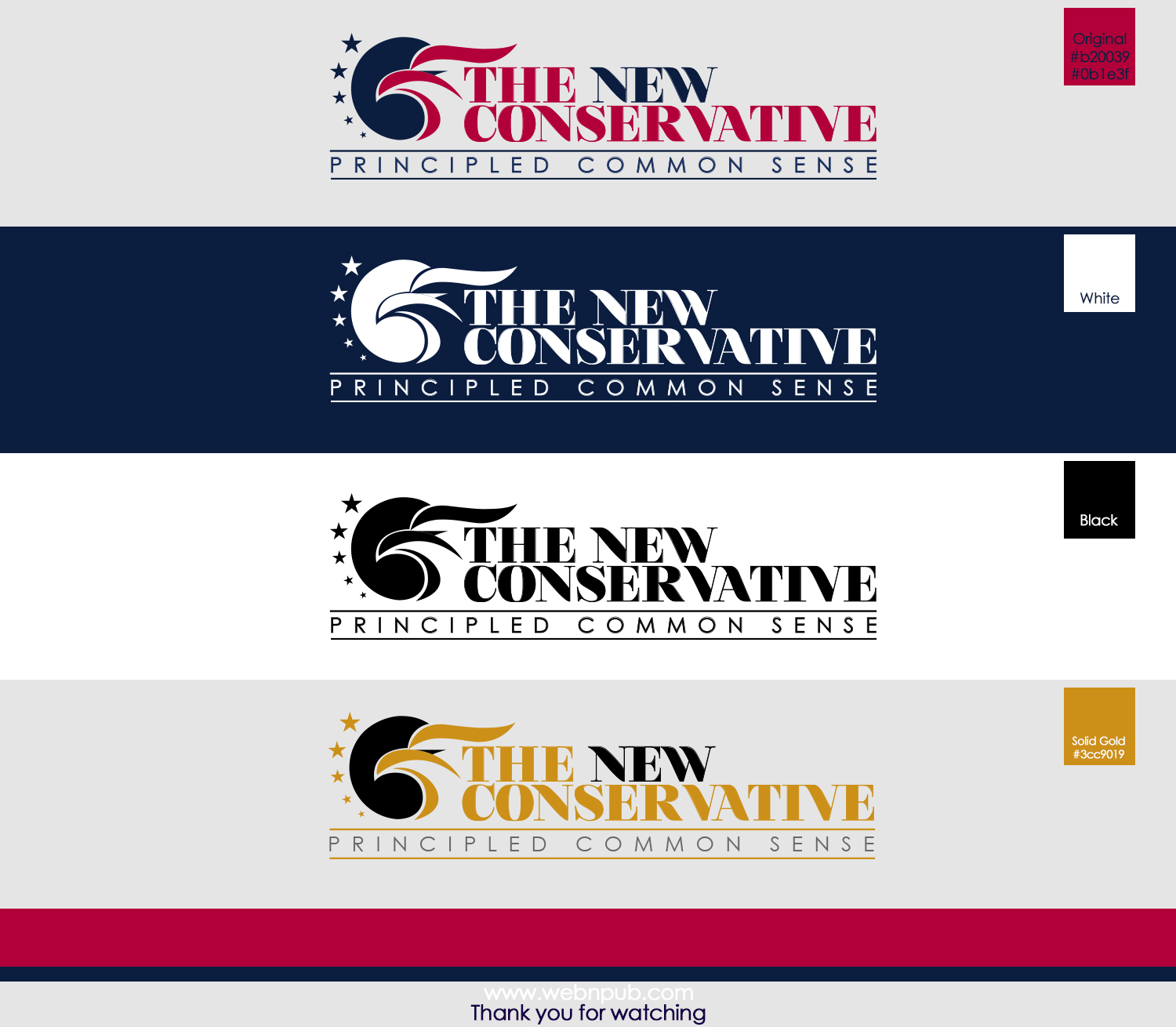
TheNewConservative.com Logo for Online Website
Wollen Sie auch einen Job wie diesen gewinnen?
Dieser Kunde bekam 120 Logo-Designs von 27 Designern. Dabei wurde dieses Logo-Design Design von WebnPub als Gewinner ausgewählt.
Kostenlos anmelden Design Jobs finden- Garantiert
-
 US$220
-
 120 Designs
-
 27 Designer
Logo-Design Kurzbeschreibung
I am starting a new website that will be an Online Magazine/Blog. The Website address is TheNewConservative.com. The logo I want is "The New Conservative" or "TheNewConservative". It is about US political commentary and National and International events. The colors that I am thinking are Red, White, Blue and Black, or a combination or some or all of these. I am open to other colors, if it makes sense.
I would like the sight to communicate the following:
Strength, Truth and Honesty, Wisdom, Solid, Bold, Strong Values, Patriotic.
I also want the logo to be primarily the text The New Conservative. It there is any artwork, it should not detract from the text. I am open to having just text, or having the text with some artwork. My goal is to create an Identity with the Text. The Treatment of the Fonts and Colors of the fonts should be the primary goal. Any additional artwork should not over-power the text.
In the US, the American Flag (Stars and Stripes), the Bald Eagle are signs of Strength. I am not sure if I want to have to have these as part of the theme or not.
I am looking for something that is easy to read, and will stand the test of time.
The "New" in The New Conservative is my way of saying that we need to take a new look at what conservatism means. Perhaps the "new" should be accentuated, or perhaps not. I am not sure. I am looking for ideas.
I have included some examples of URLs that are blogs/magazines. Just some examples.
Aktualisierungen
I have receive quite a few submissions, and I do appreciate the work that has been done so far. So Thank You!
I realize that in my first communication, that I mentioned that the word "new" could be accentuated. In some cases, however, the accentuation of "new" of many of the submissions is overshadowing the main emphasis of the website, which is discussions about "Conservative" thought and politics. Yes, we are trying to create some "new" thinking about what is conservative and what is really not, so an emphasis on the word "new" is OK, but it should not necessarily be the most important important part of the logo. It does not mean it "can't be" accentuated, but also means it does not "have to be". It just depends what works and what looks good.
The "new conservative" is not about me, a single individual, but is about a new, in some cases, way of thinking about conservatism for many individuals.
Again, the site is about "conservatism", and in some case a new way of thinking on some issues, but may very well have some older ways of thinking as well.
What I want is a logo that is mostly texts and fonts, with supporting artwork, if any, that will leave an "impression" on the viewer's mind, that will remember the logo, and become familiar with it.
The logo must be "easy to read" and memorable. I like simple yet powerful. steadfast. I also like precision with any layout. Many of the submission have shown the attention to detail that I like, and by that I mean high precision. Some have not.
This is a new website and domain, but when people come to the site, I want the site to look established. Some of that starts with the logo. I would like the logo to look familiar to them, even if it is not.
I hope this helps. Thank you.
Added Wednesday, December 16, 2015
Zielmarkt/( -märkte)
Men and Women from the ages of 18 to 70. Clear thinking people
Industrie/Einheitstyp
Political
Logo Text
The New Conservative or TheNewConservative
Logo Stile, die Sie interessieren können
Emblem-Logo
Logo eingeschlossen in einer Form
Pictorial / Combination-Logo
Ein reales Objekt (Text optional)
Wortmarke-Logo
Word oder namensbasiertes Logo (nur Text)
Zu verwendende Schriftarten
Farben
Vom Kunden ausgewählte Farben für das Logo Design:
Sehen und fühlen
Jeder Schieber zeichnet eine der Charakteristiken der Marke des Kunden aus sowie den Stil, den euer Logo widerspiegeln sollte.