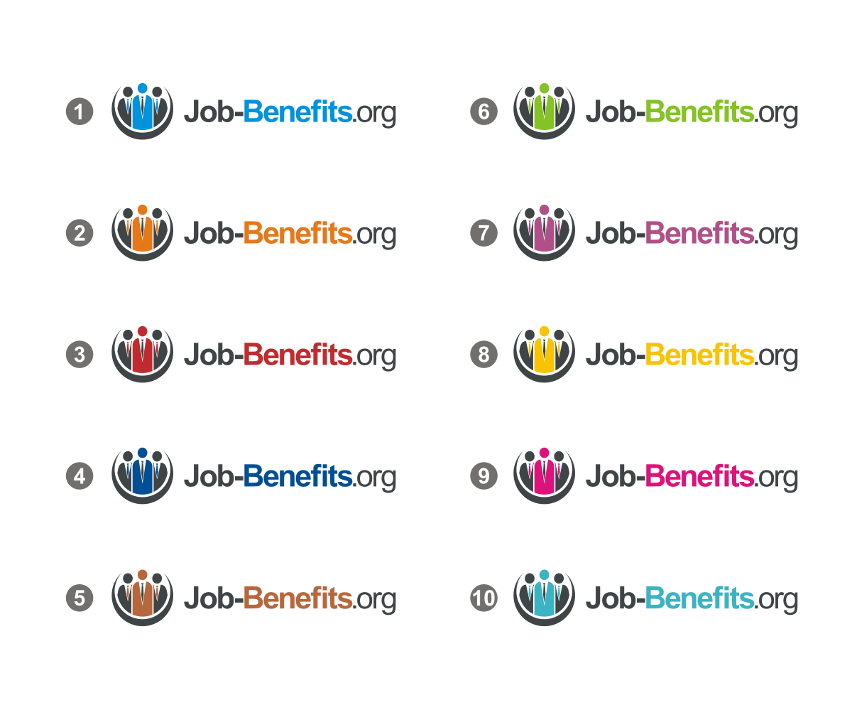
Logo Design Project for Job-Benefits.org

Wollen Sie auch einen Job wie diesen gewinnen?
Dieser Kunde bekam 314 Logo-Designs von 106 Designern. Dabei wurde dieses Logo-Design Design von haryz als Gewinner ausgewählt.
Kostenlos anmelden Design Jobs finden- Garantiert
Logo-Design Kurzbeschreibung
Need a logo design for a web information portal that reviews and compares the various employee benefits available at many of the major companies in the US.
Logo dimensions: 220 pixels wide by 60 pixels tall (must fit within, although you could center a smaller image within that size if it suits you.)
Be creative. Don't worry about colors - go with your gut, however, for my tastes less is more. Clean and professional.
Aktualisierungen
Thanks so much to all those that have posted.
Added Friday, June 28, 2013
Just so you know how I operate, I will generally post all comments in two cycles between 10am and 2pm and then between 6pm and 9pm. I typically drop a note to everyone that submits. Some times, I have nothing to change, and I will let you know that. I does not mean that I am not considering your design. It just means, I need time to reflect. Other times, I have no feedback that would be useful to get the design from where it is, to where I would like it to be. In general, I let you know that, and I will generally eliminate those designs shortly thereafter. I am just trying to be respectful of everyone's effort. It is very early in the process, so I have not yet started to rate, but will do so in the next couple of days, and begin providing very specific feed back to a few finalists.
Added Saturday, June 29, 2013
Thanks again to everyone that is submitting. However, I have noticed the use of a magnifying glass element in the image portion of many entries. I have to tell you that I'm not a fan of the magnifying glass and I would appreciate if you could focus your energies in other areas. Please eliminate magnifying glasses from future entries. Thank you.
Added Saturday, June 29, 2013
I'm finding that designs with the text all on one line resonates better with me than the text on 2 lines. If you can keep the job-benefits.org all on one line that is preferred. Thank you.
Added Saturday, June 29, 2013
I have begun eliminating some designs this morning. What you see left are those types of designs that resonate with me. You can use that for guidance with respect to modifications if you are continuing to revise. I expect to begin rating the pool of logos this evening. Thanks again to all those that participated. It is been a great success with respect to getting many different qualified entries. Thank you very much.
Added Saturday, June 29, 2013
Thanks to everyone that has submitted so far. I have eliminated many designs and I wish to thank all those people that took the opportunity to try and put something together for me. Many were very creative, but they simply were not the style or look that I was intending. As you can see a theme is starting to evolve. If you are still in the mix then there's definitely elements of your design that I find interesting. I'm going to sign off for now but I will begin rating the current designs this evening. Thanks again to everyone for all their great effort.
Added Saturday, June 29, 2013
Thanks so much for everyone's time. I've had just a wonderful selection from which to choose. I'm closing in on the finalists now, and I just wanted to drop everyone a note of thanks. What a talented group of people designcrowd has.
Added Wednesday, July 03, 2013
Zielmarkt/( -märkte)
25 to 35 year olds seeking information about employee benefits
Industrie/Einheitstyp
Employee
Logo Text
Job-Benefits.org
Logo Stile, die Sie interessieren können
Pictorial / Combination-Logo
Ein reales Objekt (Text optional)
Wortmarke-Logo
Word oder namensbasiertes Logo (nur Text)
Sehen und fühlen
Jeder Schieber zeichnet eine der Charakteristiken der Marke des Kunden aus sowie den Stil, den euer Logo widerspiegeln sollte.
Elegant
Fett
Spielerisch
Ernst
Traditionel
Modern
Sympatisch
Professionell
Feminin
Männlich
Bunt
Konservativ
Wirtschaftlich
Gehobenes
Anforderungen
Muss haben
- Job-Benefits.org (must have hyphen).
Please pay attention to the look and feel sliders.
Schön zu haben
- A visual component that suggests this is an information resource.
Sollte nicht haben
- Hard to read fonts.
Too many colors.
A design that makes me think to figure out how clever the design is.