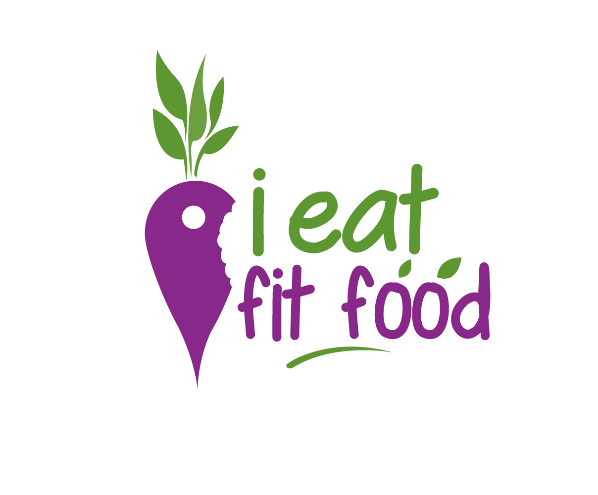
"i eat fit food" mobile application logo design
Wollen Sie auch einen Job wie diesen gewinnen?
Dieser Kunde bekam 69 Logo-Designs von 34 Designern. Dabei wurde dieses Logo-Design Design von Graphicsexpert als Gewinner ausgewählt.
Kostenlos anmelden Design Jobs finden-
 US$160
-
 69 Designs
-
 34 Designer
Logo-Design Kurzbeschreibung
The project is for an online mobile application that locates diet compliant food (healthy meals) when eating out at restaurants. The logo design will be used digitally as well as on printed media. The logo should look professional and sleek. Please use maximum of 2 colors. The company name is 'i eat fit food'. Since this will be a mobile application, it is very important for the icon of the logo to be of equal width and height in pixels.
Zielmarkt/( -märkte)
The target market are health conscious individuals or individuals with diet intolerance such as lactose intolerant, or gluten intolerant. These individuals are 18-45 years old. They eat out most of the time and usually do not know or cannot find diet compatible meals.
Industrie/Einheitstyp
Online
Logo Text
i eat fit food (all small caps)
Logo Stile, die Sie interessieren können
Pictorial / Combination-Logo
Ein reales Objekt (Text optional)
Farben
Vom Kunden ausgewählte Farben für das Logo Design:
Sehen und fühlen
Jeder Schieber zeichnet eine der Charakteristiken der Marke des Kunden aus sowie den Stil, den euer Logo widerspiegeln sollte.
Elegant
Fett
Spielerisch
Ernst
Traditionel
Modern
Sympatisch
Professionell
Feminin
Männlich
Bunt
Konservativ
Wirtschaftlich
Gehobenes
Anforderungen
Muss haben
- Since the icon of the logo will be used for a mobile application, it is important, size wise, for the icon to be compatible with using it as a mobile application icon. These are usually equal in width and height.
- Since this is an application used to 'locate' diet compliant meals, the icon of the logo should also contain the locator symbol. I attached sample locator symbols for reference. The locator symbol should not be the focus of the logo. It should be an auxiliary item that complements the overall theme of the logo.
- Design needs to be simple, communicate company overall message, memorability to make it easier for people to remember.
Schön zu haben
- The logo should have a limited number of colors. A maximum of 2 colors is preferred.
- I would also like to incorporate the beetroot symbol into it if possible. The locator symbol could be the purple section of the beetroot. I added images for reference.
Sollte nicht haben
- Non-professional fonts