Dual logo for Real Estate company
Wollen Sie auch einen Job wie diesen gewinnen?
Dieser Kunde bekam 140 Logo-Designs von 24 Designern. Dabei wurde dieses Logo-Design Design von blue eyes1983 als Gewinner ausgewählt.
Kostenlos anmelden Design Jobs finden- Garantiert
-
 US$160
-
 140 Designs
-
 24 Designer
Logo-Design Kurzbeschreibung
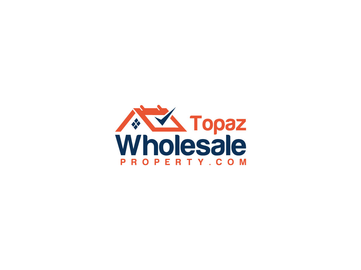
My company has two marketing branches to sell our properties: (1) TopazWholesaleProperty.com
(2) TopazRentals.com
(1) is to sell investment properties to other investors
(2) is for rent / rent-to-own and / or seller financing to the retail market
I need a logo for both - to put on each website and corresponding marketing signs. I would like the two logos to have a common theme so that they are clearly from the same source, but distinct enough that one is not confused for the other.
Also, the logo layout should be conducive to a sign which is usually a ratio of 1.3 to 1.5 (width) to 1.0 (height) (i.e. 4'x3' or 36"x24")
The sign needs to have a room for a phone number in big, visible numbers at the bottom, and some type of banner across the top that says "House for Sale" or "Available for Rent" or something similar. With the logo and website in the middle. The point being that the logo needs to be a "landscape" layout (not a "portrait" layout).
Since the primary usage for this logo is for the website and for signage - using the name of the website in the logo is required. The overall impression should communicate financial stability and trustworthiness. I don't anticipate a lot of extended graphics - the focus should be a clearly visible and readable website address with some supporting "flair" that makes it a logo instead of just a string of letters.
A sign design does not need to accompany each logo, but if you could include a basic design (as described above) to help provide perspective, that could be very helpful but not required.
I have uploaded two other logos for other company's I have. These logos do not need to be similar in color or design - but just to illustrate the type of logo that I'm looking for.
Updates
I should mention that I understand that the two websites are very different in length. I also own the domain: TopazHouses.com which could be used in place of TopazWholesaleProperty.com on signs. This would also provide more similar display dimensions to TopazRentals.com. But this is only as a backup option if TopazWholesaleProperty.com is just too big to look right.
Added Monday, January 4, 2016
Zielmarkt/( -märkte)
Target for TopazWholesaleProperty.com is real estate investors, people with cash who fix-n-flip or landlords who hold rentals. The Target for TopazRentals.com is familys who want to own their own home.
Industrie/Einheitstyp
Real Estate
Logo Text
TopazWholesaleProperty.com / TopazRentals.com
Sehen und fühlen
Jeder Schieber zeichnet eine der Charakteristiken der Marke des Kunden aus sowie den Stil, den euer Logo widerspiegeln sollte.
Elegant
Fett
Spielerisch
Ernst
Traditionel
Modern
Sympatisch
Professionell
Feminin
Männlich
Bunt
Konservativ
Wirtschaftlich
Gehobenes
Anforderungen
Muss haben
- Clearly visible website address. Strong visual correlation with colors and flow with each logo. Must also have distinctive differences so that one will not be easily confused with the other.
Schön zu haben
- Similar dimensions / colors
Sollte nicht haben
- Large amount of graphics which can be confusing.