

 Aktualisieren
Payerne Estavayer v2
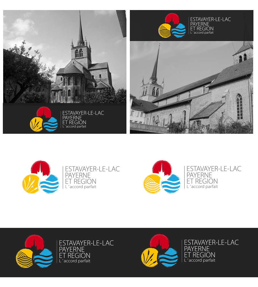
Wollen Sie auch einen Job wie diesen gewinnen?
Dieser Kunde bekam 60 Logo-Designs von 33 Designern. Dabei wurde dieses Logo-Design Design von Kolor als Gewinner ausgewählt.
Kostenlos anmelden Design Jobs finden
- Garantiert
-
 €150
€150
-
 60 Designs
-
 33 Designer
Logo-Design Kurzbeschreibung
I need a vectorised finalised version of this logo sketch, sticking very closely to this design but with two changes: the three colours to use for the spheres are red, yellow and blue; and the yellow sphere should be reworked with two options - one with reeds/bulrushes, and one with the furrows of a ploughed field.
The vertical line between the logo and text should not be too thick.
Overall the aim is to produce a usable finished logo, but keeping the dynamism of the original sketch.
The building in the red sphere is the Abbatiale in the town of Payerne, with its distinctive tower shape.
Zielmarkt/( -märkte)
tourists, local residents, daytrippers. Used for signage etc as well as stationery and marketing
Industrie/Einheitstyp
Building
Logo Text
exactly what it says on the sketch (there is an apostrophe in "l'accord parfait" which isn't clear
Sehen und fühlen
Jeder Schieber zeichnet eine der Charakteristiken der Marke des Kunden aus sowie den Stil, den euer Logo widerspiegeln sollte.
Elegant
Fett
Spielerisch
Ernst
Traditionel
Modern
Sympatisch
Professionell
Feminin
Männlich
Bunt
Konservativ
Wirtschaftlich
Gehobenes
Anforderungen
Muss haben
- Close relationship to the sketch. Interlinked spheres as in sketch, relationship between graphic and text elements as in sketch. Two options, one with reeds/bulrushes, the other with ploughed furrows. Abbatiale in red sphere. Yellow instead of green.
Sollte nicht haben
- Not too stiff or formal. Should not look too municipal in its treatment.
