Logo Design Project
Wollen Sie auch einen Job wie diesen gewinnen?
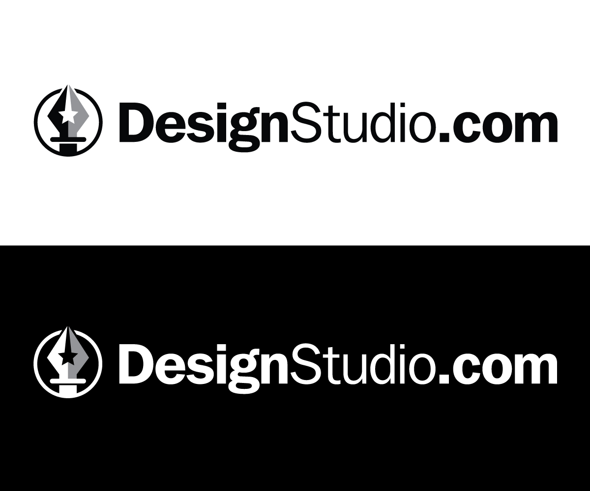
Dieser Kunde bekam 245 Logo-Designs von 61 Designern. Dabei wurde dieses Logo-Design Design von Ven Talon als Gewinner ausgewählt.
Kostenlos anmelden Design Jobs finden- Garantiert
-
 US$400
-
 245 Designs
-
 61 Designer
Logo-Design Kurzbeschreibung
We need a logo for a new social network for creative professionals that will be launched at DesignStudio.com in a few months.
This new web site is a place where talented and experienced creative professionals can post work from their portfolios for free - in order to get exposure for their work and hopefully win more clients.
The network is free to join but it is not for everyone. The portfolio work that gets submitted by new members must be peer reviewed. Also, our front end web site will filter the results in a way where the portfolio posts that generate more buzz get featured and less interesting works eventually get filtered out.
We are looking for a relatively simple logo to re-brand DesignStudio.com to meet our new business model. We are evolving a small design firm into an online talent agency and a social media venue. For that new business model, we are entertaining ideas for a new look and a new brand.
KEY PROJECT DETAILS
(1) We want a clean, simple 1-color logo.
(2) Please present logo submissions as white on black and black on white
(3) If a second color is necessary, please use only shades of gray.
(4) Text-Only logos are acceptable but legibility of the name is critical.
(5) The name of the company is: DesignStudio.com and adding ".com" to the name is required.
We do not necessarily require an icon for this logo but we are open to ideas. If there is an icon, it must be something relatively simplistic that relates to creativity, networking or design in some way. It cannot be too cliche. For instance a light bulb is not worthy unless it was done in some incredibly creative way.
POSSIBLE ICONIC MARKS
(1) The letters DS
(2) A play on a star as the symbol
(3) Something that represents "digital design"
A play on "pixels" or "Curves & Points" or graphic design tools, etc.
(4) Something representing creativity
A brain, a spark, an eye of the beholder... dunno. Light bulbs are probably too cliche unless done in some excessively creative way.
Tones of gray are acceptable if they help make the logo look better in 2 colors.
Aktualisierungen
So far we are not getting many submissions that we like. Many of these logo submissions look very amateurish to be bluntly honest. I am a designer myself and I feel like a lot of the designs could be done in 5 minutes or less. A few of them are mildly interesting but so far nothing has really piqued our interest.
I am also noticing a lot of designers who are participating in this project clearly did not read the creative brief. We were specific in stating that we want a 1-color logo and yet many people are submitting colorful renditions.
As for the type of logo we are looking for, we preferably want a nice font for the words "DesignStudio.com". The font must be easily legible. I am leaning towards san-serif fonts with bold letters so that legibility is never an issue. The .com part should not be so tiny that it is hard to read.
If we are going to have a mark with this logo, here are the options that I am intersted in seeing:
(1) A play on the letters DS
(2) An iconic mark that relates to design or creativity. (Nothing too cliche)
(3) An iconic mark that relates to people and/or networking
We appreciated everyone's effort so far but I am hoping to see a bit more creativity here.
Added Tuesday, July 16, 2013
I notice that a lot of the designs have the words "Design" and "Studio" using different fonts. I feel that is not working in many cases. I am not saying that I do not want to see this at all but I think it might be better for a lot of these designs to use the same font for both words.
Also, I am seeing a lot of logo submissions where the ".com" part is very small or placed in weird places where it does not look natural. For this brand, we want to be elegantly simple but with some clever twist.
I want to re-iterate a key point about our brand mentioned in our Creative Breif. There are literally thousands of companies with the words "Design Studio" as part of their name. There is only one DesignStudio.com, however. That domain was a fairly significant investment for us and we want our branding to make it clear that we are DesignStudio.com everywhere the logo is shown.
So my suggestion for new submissions is to send some with the same font used for both words. I would almost rather see one word bolded than two competing fonts. Also, lets see more samples with the .com just showing naturally as part of the straight-line text... not made so small it can barely be seen.
Then, we need to figure out what the clever twist will be. There should only be one clever play for this logo. A singular element that makes the logo distinctive. A cool looking iconic mark? A play on the letters D and S? Maybe the font itself is just styled so nicely that the name itself is the logo. Our business model again is about CREATIVITY, NETWORKING, SOCIAL ENGAGEMENT. We are a digital new age company but we have brick and mortar offices with strong roots in the world of print.
Hope that helps and thanks to everyone for the ideas so far.
Added Wednesday, July 17, 2013
To everyone participating on this project - first of all - a big THANK YOU for the submissions so far. I feel like this project is warming up now and I am liking more of what I see.
A quick note to everyone. I am seeing a lot of submissions with various colors but as we stated in our creative breif, we really are looking for a 1-color logo. We really just want all submissions showing the logo ideas as either white on black or black on white... or ideally both.
I will note that we are open to seeing a second tone being used but that other tone can only be gray. Use light grey on black bacgrounds or darker gray on light backgrounds. Legibility of the name is also critical part of this design. Use of negative space is a plus.
All in all, we just want a very clean professional brand. Anything not conforming to these guidelines is going to be eliminated.
Added Saturday, July 20, 2013
Thank you again to everyone who is participating on this project. I just wanted to let everyone know that there is about a week left on this project and we are hoping to see some more ideas. We've gotten a few submissions that are worthwhile but this project is still wide open.
Many of the submissions are playing off of the DS for DesignStudio.com and that is one of the ideas we specifically mentioned in our creative brief. So far, we have a few plays on the DS that we like but nothing yet that we have fallen in love with.
That being said, I would encourage a few other ideas to be tried. I will say that there are two symbols in particular that I would like to see plays on. One is a star. Our current logo has a star the mark and we are moderately happy with our current brand but still looking to improve it. I am uploading a view of the current logo for reference on this project. The reason the star works for us is because it symbolizes excellence and because we are always looking for stellar creative talent.
The other notion that I want to play around with is the concept of "digital design". Much of what our people do every days is digital artwork (both pixel and vector art) so I am interested in having a logo that represents digital artwork in some way. How? Possible a play on "pixels" or "curves with points" or " tools that would be expected as part of a graphics program.
As always, thanks for the ideas.
Added Tuesday, July 23, 2013
One concept I would like to see some plays on is using the "pen" tool icon as a mark... nobody has tried this yet but I think this could be an interesting mark.
Added Friday, July 26, 2013
Project Deadline Extended
Reason: We are adding one more week to this project in order to have enough time to explore some more ideas on the mark for this new logo. We have tried using "DS" as the mark for several logo versions and some of those are moderately appealing to us, however, nothing has really grabbed us yet as a clear winner.
Again thanks to everyone who is participating in this project. I will likely add a couple more participation payments before this project is over so that those of you who are contributing good ideas get some of the action at the end.
To re-cap where we stand as of today, I am hoping to see more ideas with other iconic imagery besides the DS. More DS submissions are acceptable but we would also like to see ideas using any of the following:
- A single star - representing excellence
- Any clever concepts that use blocky pixels in a way that represents the concepts of creativity, design, etc
- Any concept that represents digital artwork using lines, curves - or potentially the "pen" tool from graphics programs
Remember we want this logo to be executable in just 1 color. You can use shades of gray but no other colors should be used for future submissions. Please present your ideas both in black on white and white on blank. Thanks again for participating in this project.
Added Friday, July 26, 2013
Zielmarkt/( -märkte)
Our primary target audience is professional freelance designers. A secondary audience are the people that hire them.
Industrie/Einheitstyp
Graphic Design
Logo Text
DesignStudio.com
Logo Stile, die Sie interessieren können
Emblem-Logo
Logo eingeschlossen in einer Form
Wortmarke-Logo
Word oder namensbasiertes Logo (nur Text)
Lettermark-Logo
Kurzwort oder Buchstaben-Logo (nur Text)
Sehen und fühlen
Jeder Schieber zeichnet eine der Charakteristiken der Marke des Kunden aus sowie den Stil, den euer Logo widerspiegeln sollte.
Elegant
Fett
Spielerisch
Ernst
Traditionel
Modern
Sympatisch
Professionell
Feminin
Männlich
Bunt
Konservativ
Wirtschaftlich
Gehobenes
Anforderungen
Muss haben
- Must have a 1-color version of the logo included
Schön zu haben
- Something that can be turned into a social media icon