Logo Redesign Project for into
Wollen Sie auch einen Job wie diesen gewinnen?
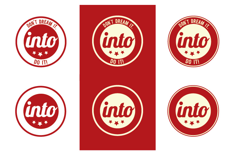
Dieser Kunde bekam 458 Logo-Designs von 122 Designern. Dabei wurde dieses Logo-Design Design von Marta Sobczak als Gewinner ausgewählt.
Kostenlos anmelden Design Jobs finden-
 €675
€675
-
 458 Designs
-
 122 Designer
Logo-Design Kurzbeschreibung
Hello everyone,
into is a company offering student exchanges, Work and Travel, volunteer projects, language holidays, international internships and classtrips world wide.
Having our headquarters based in Germany, we also send our customers with itchy feet abroad from our other branches. We have foreign offices in Switzerland, Austria, Holland, Spain, Czech Republic, England, Hungary, Norway, Schweden, Finland, Danmark and Poland.
As most our customers are in the agegroup from 14-17 (the exchange business is our core business, but we are trying to grow in the 18 + market also), we would like the logo to be fresh and young, but not childish. We definetly want to get away from 3D to 2D.
As examples you will find our old 2D Logo - this involves our corporate colors - and our newer 3D Logo. The latter naturally has more shades of colors, but please stick to the ones from the 2D. Yet, feel also free to only work with the red or only the blue. Also, it does not need to be round - we are up to any new objective approaches to our logo :)
You can find more information on www.into.de or just email me at antonia@into-exchange.com for further questions.
I am looking forward to your designs! :)
Best
Antonia
Aktualisierungen
"Don't dream it. Do it!" is our slogan, but up till now we did not have it in our Logo. This is definetly not a must to include, but maybe you feel you have something good in mind to include it. Either way is fine.
Added Monday, July 22, 2013
We use little stars as in the designs of our broschures, website etc. If you have an idea to include these..but again, not a must!
Added Monday, July 22, 2013
We also are happy to accept any new associations/mascotts for our logo. We would think of a globe, a suitcase, a plane, wings, horizon etc. Anything associating to exploring and visiting other places. But maybe you have even better and new approaches to this topic?
Added Monday, July 22, 2013
Hello everyone,
Added Thursday, August 01, 2013
Also no more cloud-designs please! They are too "cute" and a bit too childish for our target-group. Thanks
Added Thursday, August 01, 2013
Hello everyone,
Added Thursday, August 08, 2013
Hello to all the designers who have taken part in this project,
Added Saturday, August 10, 2013
Zielmarkt/( -märkte)
people who like to go abroad, main market 14-17 yrs of age, 70 % female
Industrie/Einheitstyp
Business
Logo Text
into
Sehen und fühlen
Jeder Schieber zeichnet eine der Charakteristiken der Marke des Kunden aus sowie den Stil, den euer Logo widerspiegeln sollte.
Elegant
Fett
Spielerisch
Ernst
Traditionel
Modern
Sympatisch
Professionell
Feminin
Männlich
Bunt
Konservativ
Wirtschaftlich
Gehobenes
Anforderungen
Muss haben
- - 2D
- "into" has to be visible in the logo
- stick to the three colors white, red and blue or at least one of them
Schön zu haben
- We also would like to mention, that we have a liking for the current "retro-style" (https://www.google.de/search?q=retro+logo&oe=utf-8&rls=org.mozilla:de:official&client=firefox-a&gws_rd=cr&um=1&ie=UTF-8&hl=de&tbm=isch&source=og&sa=N&tab=wi&ei=PwrtUZiQB6mQ0AXVsYGQDg&biw=1280&bih=891&sei=RQrtUdbKJfS00QWD0YCQDg)