

 Aktualisieren
Storefront Carnival Cutout Sign
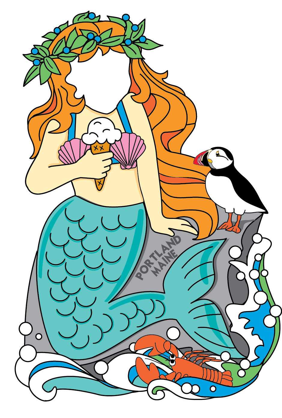
Wollen Sie auch einen Job wie diesen gewinnen?
Dieser Kunde bekam 62 Grafik-Designs von 6 Designern. Dabei wurde dieses Grafik-Design Design von tinajay als Gewinner ausgewählt.
Kostenlos anmelden Design Jobs finden
- Garantiert
-
 US$240
-
 62 Designs
-
 6 Designer
Grafik-Design Kurzbeschreibung
We would like a "cut out" sign where people put their faces in to take photos on vacation. This sign will be in front of our ice cream store in Portland, Maine. The overall height should be about 6 feet, and the sign will be cut so that the base is wider than the top (not just a rectangle).
Over all dimension - 6 feet high, base 4 feet wide, top 2-3 feet wide (a vertical design)

Aktualisierungen
Thanks to everyone who submitted for this design. We appreciate all of your hard work and talent. We wish you all the best in your endeavors.
Added Monday, August 12, 2013
Zielmarkt/( -märkte)
tourists visiting maine who like ice cream
Industrie/Einheitstyp
Store
Sehen und fühlen
Jeder Schieber zeichnet eine der Charakteristiken der Marke des Kunden aus sowie den Stil, den euer Logo widerspiegeln sollte.
Elegant
Fett
Spielerisch
Ernst
Traditionel
Modern
Sympatisch
Professionell
Feminin
Männlich
Bunt
Konservativ
Wirtschaftlich
Gehobenes
Anforderungen
Muss haben
- Must have...
The store name - Captain Sam's Ice Cream
Location - Portland, Maine
A redrawn version of our lobster holding ice cream
plus one or two additional characters - a mermaid, a lobster fisherman or a pirate
We would like to see the "complete" design first before the "cutouts" are made,
So please include faces in your drawings.
Schön zu haben
- Our store colors are red, orange, yellow and teal (and black)
Our go-to font is "Mister Sirloin"
We would love to see these ideas...
1) A lobster holding ice cream cones (one face)
2) A lobster hugging a mermaid (2 faces). the mermaid and/or lobster should be holding ice cream.
3) A mermaid hugging a pirate (holding ice cream) with the lobster at the bottom (2 faces)
4) A lobster fisherman hugging a mermaid (holding ice cream) with the lobster looking on (2 faces)
Sollte nicht haben
- We need for the lobster in our logo to be redrawn, not just copied as is.
He should be more vertical than the one shown in the logo
He should still have sunglasses :)


