

 Aktualisieren
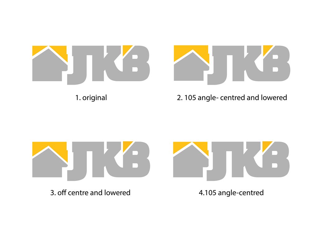
Rapidly expanding building supply company needs a modern logo design
Wollen Sie auch einen Job wie diesen gewinnen?
Dieser Kunde bekam 168 Logo-Designs von 54 Designern. Dabei wurde dieses Logo-Design Design von John-Alexander Design als Gewinner ausgewählt.
Kostenlos anmelden Design Jobs finden
- Garantiert
-
 US$225
-
 168 Designs
-
 54 Designer
Logo-Design Kurzbeschreibung
Jati Kencana Beton (abbreviated JKB) is a vastly growing Indonesian building supply company with vertically integrated operations in Quarry, Stone Crusher, Ready Mix Concrete and Pre-Cast products.
We started as a humble family business in 1980’s, JKB is now ready to embark on next and exciting phase of our Business, with a vision to grow our business on a national and international levels.
We need a logo that reflects our commitment in delivering uncompromising quality product that is strong and withstand the test of time, just like the relationship we have developed with our customers.
Direct Translation of Jati Kencana Beton is Golden Teak Concrete. Since our operations have expanded beyond concrete, we would like abbreviated version of our company name (i.e. JKB) to feature in the logo.
The logo needs to feature font AND a brand image that will become part of our new identity. It needs to portray strength, quality with strong clean lines and symmetry. Preferred colours are Golden Yellow (not metallic) and Gray which will be our corporate colour and feature in our truck fleet
NOTE:
Some general feedbacks are as follows:
1. Character combining - Yep, I am seeing plenty of J/K or K/B combos, most looks great but few are executed well. Main pit fall is losing clarity and susceptible to be misread as something else (JK3, JCB, JB etc). I would like to see JKB as very very legible, please I beg you.
2. Image - needs to convey strength in simple, modern, and yet stylish way. Ideally the image needs to have relevance or inspired from building supply industry. It's tough I know ... I am sure there is a creative genius out there that can pull it off. Please don't just slab an image just because it looks good. There needs to be a reason behind it
3. One format/application per design - receiving multiple applications/formats of the same design is a personal pet hate of mine :D. I can appreciate creative ideas without seeing it in different applications. This way I can provide a more detailed feedback.
keep 'em coming folks. Please blow my mind with your creative designs!!
many thanks
Arief
Zielmarkt/( -märkte)
Building contractors and developers, B2B, home builder
Industrie/Einheitstyp
Concrete
Logo Text
JKB
Logo Stile, die Sie interessieren können
Emblem-Logo
Logo eingeschlossen in einer Form
Pictorial / Combination-Logo
Ein reales Objekt (Text optional)

Lettermark-Logo
Kurzwort oder Buchstaben-Logo (nur Text)

Farben
Vom Kunden ausgewählte Farben für das Logo Design:
Sehen und fühlen
Jeder Schieber zeichnet eine der Charakteristiken der Marke des Kunden aus sowie den Stil, den euer Logo widerspiegeln sollte.
Elegant
Fett
Spielerisch
Ernst
Traditionel
Modern
Sympatisch
Professionell
Feminin
Männlich
Bunt
Konservativ
Wirtschaftlich
Gehobenes
Anforderungen
Muss haben
- Incorporating JKB fonts in strong clean lines and symmetry which portray uncompromising quality and strength.
- The logo can be either in Emblem, Lettermark, or Combination (Pic and Font) type
Schön zu haben
- incorporating business brand image either as an emblem or Pic/Font Combination.
Sollte nicht haben
- overly complicated and with excessive fine details.


