home made ice cream cafe Bianco eyecathcing, stylish and nice logo
Wollen Sie auch einen Job wie diesen gewinnen?
Dieser Kunde bekam 110 Logo-Designs von 28 Designern. Dabei wurde dieses Logo-Design Design von Firstception als Gewinner ausgewählt.
Kostenlos anmelden Design Jobs finden-
 €120
€120
-
 110 Designs
-
 28 Designer
Logo-Design Kurzbeschreibung
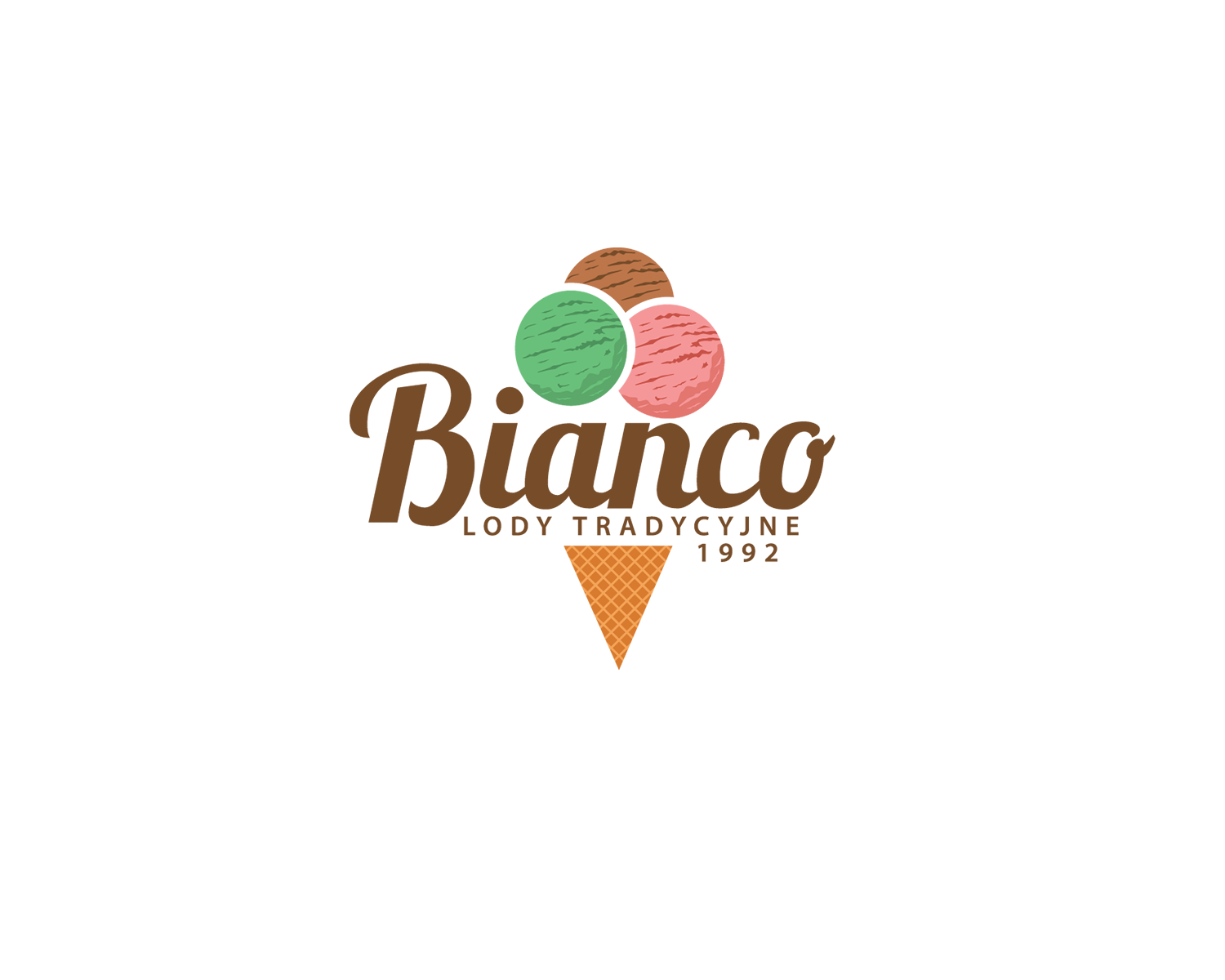
I would like to get some nice logo for our ice cream cafe. We are operating in Poland and our experience on the market is relatively long, the business started in 1992. From the beginning, we didn't have a good name, just lody tradycyjne which means ice creams (home made) that's all. Now we want to have a name maybe connected with the last one (lody tradycyjne) but just as a reminder to the people that Bianco is the same and we thought about putting the date on the logo (1992) to show that we have long experience (it is mostly about new customers which do not know us). What do we do? We are doing ice creams, they are home made and healthy we based our product on the natural ingredients (milk, eggs, sugar, fruits etc.) The product we do is very good at least people say that. We want that logo to be helpful in an advertisement of our brand, which we want to establish in a promotional way since we've got reputation but not the recognisability. As for now we sell the ice creams in one place but we are thinking about expanding the brand. Our customers are mixed, based on our reputation and long experience there are many people who commes to us for ice creams. Kids, youth, adults, old people, middle-income people, wealthy people, a few of poor people, many people, we are creating the image of well establish cafe which in my point of view for customers seems to be good place, (mostly because of experience and the product). Hope that description is helpful. :)
Bianco - means from italian WHITE, why we have choosen that? Foremost because it sounds nice, also because it is white which can be connected with something clear and we thought that we also do "clear" ice creams, we don't use any chemical stuff, and also we thought it can draw client's attention.
Zielmarkt/( -märkte)
Kids, youth, adults, old people, middle-income people, wealthy people, a few of poor people, in general many people. Families, couples, less of singles
Industrie/Einheitstyp
Cafe
Logo Text
Bianco, Lody Tradycyjne, 1992
Logo Stile, die Sie interessieren können
Emblem-Logo
Logo eingeschlossen in einer Form
Pictorial / Combination-Logo
Ein reales Objekt (Text optional)
Figuren-Logo
Logo mit Abbildung oder Zeichen
Wortmarke-Logo
Word oder namensbasiertes Logo (nur Text)
Lettermark-Logo
Kurzwort oder Buchstaben-Logo (nur Text)
Zu verwendende Schriftarten
Sehen und fühlen
Jeder Schieber zeichnet eine der Charakteristiken der Marke des Kunden aus sowie den Stil, den euer Logo widerspiegeln sollte.
Elegant
Fett
Spielerisch
Ernst
Traditionel
Modern
Sympatisch
Professionell
Feminin
Männlich
Bunt
Konservativ
Wirtschaftlich
Gehobenes
Anforderungen
Muss haben
- the name Bianco and below and in smaller font lody tradycyjne (means - ice creams) the date of establishment 1992
Schön zu haben
- perhaps something related to the ice creams, some drawing or something