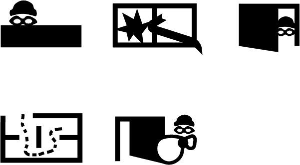
Icons for Lifcycle of a Burglary (from 'casing the joint' to 'stealing the goods')
Wollen Sie auch einen Job wie diesen gewinnen?
Dieser Kunde bekam 13 Icon-Designs von 3 Designern. Dabei wurde dieses Icon-Design Design von ainsleyhelpsyou als Gewinner ausgewählt.
Kostenlos anmelden Design Jobs finden-
 US$140
-
 13 Designs
-
 3 Designer
Icon-Design Kurzbeschreibung
I am working on a powerpoint deck for an inforgraphic I'm making and am in need of 5 icons that depict the following "burglary" lifecycle. I would ask that:
- the icons be black on white / transparent background
- the icons be of a size that will scale when printed as large as 3.5" x 3.5" (or vector art is also OK) and will be nicely visible at sizes as small as 1/2" square.
- the icons be relatively abstract (not much fine detail) and gender-neutral.
The icons are:
1. "Casing the joint" - icon of burglar looking around a home or enterprise. (burglar wearing a mask showing the act of looking or sneaking [crouched tip-toe?])
2. Breaking - broken window or door (maybe a crowbar against a shattering window?)
3. Entering - entering a home or enterprise (maybe an arm reaching through and opening the door)
4. "Room to Room" - indicating that the burglar is searching for valuable items. I picture here two doors in perspective with shoeprints going between them. maybe little dots indicating action
5. Theft - burglar with valuables (not specifically jewlery or money, no bags with $$ on them). If showing burglar leaving a door, leave the door open.
Bonus Icons (if you like, not sure if I want this or not):
- Burglar Disabling security systems
- Vandalism - burglar causing property damage (possibly combined with theft above, like maybe a spraypainted wall on the way out the door or something?)
Zielmarkt/( -märkte)
I'm using the analogy of a burglary to communicate how hackers attack a computing environment and steal information -- but I'm not looking for typical "computer-related hacking stuff" at all. This is more to help non-computer people grasp the concepts in a way that is already familiar to them.
Farben
Vom Kunden ausgewählte Farben für das Logo Design:
Sehen und fühlen
Jeder Schieber zeichnet eine der Charakteristiken der Marke des Kunden aus sowie den Stil, den euer Logo widerspiegeln sollte.
Elegant
Fett
Spielerisch
Ernst
Traditionel
Modern
Sympatisch
Professionell
Feminin
Männlich
Bunt
Konservativ
Wirtschaftlich
Gehobenes
Anforderungen
Muss haben
- The five icons indicated in the description.
Schön zu haben
- The two extra icons at the bottom of the description.
- I suggested black & white but I am open to other simple color patterns/choices.
Sollte nicht haben
- Icons should be "open ended" - not in a surrounded box.