

 Aktualisieren
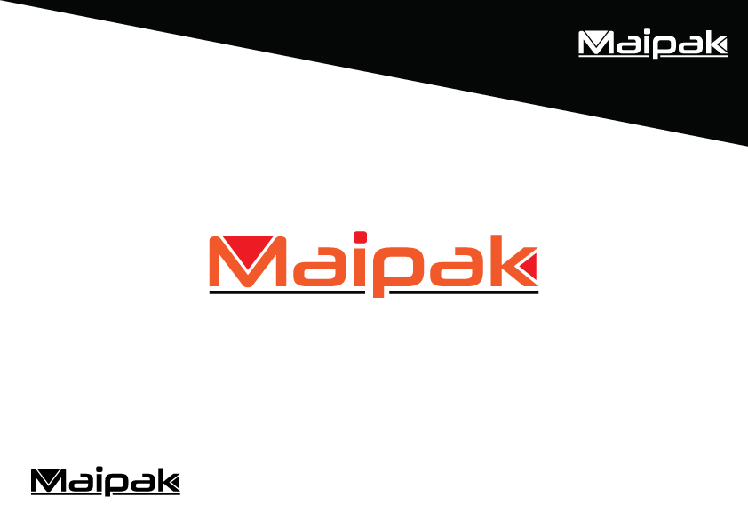
Maipak Solutions (Maione packaging solutions)
Wollen Sie auch einen Job wie diesen gewinnen?
Dieser Kunde bekam 92 Logo-Designs von 32 Designern. Dabei wurde dieses Logo-Design Design von Zeeshan Ali als Gewinner ausgewählt.
Kostenlos anmelden Design Jobs finden
- Garantiert
-
 A$170
-
 92 Designs
-
 32 Designer
Logo-Design Kurzbeschreibung
Maipak is a recently established family business from South Australia. We are a packaging company, who contract out to other businesses to pack their products ready for wholesale and retail market. Our main focus is within the coffee industry – we contract to coffee rosters to pack their coffee in capsules for them to on sell to the retail market. While our focus is currently within the coffee industry, we have the ability and idea to expand to other forms of consumables and products.

Aktualisierungen
Project Deadline Extended Reason: updated brief to be more specific in what is required for our logo Added Monday, April 11, 2016
Zielmarkt/( -märkte)
Maipak is a contactor to businesses providing a service to package their products. Maipak appeals to the food and beverage market, providing a service to businesses to assist them with packing their products. Maipak does not have a presence in the retail market for an end buyer.
Industrie/Einheitstyp
Business
Logo Text
Maipak Solutions
Logo Stile, die Sie interessieren können
Abstraktes Logo
Begrifflich / symbolisch (Text optional)
Wortmarke-Logo
Word oder namensbasiertes Logo (nur Text)
Lettermark-Logo
Kurzwort oder Buchstaben-Logo (nur Text)

Zu verwendende Schriftarten


Farben
Vom Kunden ausgewählte Farben für das Logo Design:
Sehen und fühlen
Jeder Schieber zeichnet eine der Charakteristiken der Marke des Kunden aus sowie den Stil, den euer Logo widerspiegeln sollte.
Elegant
Fett
Spielerisch
Ernst
Traditionel
Modern
Sympatisch
Professionell
Feminin
Männlich
Bunt
Konservativ
Wirtschaftlich
Gehobenes
Anforderungen
Muss haben
- Logo needs to be easy to work with when designing brochures, leaflets, web pages etc. We would like Maipak logo and design to be simple but effective, integrating sharp and clean text and colour.
Schön zu haben
- A logo with a symbol which is part of the 'Maipak' text, however is also able to stand alone as trade mark of the company.
Sollte nicht haben
- Logo should not be too complex nor have too many colours.