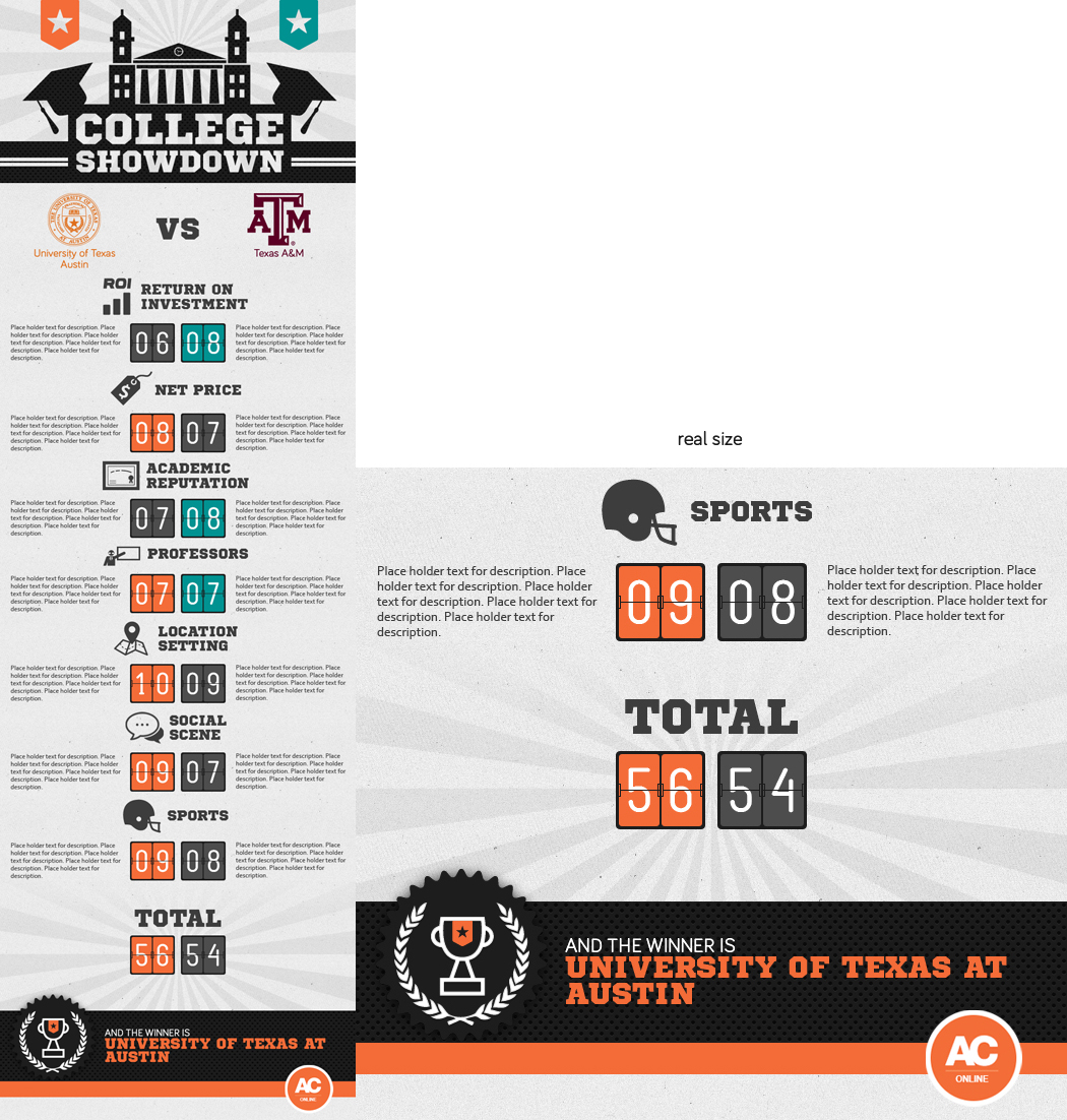
College Comparison (College Showdown) - One Page Design with Infographic Feel

Wollen Sie auch einen Job wie diesen gewinnen?
Dieser Kunde bekam 37 Infografik-Designs von 6 Designern. Dabei wurde dieses Infografik-Design Design von HXeight als Gewinner ausgewählt.
Kostenlos anmelden Design Jobs finden- Garantiert
Infografik-Design Kurzbeschreibung
Hi,
Thanks for viewing our project.
Summary: We want to create a one page design that compares characteristics of two big named U.S. colleges. Each college will be scored on several factors and the college with the most points wins. See details below.
Website: AffordableCollegesOnline.org
Overall Look and Feel: We'd like this to have an infographic feel and inspire a competition between two colleges - we have nicknamed this project "College Battle Royal." It should appeal to a college crowd and 18-25 year old demographic. It should inspire people to share it socially. If you google "comparison infographics" you will see a variety of examples.
Flexibility in design: We will start with University of Texas - Austin vs Texas A&M - College Station. But the design needs to be flexible so we can easily reuse this design for the next two colleges we compare.
Comparison Metrics: Return on Investment, Net Price, Academic Reputation, Professors, Location Setting, Social Scene, and Sports. Scoring for each metric will be on a 1-10 scale. And there should be an area next to each colleges score that can be used for a 2-3 sentence description. The winning score for each metric should be highlighted vs the other score. For example if Social Scene for one college is a 9 vs the other college at an 8, it should be evident that the 9 is better.
Calling out the winner: At the bottom we need to prominently highlight the winner.
Title at the top: As a placeholder working title for now please use: "College Showdown" with the two college names below the title. I'm very open to title options - so if you come up with a great one please use it.
Background: I'm open to having a background image or color - up to you - but we just need to be sure it is flexible for when we reuse the design.
Logos: I like the idea of using the college logo somewhere in the deisgn.
Dimensions and details: The dimensions should match the full width of the example page seen here. http://www.affordablecollegesonline.org/financial-aid/529-plans-and-saving-for-college/
Attachment: I attached an image that is a start of a design. This will just give you a general idea of what I mean by comparison. The rough structure is here - we just need to improve the look and feel. This specific example, while matches the colors and theme of our site, doesn't really inspire competition and lacks emotion. I also don't like the graphics on this page - the trophy feels a little too much like clipart and the top image doesn't really feel like college.
Aktualisierungen
Project Deadline Extended
Reason: Still working through ideas and edits with designers who have submitted work.
Added Wednesday, August 14, 2013
Industrie/Einheitstyp
College