Australian Speciality cafe logo design
Wollen Sie auch einen Job wie diesen gewinnen?
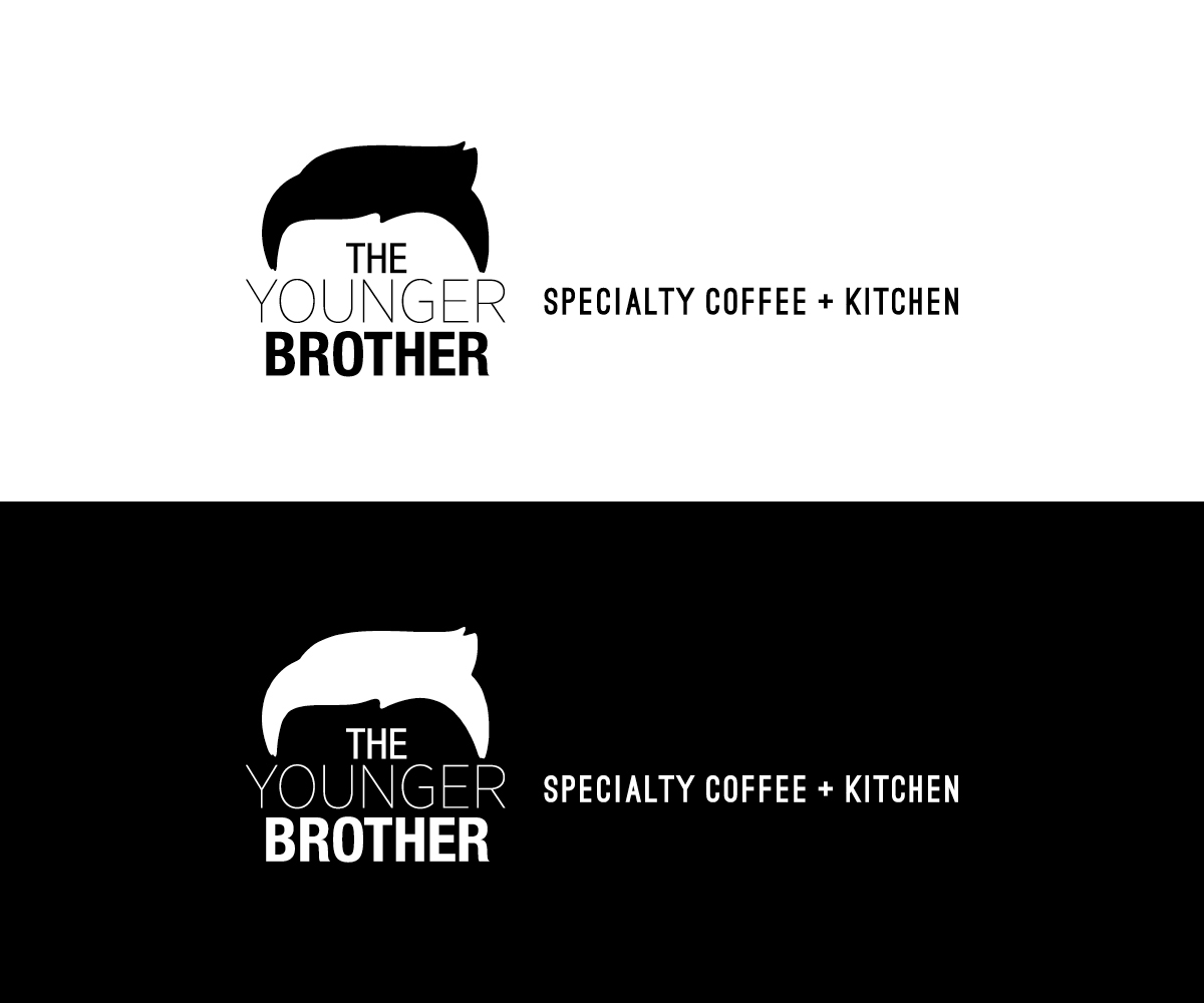
Dieser Kunde bekam 33 Logo-Designs von 13 Designern. Dabei wurde dieses Logo-Design Design von Bittersweet als Gewinner ausgewählt.
Kostenlos anmelden Design Jobs finden-
 A$160
A$160
-
 33 Designs
-
 13 Designer
Logo-Design Kurzbeschreibung
The Younger Brother
Creative Brief
Useful Background Information
We are an industrial, warehouse style café in a busy transit precinct in a city with a strong café culture.
The Younger Brother name is of special significance to our brand. We are adapting an existing inner-city design concept for families and white collar professionals in a busy suburban neighbourhood. In this market, our brand is symbolic of everything a big city has to offer – choice, freedom and luxury. Our café is about indulging the individual and stimulating their senses of touch, taste and smell.
Our brand will differentiate itself from the competition on the following points:
1) Product: High quality, local produce, rich and full-flavoured
2) Atmophere: Intimate, warm, sensual
3/ Fit out and décor: Modern industrial, fashionable, city chic
Project Overview
The project is to establish a brand identity for The Younger Brother cafe. Our brand as much about the design as it is about the experience. We want to communicate quality and indulgence whilst referencing our ambition, passion and enthusiasm.
This is to be achieved by integrating a clean, minimalist font design into a bold and eye-catching logo that immediately communicates these brand qualities.
The key aim here is balance – communicate warmth in a minimalist, bold and eye-catching design.
Collatoral to be supplied: -
Number of logo design variations that each communicate the above criteria.
Key considerations:
The logo design will be displayed prominently on a café fascia sign. The logo must be eye-catching and easy to read from a distance.
Target Market
25-51 year old white collar professionals working in the inner-city during peak travel times before and after work
30-45 year old stay-at-home mothers living locally during weekdays
Families on weekends
Value Proposition
The Younger Brother provides a unique experience for its patrons. It offers a down-to-earth and inviting experience with premium café quality – for young professionals, local mothers and families who enjoy an artisan, speciality brewed coffee in a stimulating environment.
Image and Tone of Voice
The Younger Brother wants to be perceived as passionate and committed to delivering high-quality coffee and providing customers with an interesting and atmosphere to delight in.
We need a high contrast, confident logo to build the foundations of trust primarily based on artisan quality, knowledge, skill and dedication to the craft.
There is room for a softer design element to signal the warm, inviting and sensual atmosphere. This is a confident and sociable brand – but not arrogant or pretentious.
Thoughts on the Design
Contemporary, crisp, modern and clean. The font and design needs to be minimalist, striking and modern. The colour scheme should be simple and restricted to two primary colours – black and white.
The logo should:
Be modern and minimalist.
Be consistent with an industrial, New York loft style setting
Suggest a sensual environment – think smell, touch, taste of rich, decadent coffee
Logo must write Specialty Coffee & Kitchen. Can be placed on the side or incorporated in.
Client Likes
White and Black.
Fonts and designs that instantly recognisable and easy to read
Client Dislikes
Overly simple, ambigious or generic design symbols and motifs.
Avoid cliche coffee cup symbols.
Avoid elaborate, cursive writing.
Avoid fonts that make the name of the café difficult to read
Overworked designs that aren’t specific to the Younger Brother brand.
Industrie/Einheitstyp
Cafe
Logo Stile, die Sie interessieren können
Pictorial / Combination-Logo
Ein reales Objekt (Text optional)
Wortmarke-Logo
Word oder namensbasiertes Logo (nur Text)
Farben
Vom Kunden ausgewählte Farben für das Logo Design:
Sehen und fühlen
Jeder Schieber zeichnet eine der Charakteristiken der Marke des Kunden aus sowie den Stil, den euer Logo widerspiegeln sollte.
Elegant
Fett
Spielerisch
Ernst
Traditionel
Modern
Sympatisch
Professionell
Feminin
Männlich
Bunt
Konservativ
Wirtschaftlich
Gehobenes
Anforderungen
Muss haben
- The Logo must incorporate Specialty Coffee + Kitchen