Entertainment Magazine Needs a Logo/Title Design
Wollen Sie auch einen Job wie diesen gewinnen?
Dieser Kunde bekam 90 Logo-Designs von 35 Designern. Dabei wurde dieses Logo-Design Design von site als Gewinner ausgewählt.
Kostenlos anmelden Design Jobs finden- Garantiert
-
 US$160
-
 90 Designs
-
 35 Designer
Logo-Design Kurzbeschreibung
We need a new logo/title design for our paper in Fresno, CA which acts likes a magazine. It covers local entertainment, music, events, food and other various news pertaining to our region. It is free to the public and our focus is to communicate the new/interesting/cool things about our community to our community in a fun, modern and professional way, using a traditional medium... newspaper.
We would like to see designs using the colors orange and black. Orange is preferred as the accent color.
**note: we can't use anything resembling a paper airplane.
The designs should be clean and relatively simple since it will be printed on newspaper material, as too many fine details can get lost in production. However, we also need something that translates easily in to a short hand version for social media, business cards etc.
The final design should communicate a sense of fun while also being sophisticated.
Example publications we aspire to be on the same level as:
SF Weekly:
http://www.sfweekly.com/sanfrancisco/IssueArchives
Salt Lake City Weekly: http://www.cityweekly.net/utah/IssueArchives
Aktualisierungen
Hey All,
We've been seeing a lot of designs incorporating the idea of a Raven and although many of the attempts have been very solid, we've decided that it's a design difficult to achieve on newsprint and for all of our specific purposes.
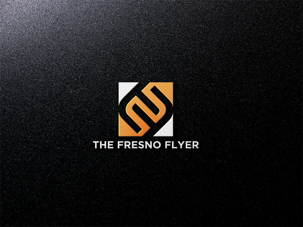
We have updated our brief to include some new directions. We would like to see designs using the double 'F' as the image/icon. Sans-serif font is preferred for the full layout of "The Fresno Flyer" and the weight should be medium to bold. The style in which the 2 Fs are utilized is up to you, we only require that you use the color orange and the design be flexible, professional and clean, communicating the same things as listed in our brief: "Fun yet sophisticated".
Thank you for your time, efforts and skill. Every design helps to bring us closer to the image that best represents us and our publication.
Added Monday, May 30, 2016
Hi Everyone!
We're seeing a lot of backwards, double F designs. And although the quality and presentation is great, it unfortunately resembles an already established logo by an American footwear and apparel company called Fallen. Any designs that appear similar will not be in the running for the winning design.
Thanks for all your hard work!
Added Wednesday, June 1, 2016
Zielmarkt/( -märkte)
Everyone. Our readers are anywhere from 18 - 75 and have about a 60/40 male to female ratio. We need to appeal to the younger demographic without losing the mature audience in the process.
Industrie/Einheitstyp
Media
Logo Text
The Fresno Flyer
Logo Stile, die Sie interessieren können
Abstraktes Logo
Begrifflich / symbolisch (Text optional)
Wortmarke-Logo
Word oder namensbasiertes Logo (nur Text)
Zu verwendende Schriftarten
Farben
Vom Kunden ausgewählte Farben für das Logo Design:
Sehen und fühlen
Jeder Schieber zeichnet eine der Charakteristiken der Marke des Kunden aus sowie den Stil, den euer Logo widerspiegeln sollte.
Elegant
Fett
Spielerisch
Ernst
Traditionel
Modern
Sympatisch
Professionell
Feminin
Männlich
Bunt
Konservativ
Wirtschaftlich
Gehobenes
Anforderungen
Muss haben
- The use of the color orange and black.
Schön zu haben
- We'd like to see a combination of the wordmark logo idea with an abstract logo added in somehow. They can be 2 separate objects or joined.
- Utilization of the letters 'F'. We would like to see designs creating an icon using double 'F's to represent Fresno Flyer.
Sollte nicht haben
- Airplanes (literal or abstract)