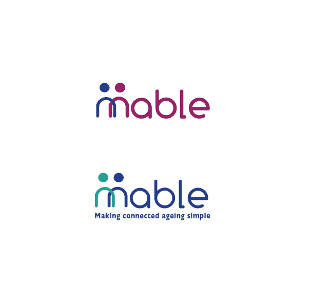
Logo and colour palette: Connecting older people
Wollen Sie auch einen Job wie diesen gewinnen?
Dieser Kunde bekam 17 Logo-Designs von 8 Designern. Dabei wurde dieses Logo-Design Design von Hiccups Design als Gewinner ausgewählt.
Kostenlos anmelden Design Jobs finden-
 US$200
-
 17 Designs
-
 8 Designer
Logo-Design Kurzbeschreibung
Needs to project a friendly service that is simple and intuitive to use. To attract consumers who are not comfortable with technology to trust us to provide them with a useable service that will improve their lives.
Warm inviting colours, large and easy to read.
Logo and colour palette will be used as identity for web and application designs. Therefore output needs to be the logo and the colour palette for the company.
Zielmarkt/( -märkte)
Three markets - care providers; younger family members of older people; older people
Industrie/Einheitstyp
It Company
Logo Text
"Mable" plus we need to see logos with and without the strapline "Making connected ageing simple"
Logo Stile, die Sie interessieren können
Emblem-Logo
Logo eingeschlossen in einer Form
Pictorial / Combination-Logo
Ein reales Objekt (Text optional)
Sehen und fühlen
Jeder Schieber zeichnet eine der Charakteristiken der Marke des Kunden aus sowie den Stil, den euer Logo widerspiegeln sollte.
Elegant
Fett
Spielerisch
Ernst
Traditionel
Modern
Sympatisch
Professionell
Feminin
Männlich
Bunt
Konservativ
Wirtschaftlich
Gehobenes
Anforderungen
Sollte nicht haben
- avoid images of old people and associated cliches; avoid reds; mustn't look like an IT or technology company