I am a commercial Interior Designer and new business owner in need of a new logo/brand. I've worked
Wollen Sie auch einen Job wie diesen gewinnen?
Dieser Kunde bekam 145 Logo-Designs von 49 Designern. Dabei wurde dieses Logo-Design Design von all wazedo als Gewinner ausgewählt.
Kostenlos anmelden Design Jobs finden-
 US$160
-
 145 Designs
-
 49 Designer
Logo-Design Kurzbeschreibung
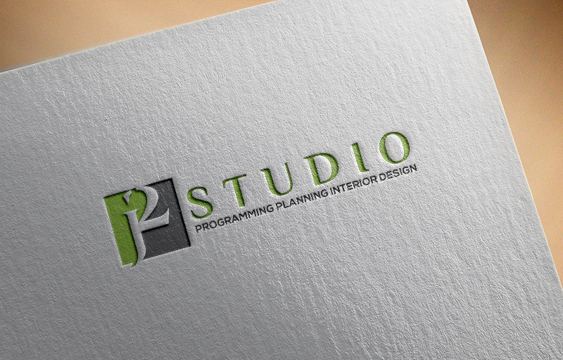
My logo needs to be eye catching but sophisticated - not whimsical like you see on many residential interior designer's business cards. The name of my company is j2 Studio.
There is a meaning behind the name. My former initials were JJ and this is the 2nd phase of my professional career. In addition the number 2 is referred to as "Squared" like J to the 2nd power. We use a lot of math in architecture and design so the logo with the 2 is very relevant. I love black and white but would consider a touch of color to accent the logo. I may have to add LLC or Inc. after the logo. i will know shortly on that detail. This logo will be used on my business cards and letter head.
Zielmarkt/( -märkte)
Clients (end users), Vendors for Building materaials and Furniture, Construction Companies, Real Estate Brokers, Executives.
Industrie/Einheitstyp
Business
Logo Text
j2 Studio (2nd line): Programming. SpacePlanning. Interior Design
Logo Stile, die Sie interessieren können
Wortmarke-Logo
Word oder namensbasiertes Logo (nur Text)
Lettermark-Logo
Kurzwort oder Buchstaben-Logo (nur Text)
Zu verwendende Schriftarten
Farben
Vom Kunden ausgewählte Farben für das Logo Design:
Sehen und fühlen
Jeder Schieber zeichnet eine der Charakteristiken der Marke des Kunden aus sowie den Stil, den euer Logo widerspiegeln sollte.
Elegant
Fett
Spielerisch
Ernst
Traditionel
Modern
Sympatisch
Professionell
Feminin
Männlich
Bunt
Konservativ
Wirtschaftlich
Gehobenes
Anforderungen
Muss haben
- Unique Fonts and legible. I don't want to be limited to what is listed on this page as options. I'd like the "2" in the logo to be different and stand out.
Schön zu haben
- I like the idea of two tone logo where the the color is reversed as the font stretches over the opposite color. Artwork if used should be geometric
Sollte nicht haben
- No pictures or whimsical frilly fonts, images.