

 Aktualisieren
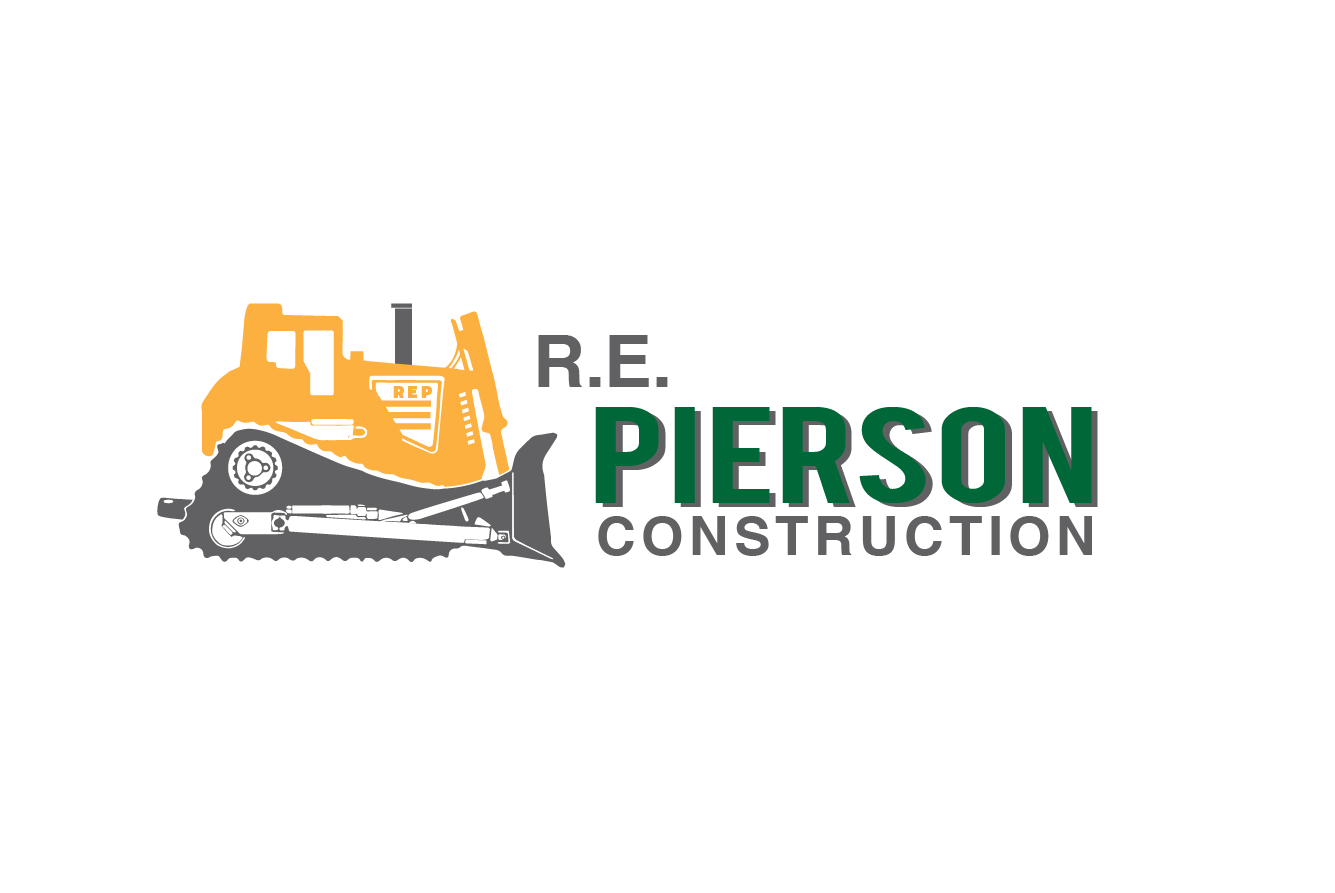
Construction Company Revive Logo
Wollen Sie auch einen Job wie diesen gewinnen?
Dieser Kunde bekam 125 Logo-Designs von 38 Designern. Dabei wurde dieses Logo-Design Design von Alexandar als Gewinner ausgewählt.
Kostenlos anmelden Design Jobs finden
- Garantiert
-
 US$160
-
 125 Designs
-
 38 Designer
Logo-Design Kurzbeschreibung
**** The most important part is the bulldozer..
**** If there is no bulldozer then it's no good.. the bulldozer must be the same model as in our current logo and facing the same way.
**** From what I can tell, it is approx a CAT D10 bulldozer.. Although it should not have the name or model of the dozer on the logo anywhere.
Here is a pretty clear picture of what I believe is the bulldozer in our logo.. http://preview.repierson.com/IMG_5634.jpg
You should redraw this in an abstract way..
**Some people submitted an awesomely draw bulldozer, although it was not the correct model..
Trying to update the logo so it will fit better with our new website design which you can see at http://preview.repierson.com
Industrie/Einheitstyp
Construction Company
Logo Text
R. E. Pierson Construction
Logo Stile, die Sie interessieren können
Pictorial / Combination-Logo
Ein reales Objekt (Text optional)


Abstraktes Logo
Begrifflich / symbolisch (Text optional)



Sehen und fühlen
Jeder Schieber zeichnet eine der Charakteristiken der Marke des Kunden aus sowie den Stil, den euer Logo widerspiegeln sollte.
Elegant
Fett
Spielerisch
Ernst
Traditionel
Modern
Sympatisch
Professionell
Feminin
Männlich
Bunt
Konservativ
Wirtschaftlich
Gehobenes
Anforderungen
Muss haben
- 1. 2 Squares/rectangles overlapping
- 2. Bulldozer
- 3. Bulldozer
- 4. Bulldozer
- 5. Wording (R. E. Pierson Construction)
- 6. Colors (Green Approx #16752F, Construction Yellow, Black)
Schön zu haben
- I really want the main focus point to be on creating an abstract bulldozer that can be identified to look like the same bulldozer as our current logo has. But not so detailed as an actual picture of a bulldozer and not cartoony, slightly in the middle, maybe abstract looking?..
- I think making the 2 squares/rectangles abstract would add a lot also..
Sollte nicht haben
- It can not look cartoony
- See uploaded files for current logo and inspirational pictures, and a "Not Like" folder

