

 Aktualisieren
Recording studio and music production services
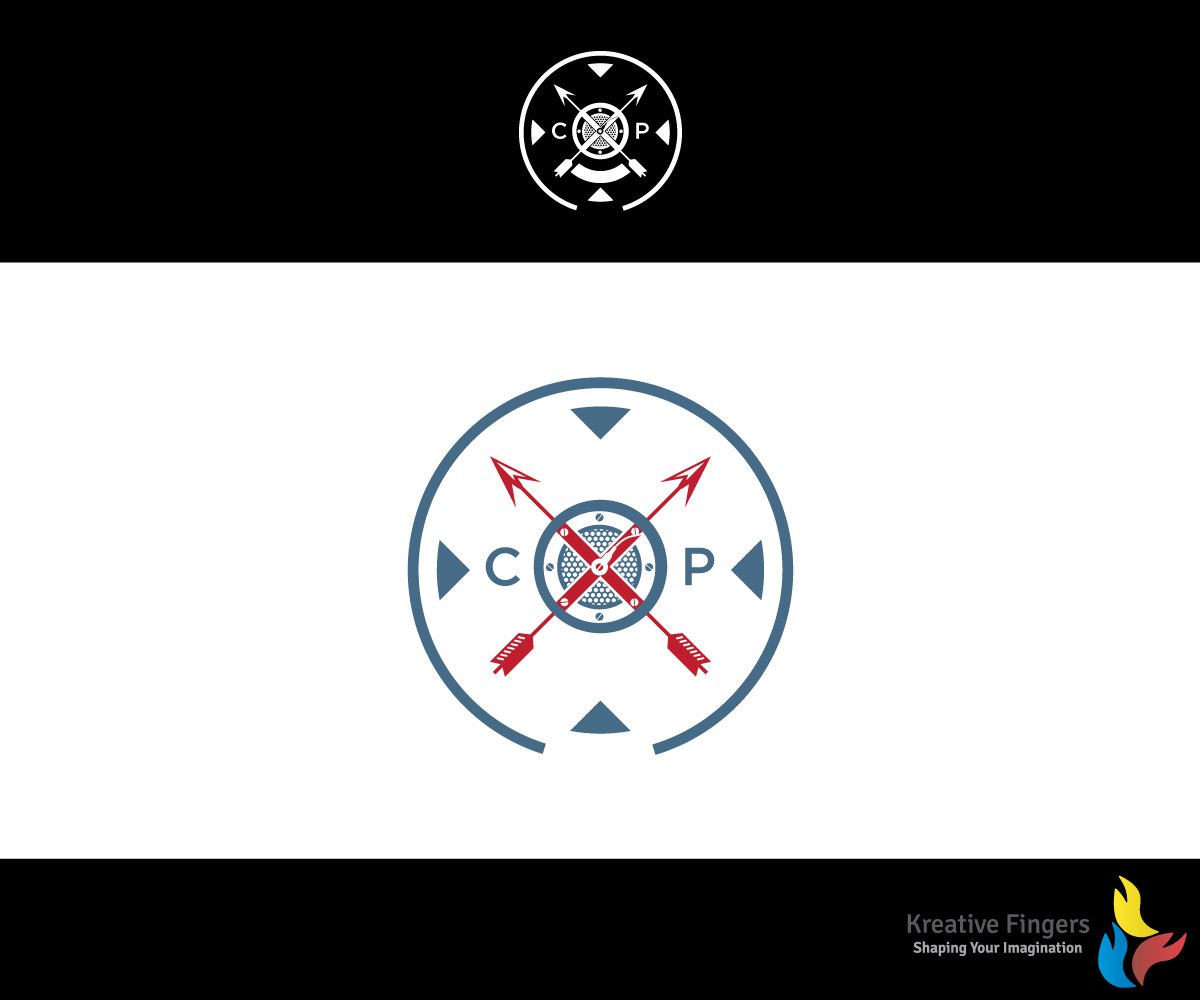
Wollen Sie auch einen Job wie diesen gewinnen?
Dieser Kunde bekam 69 Logo-Designs von 21 Designern. Dabei wurde dieses Logo-Design Design von Kreative Fingers als Gewinner ausgewählt.
Kostenlos anmelden Design Jobs finden
- Garantiert
-
 US$260
-
 69 Designs
-
 21 Designer
Logo-Design Kurzbeschreibung
I have an original logo I would like used as the basis for the new logo.
The current logo is a shield design. The lettering and font are a bit dated (I created this in Iraq with Photoshop - lost the .psd files though.)
I would like the color scheme to be Pelham blue with black and white accents. The word CXP Studios should appear and the year 2006. Creative license on how those are incorporated.
This will be used on business cards and websites.

Aktualisierungen
the year "2006" should appear not "2016"Also, the letter's "CXP" are now the only requirements for text. The year "2006" no longer is mandatory. Added Wednesday, August 31, 2016
Zielmarkt/( -märkte)
Professional music performers, singer/songwriters, and entertainment professional requiring audio services (voice over, score production).
Industrie/Einheitstyp
Performing Art
Logo Text
CXP Studios
Logo Stile, die Sie interessieren können
Abstraktes Logo
Begrifflich / symbolisch (Text optional)



Lettermark-Logo
Kurzwort oder Buchstaben-Logo (nur Text)



Zu verwendende Schriftarten

Sehen und fühlen
Jeder Schieber zeichnet eine der Charakteristiken der Marke des Kunden aus sowie den Stil, den euer Logo widerspiegeln sollte.
Elegant
Fett
Spielerisch
Ernst
Traditionel
Modern
Sympatisch
Professionell
Feminin
Männlich
Bunt
Konservativ
Wirtschaftlich
Gehobenes
Anforderungen
Muss haben
- The shield and X design are important. The attached logo should be considered the spirit of the logo not an exact request to match. It should be a shield though. Going for a subtle nod to my career as a Soldier without being too in your face about it.
- The name of my company is "Circle X Productions" hence the circle and X imagery.
Schön zu haben
- Perhaps a microphone grill as the "cap" replacing the star? Maybe two arrows crossed - tribute to the special forces crest (attached)
Sollte nicht haben
- The star in the middle seems a bit too USA for me.


